Components
The components page (Global Design > Components) contains a list of components that come built-in with Studio and new components created by Studio users. Components that appear in this list are available for use in the Components tab (left panel of the Visual Builder). Refer to the annotated image below to learn more.
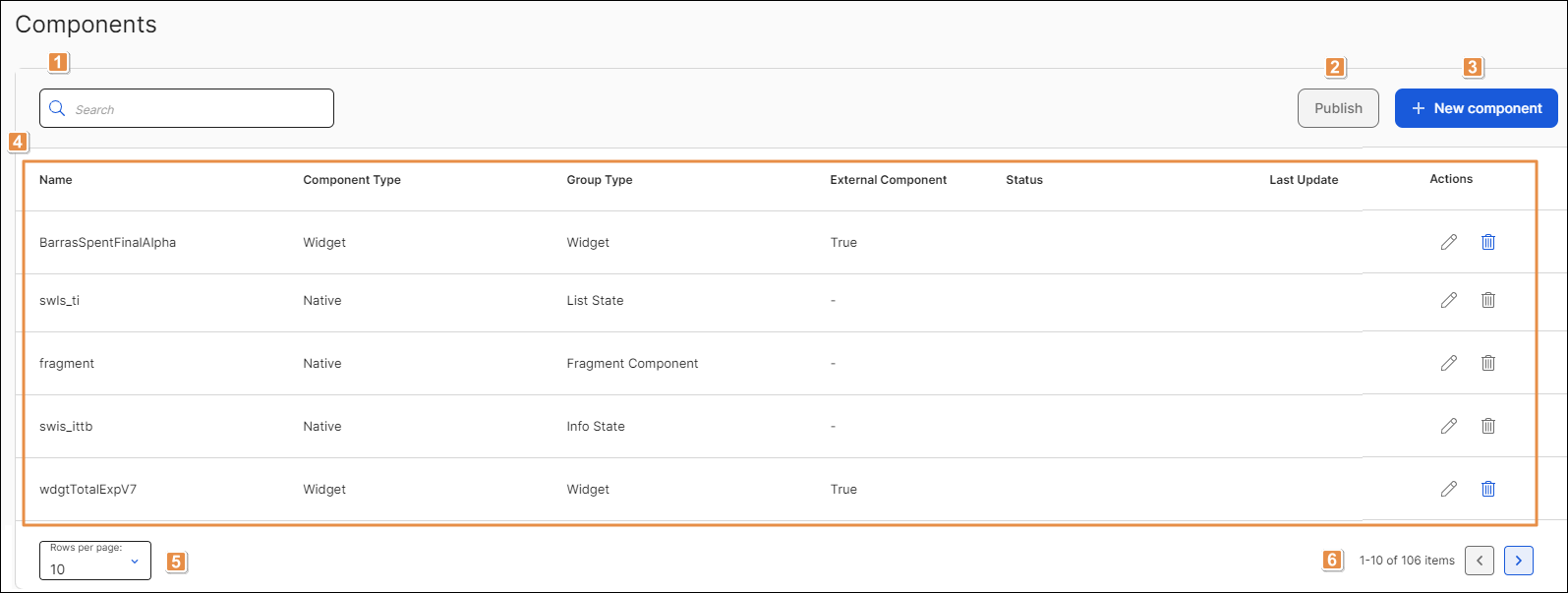
Search bar. To find a component, click the search bar and type its name, component type or group type.
Publish. Click to publish all the React components that have not been published yet. This action only appears available if there are React components unpublished.
Important
Native and widget components cannot be published.
+ New Component. Click to create a new component. Refer to Create or Edit a Component to learn more.
List of built-in components. Refer to the table below to learn more. The table contains a row for each component and columns that show the component's name, type and whether or not it's an external component.
Name
Name given to the component.
Component Type
Type of component. Components can be Native, React or Widget.
Group Type
Component category.
External Component
Attribute that defines whether the component was created by a Studio user.
Tip
Only React and widget components are classified as external components.
Status
Status of React components. It can be Published or Pending publication.
Important
The status information only applies to React components.
Last Update
Last time and date on which the component was updated.
Actions
Refer to the table below to learn more about the actions available for each component.
Edit
Click to edit the component.
Delete
Click to delete the component. A modal appears, asking you to confirm the elimination and informing you that the action can't be undone. Click Delete to confirm.
Important
Components classified as Native cannot be edited or deleted.
Rows per page. Number of rows displayed on screen. Click the arrow to select an option from the drop-down menu: 10, 20 or 50.
Pagination. Click the arrows to move forwards or backwards in the list of components.