How to create a module and invoke a configurable component in your app
After you create a module, you must follow several steps to be able to invoke and use its content from a parent app or module. These steps involve entities that must be configured beforehand, that you will need when you configure the module interfaces. The decision as to whether you need to create these entities or use existing ones depends on the characteristics of the module you need to create and the purpose it will fulfill. To learn more about when you should create a module, read Modules.
The steps below must be taken to invoke and use a module's content.
Create the module.
Define the app layout template or templates to be applied to the views of the module's screens.
Define the view or views to be used in the app screens.
Note
Mobile apps usually contain one view that refers to the whole content of the screen.
Create the screen or screens where the content of the module will be designed (either the content involves configured components or screens flows).
Create the module interface or interfaces that will communicate the module with the parent app or module, depending on the screens previously created.
Link the module to the parent app or module where you want to invoke the configured component or screens flow that the interfaces represent.
Invoke the configured component or screens flow from the parent app or module.
The use case below involves creating a module with a component that shows a generic error in the app. In addition, you will set that, when the user closes the error message, the session is closed and the user is redirected to the Login screen.
In this case, you must build a module and make use of its reusable capabilities for two reasons: on one hand, you need to apply it in several screens of the app, so the correct practice would be to use a configurable component and avoid creating one component per screen; on the other hand, considering it is a generic error, it can be reused in any other app or module. These sections below explain how to perform each of the steps specified above.
The first step involves creating the module errors. Modules are configuration units that can be instanced through their interfaces in an app or another module (called parent app or module). They have the same functionalities of an app but they cannot be published. To learn more about modules, read Modules.
Read the instructions below to create the module.
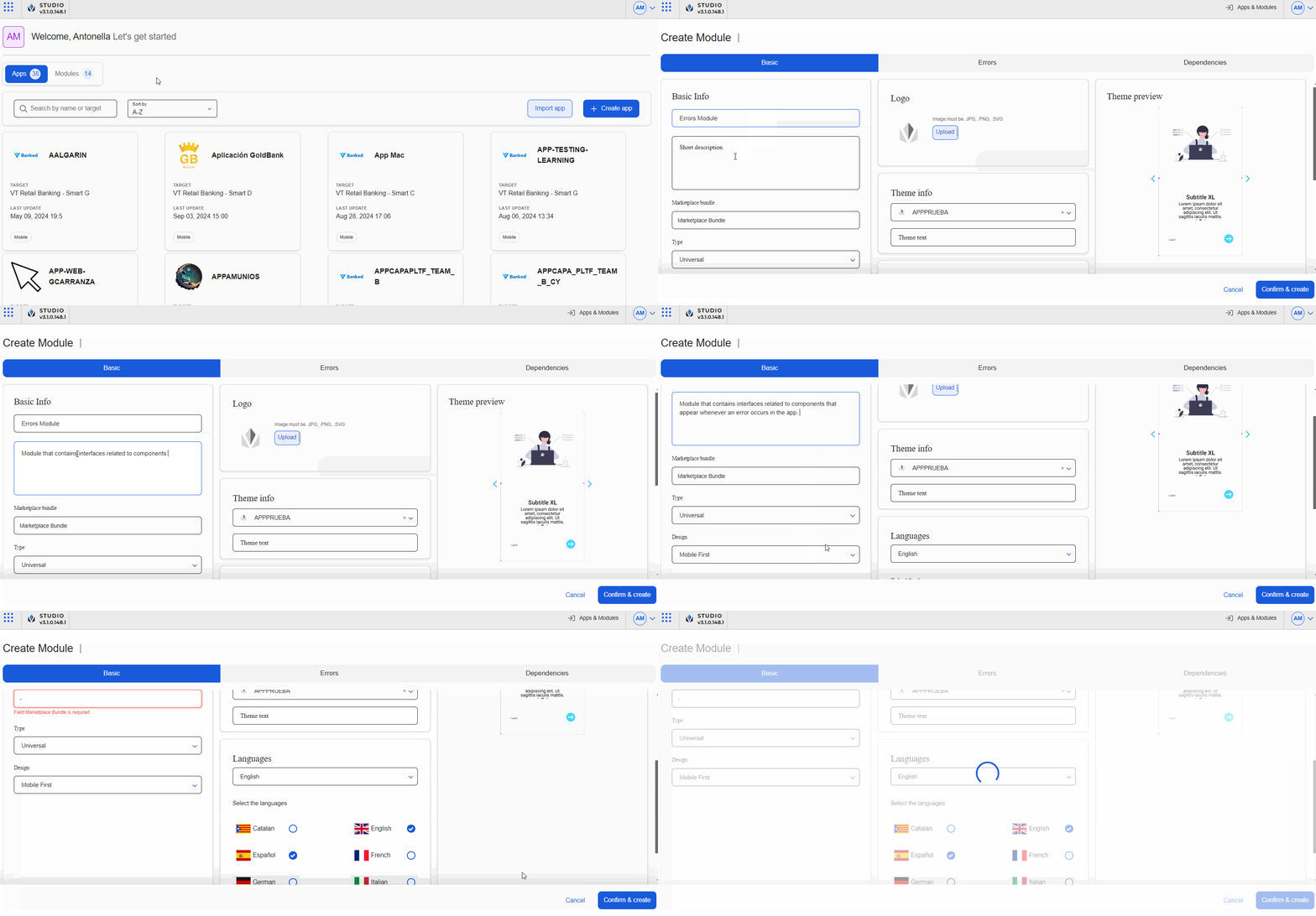
Log in to Studio using your username and password credentials.
Studio opens in the Apps & Modules page. Click Modules to open the tab.
Click + Create module. The Create Module page opens, where you have to complete three tabs: Basic, Errors and Dependencies. For this example, you will only configure the Basic tab. To learn more about all the tabs and how to complete all the fields available, read Create or Edit a Module.
Go to the Basic tab and complete the basic settings of the module.
Note
The module name must be unique. If the name you enter already exists, you won't be able to create the module.
Basic Info.
Go to the Module's name field and enter Errors Module.
Go to the Short description field and specify the module content. For this example, enter Module that contains interfaces related to components that appear whenever an error occurs in the app.
Go to the Type field and leave the option Universal selected.
Important
This field works as in the case of apps. If you choose Universal, when you configure a screen, the screens editor will show the device options. If you choose Web, it shows the breakpoints options. Read Screens Editor Navigation to learn more.
Go to the Design field and leave the option Mobile First selected to define that the module design prioritizes mobile view.
Theme info. In this section, click the x field to remove the theme applied by default. Now, the module will inherit the theme applied to the parent app or module when it is invoked. To learn more about Errors inheritance, read Create or Edit a Module.
Languages. In this section, select the English and Español radio buttons.
Click Confirm & create to save the settings of the new module.
You are redirected to the Apps and Modules page, and a confirmation message indicates that the module was successfully created. Click the Modules tab and then click the card of the module created to start working on the module.
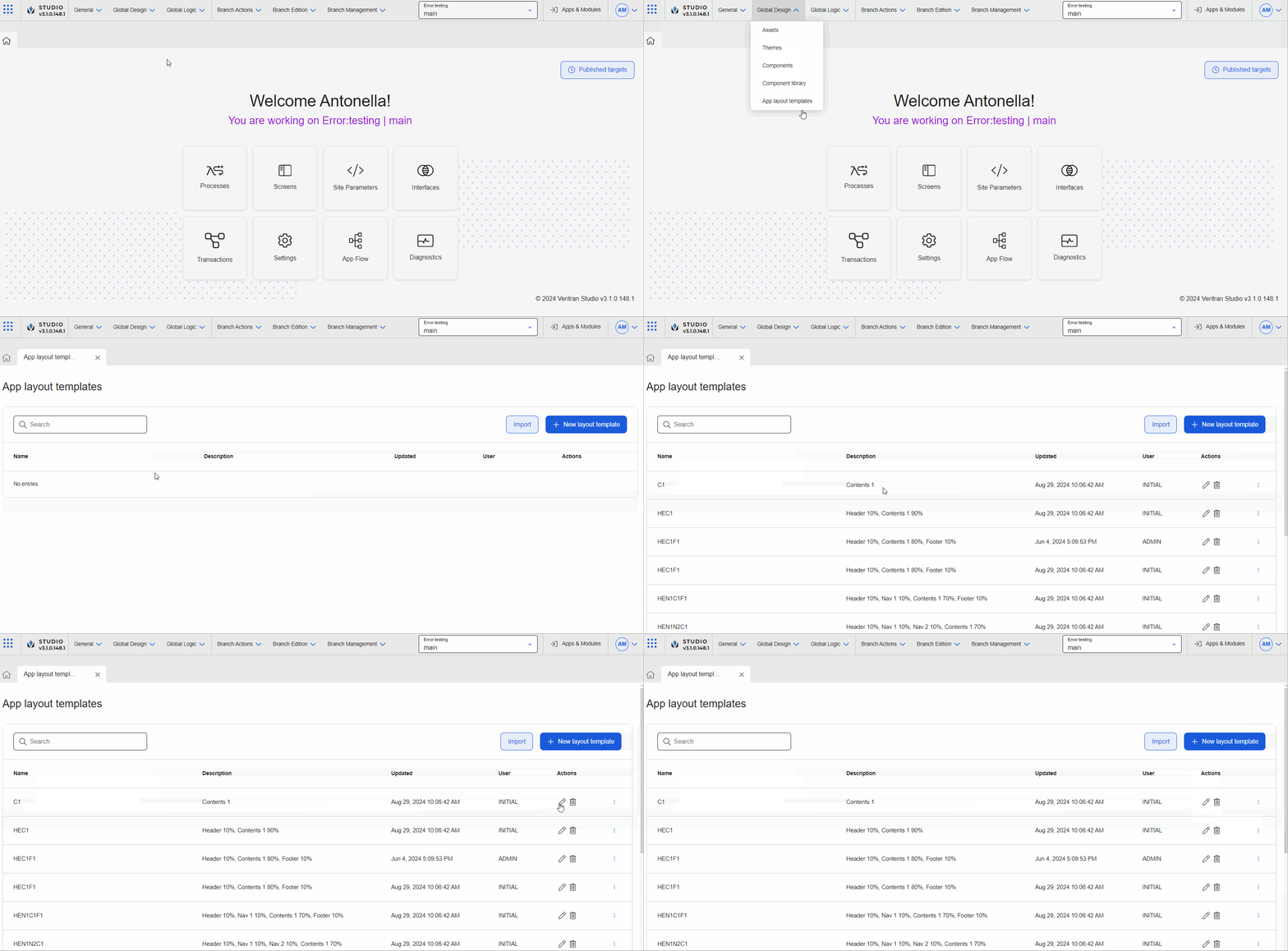
The second step involves defining the app layout template to be used in the views of the Error module module you created. App layout templates define how the elements of your app are distributed in visual areas or within a screen, while adapting to the size of the device. Each new app or module contains a set of default app layout templates (Global Design > App layout templates) that you can use in the views of the app or module. In addition, you can create or import templates.
For this example, the module you created, and therefore, its content, will be used in a mobile app. As a consequence, the only layout template you need is the C1 (Content) template, which is one of the default templates available (as shown in the animated image below). Therefore, you won't need to create a new layout template. To learn more about these templates, read App Layout Templates.
Views represent the visual space where the screens of the app will be included. Each view can have a specific layout or view area, which is the visual area within which the content of the screen will be created. Views must be created first to then create and configure the content of the app screens.
Read the instructions below to create the view.
In the Overview, go to Branch Edition > Views.
Click + New site view.
Once the Views page opens, complete the fields as specified below.
Note
The Site field contains the name of the module in which the view is being created. This field cannot be edited.
Go to the View field and enter V00.
Go to the Theme field and leave the option No Theme selected.
Go to the Description field and enter View that represents the content of the whole screen.
Go to the Layout field and leave the Contents 1 (C1) option selected. As mentioned in the Define app layout template section, you apply the contents layout to this view.
Click Save to create the view and be redirected to the Views page.

In this step, you must create the screen where you will configure the component or screen flow that will become part of the container view in the module interface configuration. In this example, you will create a screen to configure the configured component that will be communicated with the parent app through a component interface.
Read the instructions below to create the module screen. To learn more about how to use the screens editor with a use case, read Flex Container.Flex Container
Go to the Overview.
Click Screens to open the Screens page.
Click + New screen to create the screen and go to the screens editor.
Click Settings in the left panel.
In the Sequence field, enter S022.
In the name field, enter Error dialog.
Click Treeview in the left panel and then click the maximize icon to hide the canvas and the components to the treeview as specified below.
Add a Flex Container component to the Panel component that appears by default.
Go to the right panel and change its Name attribute to Flx_Main. Then, add the following two components to the Flx_Main:
Add a Text label component and change its Name attribute to TxtLbl_Title in the right panel.
Add a second Text Label component and change its Name attribute to TxtLbl_Description in the right panel.
Add a secondary Flex Container to the parent flex container.
Go to the right panel and change its Name attribute to Flx_ButtonContainer. Then, add the following component to the Flx_ButtonContainer:
Add a Button component and change its Name attribute to Btn_Main in the right panel.
Now, configure each of the components as specified below.
Flx_Main flex container componentGo to the Treeview and select the Flx_Main component.
Go to the right panel then go to the size and position section. In the W (width) field enter 100 and in the H field enter 100. Then, click the unit of measurement menu and select % for both fields.
Go to the Layout section. In the Direction subsection, select Column. In the Align subsection, select center. In the Justify subsection, select start and in the Children section, select Don't wrap.
TxtLbl_Title text label componentGo to the Treeview and select the TxtLbl_Title component.
Go to the right panel, that opens in the Design tab, and then go to the size and position section. In the X field enter 0 and select the rw unit; in the Y field enter 0 and select the rh unit. In the H field, enter 4and select rh as unit of measurement.
Go to the Basic section. In the Value field, enter #S{1504}. This syntax represents the register that will be defined in the interface, so that, when a value is entered in this field, it will be stored in this register.
Go to the Size & Position section. In the Position Type field, click the arrow and select relative from the drop-down menu.
Go to the Text section. In the Font Size field, enter 3rh.
TxtLbl_Description text label componentGo to the Treeview and select the TxtLbl_Description component.
Go to the right panel, that opens in the Design tab, and then go to the size and position section. In the X field enter 0 and select the rw unit; in the Y field enter 0 and select the rh unit. In the H field, enter 4and select rh as unit of measurement.
Go to the Spacing section. In the top margin, enter 18 and leave the px unit of measurement defined.
Go to the Basic section. In the Value field, enter #S{1505}. This syntax represents the register that will be defined in the interface, so that, when a value is entered in this field, it will be stored in this register.
Go to the Size & Position section. In the Position Type field, click the arrow and select relative from the drop-down menu.
Go to the Text section. In the Font Size field, enter 2rh.
Flx_ButtonContainer flex container componentGo to the Treeview and select the Flx_ButtonContainer component.
Go to the right panel then go to the size and position section. In the W (width) field enter 100 and select % as unit of measurement.
Go to the Spacing section. In the top margin, enter 8 and leave the px unit of measurement defined.
Go to the Layout section. In the Direction subsection, select Row. In the Align subsection, select stretch. In the Justify subsection, select end and in the Children section, select Don't wrap.
Btn_Main button componentGo to the Treeview and select the Btn_Main component.
Go to the right panel, that opens in the Design tab, and then go to the size and position section. In the W field enter 100 and in the H field enter 40. Then, select px for both as unit of measurement.
Go to the Basic section. In the Value field, enter #S{1506}. This syntax represents the register that will be defined in the interface, so that, when a value is entered in this field, it will be stored in this register.
Go to the Size & Position section. In the Position Type field, click the arrow and select relative from the drop-down menu.
Go to the Text section. In the Color field, enter the hexa code #c44747. In the Font Size field, enter 2rh.
Click Actions to open the tab and then go to the Events & Actions section.
In the OnClick attribute, click the vertical three dot icon. The Create New Link modal opens, where you can invoke the interface message set, that will allow you to set an action to occur when the user clicks on the Ready to start label. Refer to the instructions below to learn how to invoke the message.
In the Select link type drop-down menu, click the arrow and select Interface Message.
In the Select Message field, click the arrow and select Error_Component@Error_Component: BUTTONCLICKED.
Important
You will be able to configure this Event after you created the interface and defined the Message parameter.
Once you configure all the components, go to the saving options (diskette icon), click the arrow and click Save and close. In the Commit Message modal that opens, enter New error component created. in the Description field. Then, click Save and close. Click Close again in the confirmation message to be redirected to the Screens page.
In the fifth step, you must create the interface required according to the component that you want to reuse or connect with the parent app or module. As a result, since you are creating a configured component, you need to create an interface to communicate it to the app. To learn more about interfaces, read Create or Edit an Interface.
Read the instructions below to create the component-type interface for the error component.
Go to the Overview of the module.
Click Interfaces to open the interfaces page.
Click + New interface.
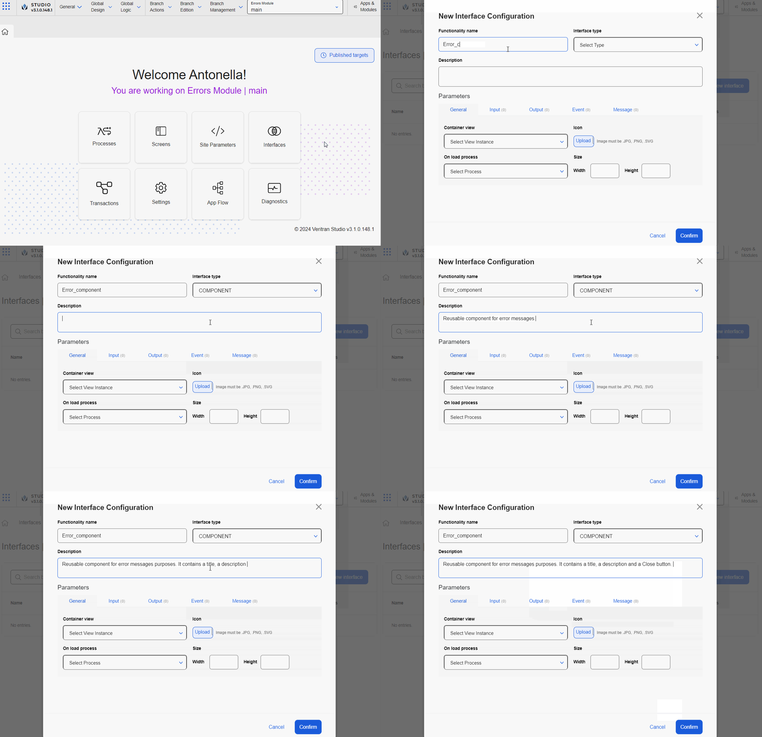
The New Interface Configuration modal opens. Go to the Functionality Name field and enter the name Error_Component.
Go to the Functionality Type field. Click the arrow and select Component .
Go to the Description field and enter Reusable component for error messages purposes. It contains a title, a description and a Close button..
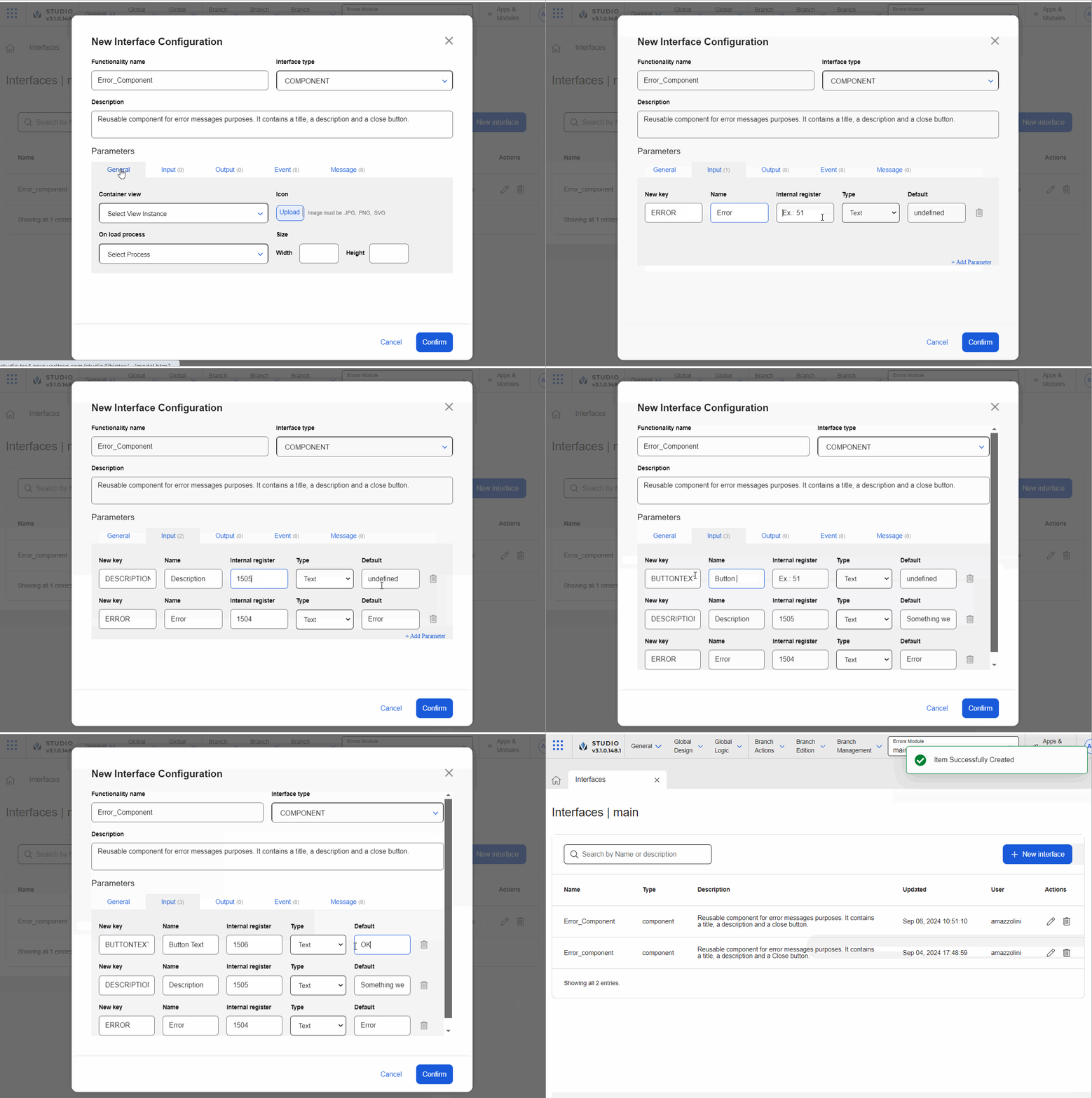
Go to the Parameters section. For this example, you will complete data in the General, Input, and Message tabs. Learn more about these sections below
The General tab appears open by default. For this example, you will only complete the Container View field. In this case, you don't need to set a process and the size fields remain empty since you need to make the component autosize - this means that it will adapt to the size of the component that contains it in the parent app.
Go to the Container view field. Click the arrow and select V00|contents1:S022 - Error Dialog.
Click Input to open the tab. In this tab, you enter the parameters that the configured component requires to function in the parent app or module. For this configured component, once invoked, the parameters will appear as attributes in the Basic Input section of the right panel (Design tab).
Complete the fields as explained below.
Click + Add Parameter to add the first parameter. Then, complete as explained below.
In the New key field, enter ERROR.
In the Name field, enter Error
In the Internal register field, enter 1504, so that this register stores the value defined for the Error parameter. Then, when you invoke the register, the value stored will appear on screen.
In the Type field, leave the option Text selected.
In the Default field, enter Error.
Click + Add Parameter to add the second parameter. Then, complete as explained below.
In the New key field, enter DESCRIPTION.
In the Name field, enter Description
In the Internal register field, enter 1505.
In the Type field, leave the option Text selected.
In the Default field, enter Something went wrong.
Click + Add Parameter to add the third parameter. Then, complete as explained below.
In the New key field, enter BUTTONTEXT.
In the Name field, enter Button Text
In the Internal register field, enter 1506.
In the Type field, leave the option Text selected.
In the Default field, enter OK.
Click Message to open the tab. Complete the fields as explained below.
Click + Add Parameter to add the third parameter. Then, complete as explained below.
In the Key field, enter BUTTONCLICKED.
In the Name field, enter BUTTONCLICKED.
After you complete the parameters, click Confirm to save the interface. then, go to the Overview.
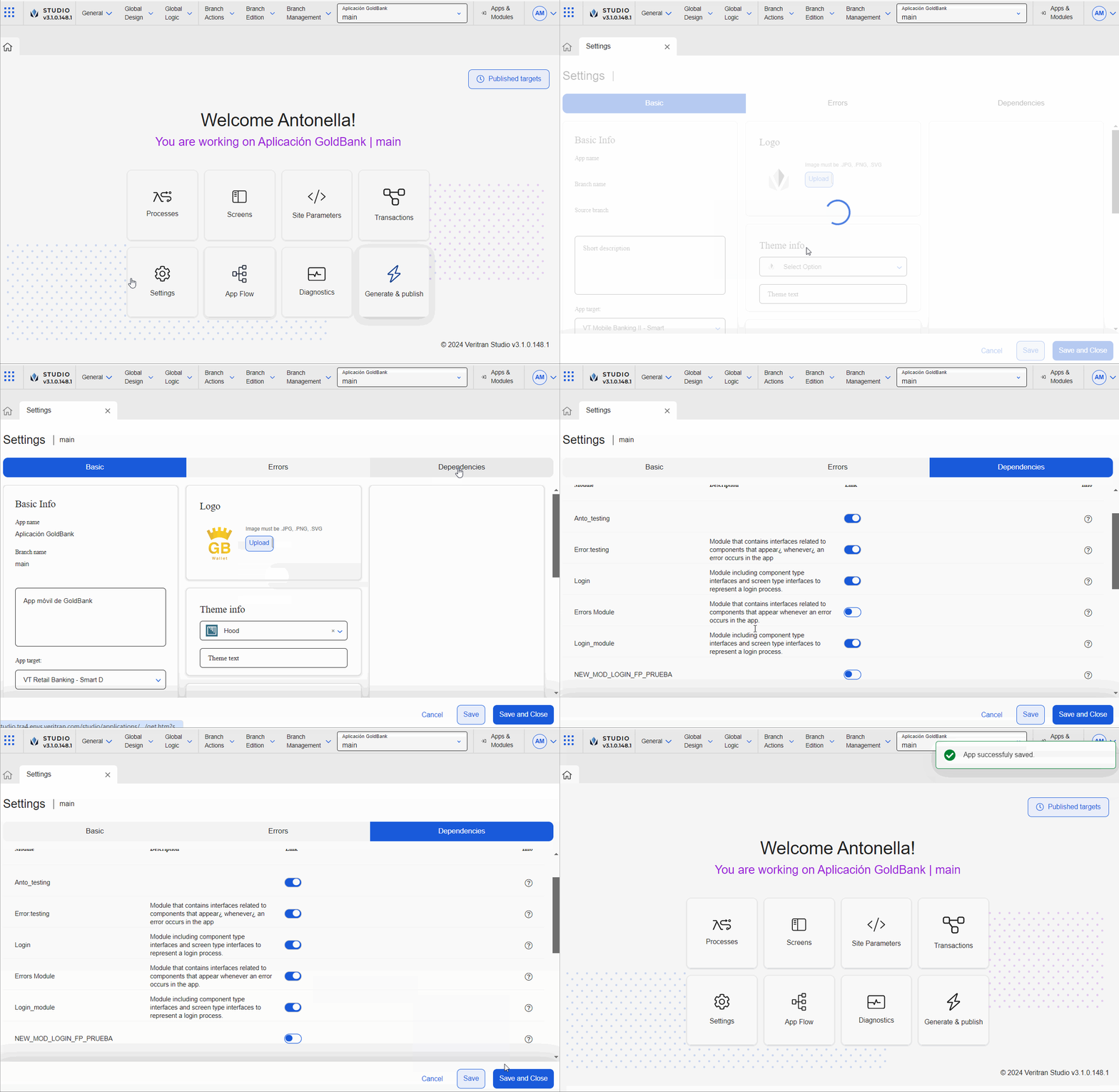
In the sixth step, you must link the Errors Module to the GoldBank app. To link it, you must enable the module as a dependency of the app. Enabling dependencies allows you to use the module’s content in the screens editor for the app selected. To learn more about dependencies, read Settings.
Read the instructions below to link the Errors Module to the app.
In the Overview, click Apps & Modules.
Find the Goldbank app and click on the app card.
In the app Overview, click Settings (Overview > Settings).
Click Dependencies to open the tab.
Find the Erros module module and click the toggle switch to link it to the GoldBank app.
Click Save & Close to save changes and be redirected to the Overview.
In the seventh and last step, you must invoke the configured component. Invoking the module's allows you to use the configured component in the screen of the GoldBank app. To invoke the configured component, you must be working in the screens editor of the parent app or module.
Read the instructions below to invoke the error configured component from the home screen of the app. For this use case, consider the following scenario: for the home screen, there are different transactions previously defined that validate that all the functions avaiable in the screen work correctly; these transactions validate the information through different processes.
These instructions apply to any other screens where you need to invoke the same configured component.
Note
Read Invoke a configured component and Invoke a screens flow to learn how to invoke both types of module's content and the steps each procedure includes.
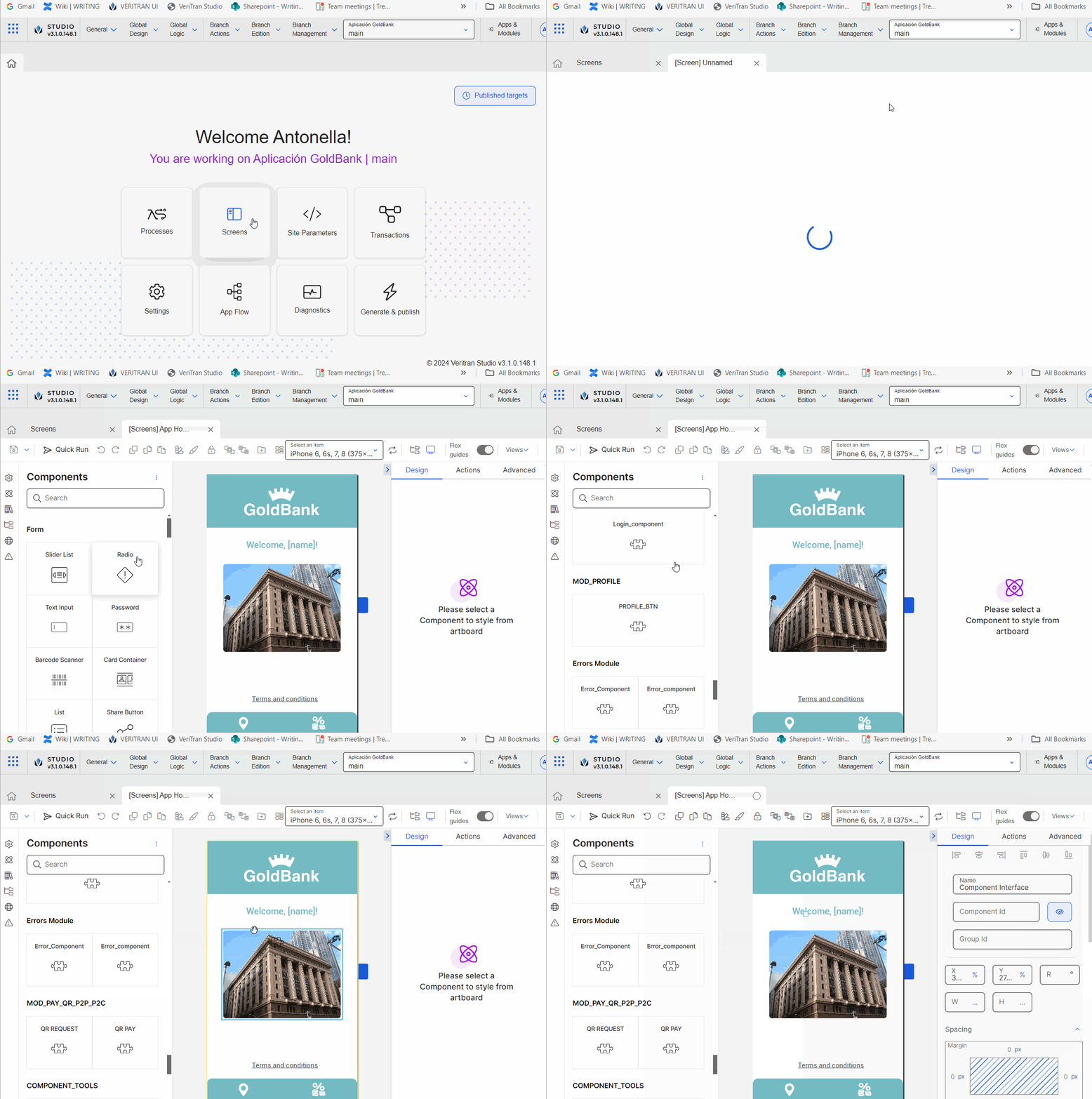
In the Overview, click Screens. Find the App Home screen and click Design or double click the screen card.
Note
You can also access the screens of the app in Branch Edition > Screens.
Once the screens editor opens, go to the left panel. Click Components . The components tab contains all the components available in Studio as well as configured components that will be displayed as separate components.Components
Scroll down to the bottom of the list and find the Errors Module module. It contains the configured component represented by the interface called Error_Component displayed as a component.
Drag and drop the Error_Component component to the canvas.
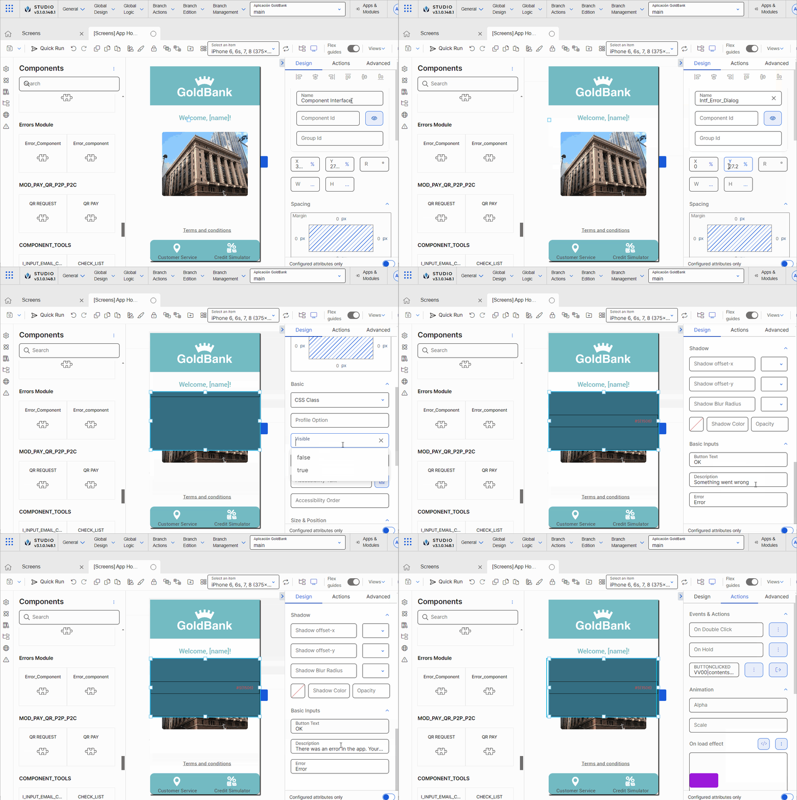
Go to the right panel. Change the Name to Error Dialog.
Configure the X attribute with 0 and the Y attribute with 30 and leave the % unit selected. In the W attribute, enter 100 and in the H attribute enter 30, and select the % unit of measurement for both attributes. Now, all information in the reused component can be visualized in the canvas.
Go to the Basic section. In the Visible attribute, enter the expression #S{7000}. This register was previously configured in the lambda process that validates the Customer Service function.
Go to the Basic Inputs section. Leave the Error attribute as defined by default. In the Description attribute, enter There was an error in the app. Your session will be closed.. In the Button Text attribute, enter Close.
Click Actions to open the tab and go to the Events & Actions section. In the BUTTONCLICKED attribute, click the vertical-three dot icon. The Create New Link modal opens, where you configure the interface message as explained below.
In the Select link type drop-down menu, click the arrow and select View.
In the Select View field, click the arrow and select V00.
In the Visual Areas section, click the arrow and select S045 - Login Forgot Password-m.
Click Accept. Now, when the user clicks the Close button defined in the screen interface, the interface invokes the message defined, and therefore the app will display the specified screen (that refers to the Login screen).
Now, you have to define that, when the user clicks the Customer Service label, the system validates if the service is available, and, if it is not available, the error set in the interface appears on screen. Go to the Treeview in the left panel. Find the txtCustService component and click it to select it in the canvas.
Go to the right panel. Then, click Actions to open the tab.
Go to the Events & Actions section. In the On Click attribute, click the vertical three-dot icon. The Create New Link modal opens, where you configure the interface message as explained below.
In the Select link type drop-down menu, click the arrow and select Lambda.
In the drop-down menu, click the arrow and select CUSTOMER_SERVICE_AVAILABILITY-.
Click Accept. Now, when Customer Service label is clicked, the lambda process will be executed.