Create or Edit an Interface
Once you created the module according to your project requirements, you have to follow several steps to then build the interfaces of the module, that will allow you to communicate the module content with the parent app or module and reuse it.
Before creating the interfaces, you must create the views and the screens of the module you are working on. You will require the view and screen information when you configure the interface.
In the module screens, you configure the appearance of the configured component or screens flow within it. Then, in the module interface, you configure the logic that will be associated to the visual elements configured in the screen, and that will allow you to connect with other entities when the module is invoked from the app or another module.
Once you created the previous elements, you can configure the new interface or interfaces you need. First, click Interfaces in the Overview page or go to Branch Edition > Interfaces.
For efficiency purposes, each section will be explained in videos using an example of a configured component, that is represented by a component-type interface. The configuration of all the sections applies to both screen-type interfaces and component-type interfaces. Refer to the instructions below to learn more.
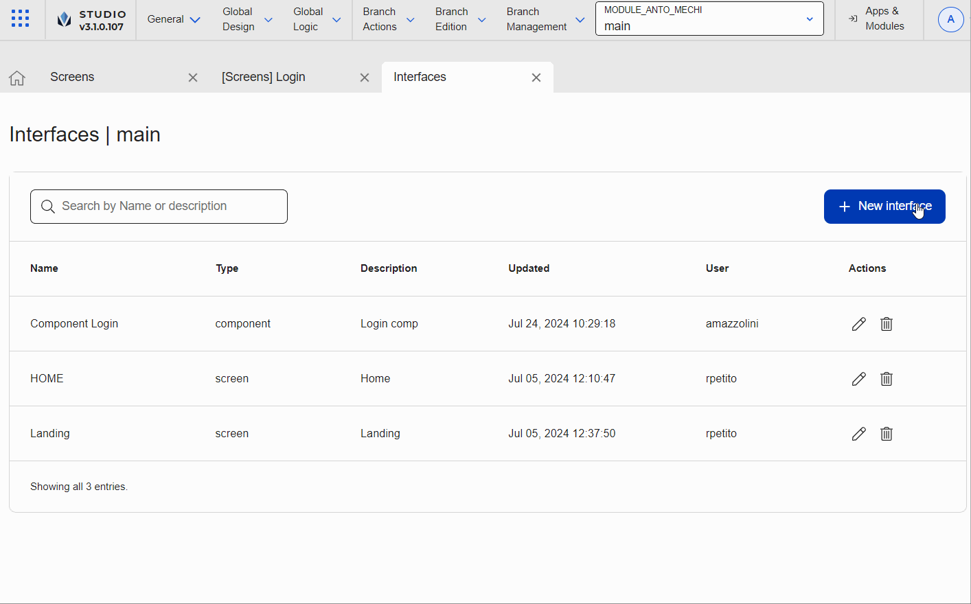
In the Interfaces page, click + New interface.
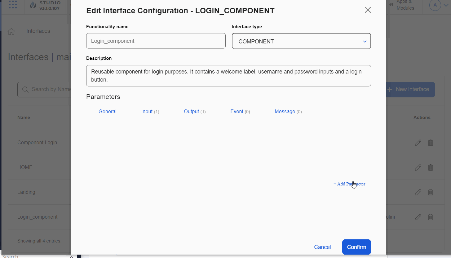
The New Interface Configuration modal opens, where you complete the settings according to your needs. Go to the Functionality Name field. Enter a name that must be descriptive enough as to allow your team to identify the interface and its purpose. For this example, enter Login_component, that includes the functionality of the module's content and which type of content you are creating (either a configured component or a screens flow).
The name is displayed when the configured component represented by the interface is invoked from the screen of the parent app or module. For configured components, the name appears in the Components tab of the left panel. For screens flows, the name appears in the list of links available in the Actions tab of the right panel.
Go to the Functionality Type field. Click the arrow and select Component if you want to create a configured component that can be reused or select Screen if you want to create a screens flow including the whole screen or more than one screen. For this example, click the arrow and select Component.
Go to the Description field. Describe and explain the purpose of the module's content ((either a configured component or screens flow) that is represented by the interface. For this example, enter Reusable component for login purposes. It contains a welcome label, username and password inputs and a login button.
Then, go to the Parameters section. You can complete data in the General, Input, Output, Message and Event tabs according to the purpose of the interface you are creating. Learn more about these sections below.
The General tab appears open by default. Complete them as explained below.
Note
Only the Container view field is mandatory.
Container view. For configured components, view instance where the component was created. For screens flows, initial screen where the screen flow was created and from where it starts running.
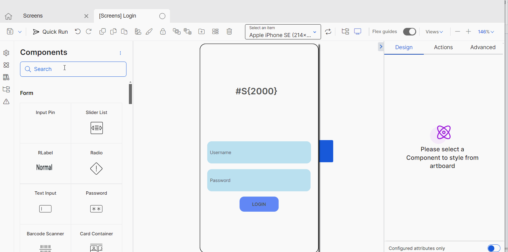
Click the arrow and select a view instances from the drop-down menu. For this example, select the view V00|contents1:SLogin - Login.
The image below shows the screen module where the module's content was created. The screen was created before configuring the interface.
Tip
The container view combines the view, the layout and the sequence and name assigned to the screen where the module's content was drawn. To set the container view, you must previously create the screen that contains that component or screens flow. After creating the interface, you can go back and configure the attributes according to the values set in the Input, Output, Messages and Events tabs.
On load process. Process (lambda or legacy) to be executed when the module's content (either a configured component or screens flow) finishes rendering in the mobile device or browser. The processes that appear listed are those previously created in the module. If required, click the arrow and select one of the processes from the drop-down menu. Set a process, for example, if the module content involves transaction results and you need a process to be executed so those results are displayed on screen. For this example, don't set a process.
Icon. Icon that represents the configured component or screens flow you are creating. For configured components, this image will appear in the Components tab of the left panel when the module's content is invoked. To add an image, click Upload. When the file browser opens, find the file you want to add in .JPG, .PNG or .SVG format and click Open.
Size. Space (in height and width) that the configured component or screens flow will occupy in the screen of the parent app or module when it is instanced. In the case of screens flows, complete the Width and Height fields with 100%, respectively. In the case of configured components, choose one of two options: if you want the component to be autosize (meaning that it adapts to the size of the content within the component), leave the fields empty; if you want to set a specific size, enter the number and the px or % unit of measurement. For this example, since it is a configured component, enter 100% in the Width field and 50% in the Height field.
Tip
In the case of a configured components, when invoked from a screen of the parent app or module in the screens editor, you can modify the size in the size section of the right panel (Design tab). The changes will only have effect in that app and won't affect the initial size defined for the module's content.
Click Input to open the tab. In this tab, you enter the parameters that the module's content (either a configured components or screens flow) requires to function in the parent app or module. For a configured component, once invoked, the parameters will appear as attributes in the Basic Input section of the right panel (Design tab). For a screens flow, once invoked, the parameters will appear when the flow is selected as a Module Screen in the Create new link modal of the right panel (Events & Actions section of the Actions tab).
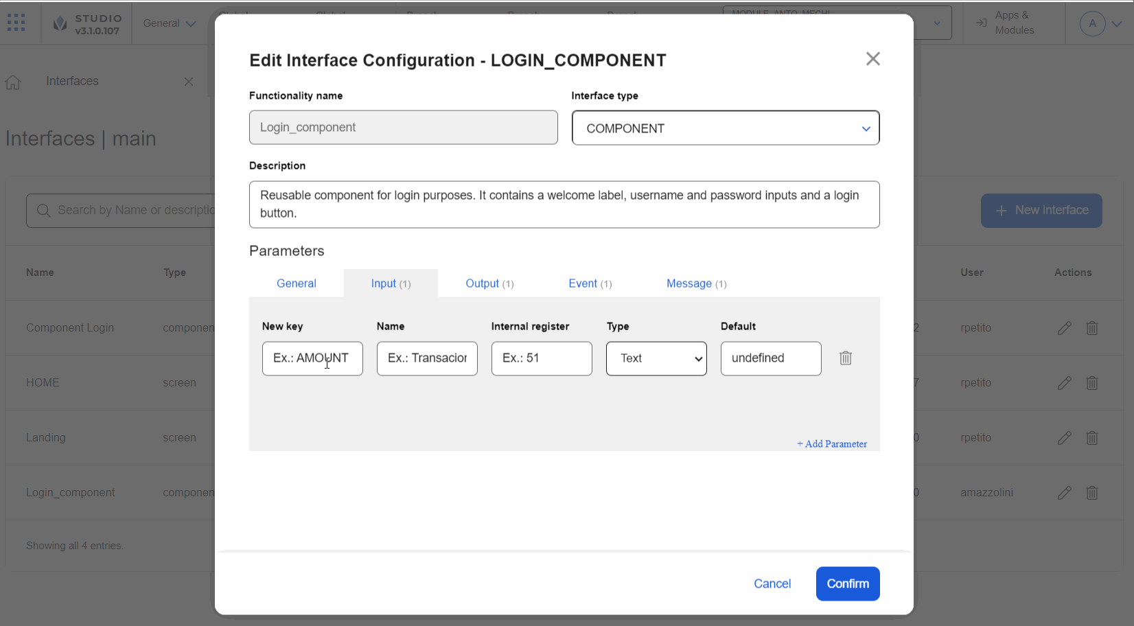
By default, the tab contains no parameters. To add one, click + Add Parameter. Then, complete the fields as explained below.
In the New key field, enter a name to identify the parameter at a code level; for example, when you test the app using Devtools. For this example, enter Inputwelcome.
In the Name field, enter the name to identify the parameter. This name appears as the parameter name in the Basic Inputs section of the right panel (Design tab). For this example, enter Input_welcome.
Best practice
For all tabs, the New key and the Name fields must have the same data. Note that, in the case of the Input and the Output tab, you cannot use _ in the New key field.
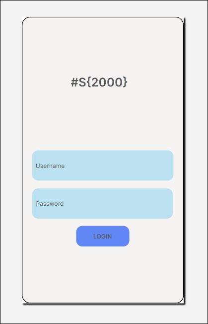
In the Internal register field, enter the register where the value configured in the parameter will be stored. Use a register from 999 upwards, so that it is local to the module and only impacts its configuration. For this example, enter 2000, so that this register stores the value defined for the Username parameter. Then, when you invoke the register in the Welcome message (as in shown in the image above) or in any other part of the app, the value stored will appear on screen.
Note
Registers from 0 to 999 are global, which means that the values stored in those registers have effect on all the apps in which they are invoked. Registers from 1000 upwards are specific for the main app or module selected.
In the Type field, select the format of the parameter. This defines the type of data that can be entered in the right panel when the configured component or screens flow is invoked. The options available are: Text, Number Color, Image and Text Area. Learn more about these options in the table below. For this example, click the arrow and select Text.
Text
Select Text if the value contains a word or brief set of words.
Number
Select Number if the value is a number.
Color
Select Color if the value is a color. When the component is instanced, the right panel of the screens editor will contain a color picker section.
Image
Select Image if the value is an image. When the component is instanced, the right panel of the screens editor will contain an image explorer section.
Text Area
Select Text Area if the value contains text of considerable length - as opposed to a brief set of words.
In the Default field, enter a value that appears in the right panel by default configured in the input parameter when the module's content is invoked. You can complete this field, for example, so that, if no value is defined in the screens editor, the component where it is invoked does not remain empty. For this example, ready to start?.
Once you complete the parameters you need, click Output. To delete a parameter before continuing to the next tab, click the trashcan icon.
Once you complete the Input parameters you need, click Output. To delete a parameter before continuing to the next tab, click the trashcan icon. In the Output tab, you can configure parameters that allow you to set values that the module's content (either a configured component or screens flow) makes available in the parent app or module and stores them according to the configuration of that module's content in the right panel. For a configured component, once invoked, the parameters will appear as attributes in the Basic Output section of the right panel (Design tab).

In the New key field, enter a name to identify the parameter at a code level. For this example, enter Outputusername.
In the Name field, enter the name to identify the parameter. This name appears as the attribute name in the Basic Outputs section of the right panel (Design tab). For this example, enter Output_username.
In the Internal register field, enter the register so that the value configured for it in the module is stored in a specific register of the parent app or module in real time. You will define the parent register in the right panel when you set the screens of the parent app or module. Use a register from 999 upwards, as explained for the basic inputs. For this example, enter 1503.
In this case, as shown in the image above, the configured component content includes four components: a text label for the welcome message, a text input for the Username, a text input for the Password, and a Login button. For this example, consider the following scenario: for the Username text input you set the Auto dump attribute with the register 1503. Then, you invoke the configured component in the screens editor of the parent app. Once in the Basic Outputs section (Design tab of the right panel), you configure the Output_username parameter with the parent register #S{1500}. As a result, whenever the user enters a value in the Username field, that value will be stored in the module register 1503 and, in real time, that value will also be stored in the parent app register 1500.
Once you complete the Output tab, click Event. To delete a parameter before continuing to the next tab, click the trashcan icon. In the Event tab, you can define the events that the parent app or module requires the the module's content (either a configured component or screens flow) to execute. The event must be invoked from the parent app or module. Then, configured events will be executed as defined by the module's content.
Tip
Events must only be configured for configured components.
For this example, consider the following scenario: in the module screen where you created the module's content, add the text label lbl_invisible with the value Sign in. Then, you configure the Visible attribute in false, so that the label is not displayed in the app.
Best practice
If you make changes in the app or module settings, make sure to save them before changing to the other entity. If you don't save the changes, they won't appear reflect when they are invoked in the other entity.
Then, you go to the Processes page and configure a lambda process called show_label to display the mentioned label. Check the image below.
This process will then be set in the interface event, as shown below.
In the New key field, enter a name to identify the parameter at a code level. For this example, enter Showlabel.
In the Name field, enter a name to identify the parameter when the configured component ot screens flow represented by the interface is invoked from the parent app or module. The event name appears listed as Interface Messages in the Create New Link modal when you configure an event from the Events & Actions section (Actions tab) in the right panel. For this example, enter Show_label.
In the Process field, enter the process to be executed when the event is instanced in the parent app or module. For this example, enter Zshow_label.
Note
The processes that appear when you start typing are those created in the module.
In the parent screen, you set a Forgot my password button. In this button, you configure the Show_label event: click the vertical three-dot icon, and, in the Create new link modal that opens, select Event. Then, select the SHOW LABEL action.
Important
When you add the configured component to the screen, make sure to complete the Component id field in the right panel. If you don't define an id, you won't be able to invoke the event from the Actions tab.
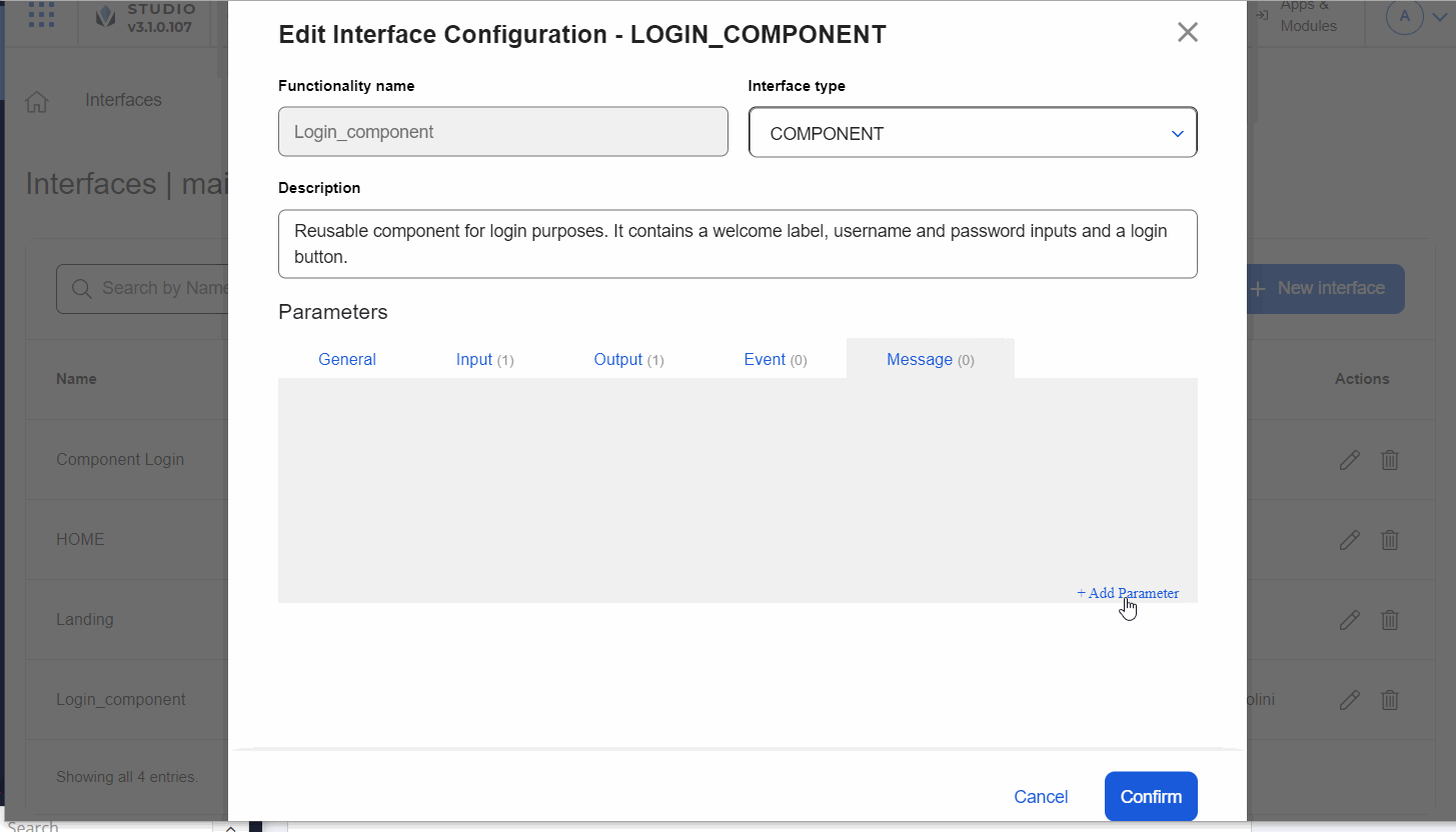
Once you complete the Event tab, click Message. To delete a parameter before continuing to the next tab, click the trashcan icon. In the Message tab, you can define messages that the the module's content (either a configured components or screens flow) communicates to the parent app or module to execute a specific event or action as configured in that parent's screens.
In the New key field, enter a name to identify the parameter at a code level. For this example, enter OnLoginClick.
In the Name field, enter a name to identify the parameter when the module is invoked from the parent app or module. The event name appears in the Events & Actions section (Actions tab) in the right panel of the screens editor. Then, you can set any action to be executed from this event, that only has effect in the parent app or module. For this example, enter ONLOGINCLICK.
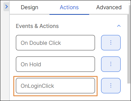
Before invoking the module's content from the parent, you must configure the event or action that triggers this message in the module. For this example, go to the screen that displays the content, click the Login button. In the right panel, go to the Actions tab. Then, in the Events & Actions section, go to the OnClick attribute. Click the vertical three-dot icon. In the Create new link modal, select Interface message and then select the OnLoginClick message. As a result, when the app user clicks on the Login button, the message will be sent to the parent app and the parent app will execute the action or event defined in the OnlOginClick event.
To save changes made to the basic information or parameters, click Confirm. To go back, click Cancel or Close.
Edit an interface
If you or another team member need to make changes to one or more interfaces, find the interface you want to edit in the Interfaces page and click Edit. The Edit Interface Configuration page opens. You can modify the sections following the instructions given above.