Settings
To view or edit your app or module's settings, navigate to your context and click Branch Edition > Settings. By default, the page opens in the Basic tab. Click the Errors and Dependencies tabs to open them. Learn more about each tab in the sections below.
Basic
The Basic tab shows general information about the app or module. You can edit the content of most fields, except for the app and branch's name and the default editing screen. Refer to the annotated image below to learn more.
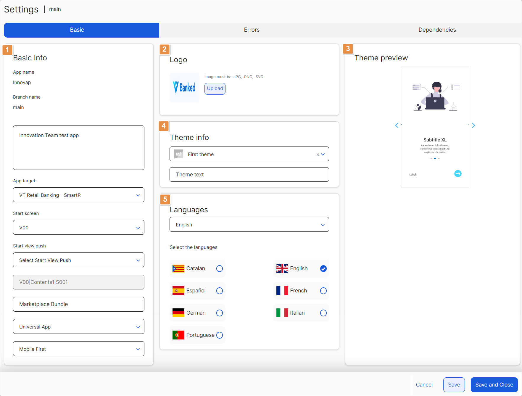
Basic Info.
App name
Name of the app or module. This field cannot be modified after creating the app or module.
Branch name
Nave of the app or module's branch you are working on. This field cannot be modified after creating the branch.
Source branch
Parent branch name. This field is not available for the main branch.
Description
Short text that describes the app or module.
App target
Configuration where the app will be published. Click the arrow and select an option from the drop-down menu to change this setting.
Start screen
Initial screen that will show when the user starts the app. Select any option from the drop-down menu to change this setting.
Start view push
Initial screen that will show if the app is opened through a push notification. Click the arrow and select an option from the drop-down menu to change this setting.
Default editing screen
First screen that appears available for editing. This field is grayed-out and cannot be modified.
Marketplace Bundle
Name or ID used to identify your app or module in the Veritran Marketplace.
Type
Type of app. Click the arrow and select an option from the drop-down menu: Universal (both mobile and web) or Web.
Design
Design view. Click the arrow and select an option from the drop-down menu to define if the design of the app prioritizes mobile view (Mobile First) or desktop view (Desktop First).
Logo. In this section, you can view the logo that is set for your app or upload a new logo by clicking the Upload icon next to it. The image must be in .JPG, .PNG, or .SVG format.
Theme preview. In this section, you can see how the screens of your app or module look like considering the theme chosen.
Theme info. In this section, you can view the theme selected during the creation process of your app or module. To edit the theme, choose one of the options available in the drop-down menu. As an alternative, complete the Theme Text field with the name of the theme you want to choose.
Languages. In this section, you can see and edit the languages configured for your app. Click the checkboxes to add new languages. To edit the default language, click the arrow in the Default field and select a new language from the drop-down menu.
Click Save to save any changes made or Save and Close to save changes and go back to the previous page. If you don't want to save changes, click Cancel.
Errors
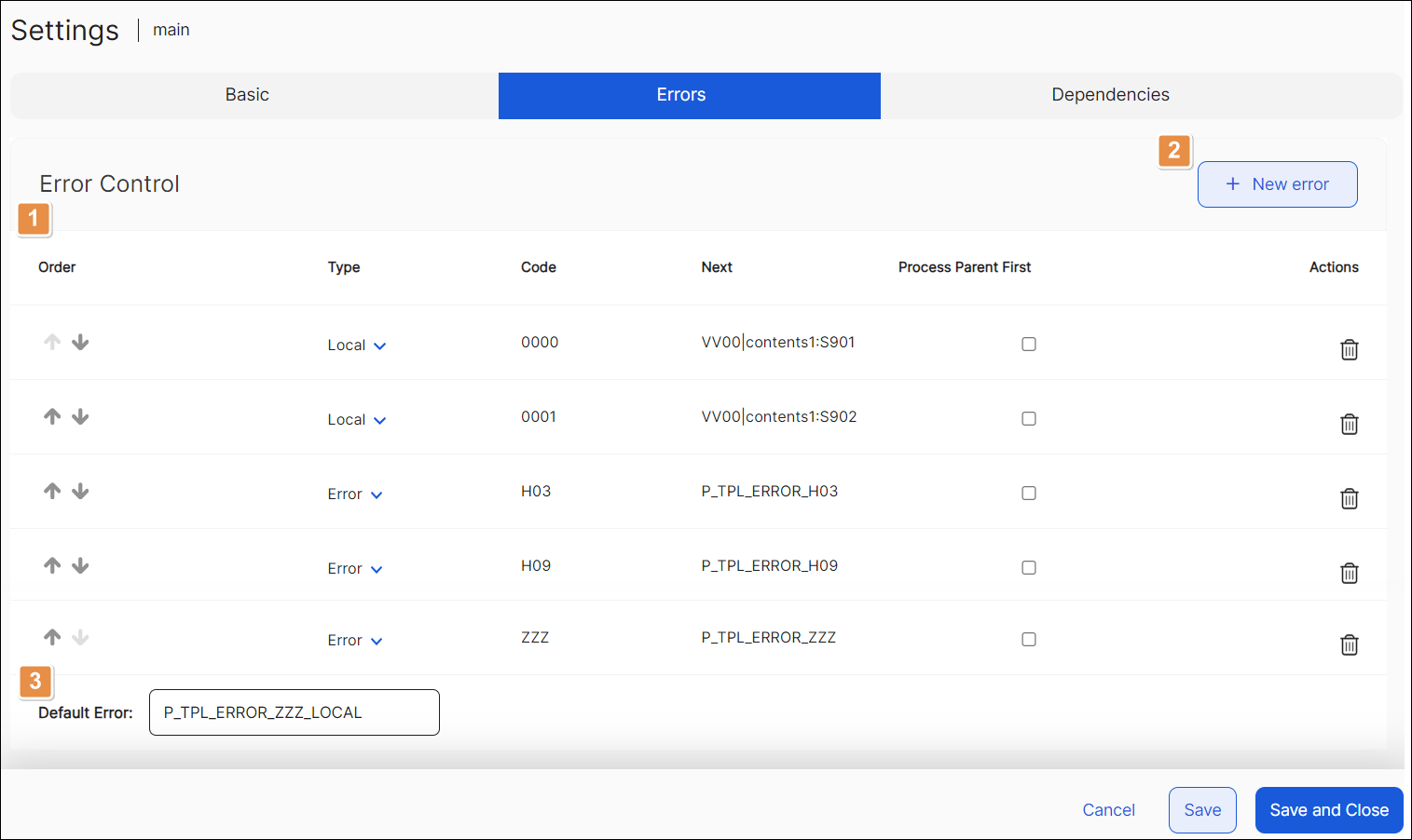
Errors list. See a list of every error configured for your app or module, divided into the following columns.
Order
Positioning of errors. Click the arrows to move the errors up or down in the list and change the order.
Type
Type of error configured.
Local
Error generated within the app or module itself.
Error
Error that usually results from a transaction.
Event
This type of error is no longer available and and will be deprecated soon.
Code
Numeric code used to identify each specific error. Error codes and the events that trigger the occurrence of errors are configured in the middleware, outside the Studio environment.
Next
Action that will be triggered if the configured error occurs. It can invoke a screen with a message, a pop-up, a process, or it can trigger another event.
Process Parent First
Important
This column is only available for module settings.
Option to determine whether the module or the main app processes specific errors configured. Click the checkbox so that the errors are processed within the main app and not the module itself.
Actions
To delete an error, click Delete Row (trashcan icon) in the respective row.
New Error. Click here to add a new error from those created in Middleware. A new blank row appears in the list. Complete all the attributes of the error in accordance with its configuration in Middleware.
Default Error. Action that will be triggered by default in case an error different than those configured occurs.
Click Save to save any changes made or click Save and Close to save changes and go back to the overview. If you don't want to save changes, click Cancel.
Dependencies
The Dependencies tab shows a list of the modules available in Studio with their name, description and information about the interfaces it may contain.
In this section, you also link modules and their components to your main app or to another module. To link a module, navigate through the list of modules to find the desired one and click the toggle switch. The toggle switch turns blue, which means that the module is now linked.
To see a detail of the interfaces created within a module, hover over the question mark icon on the Info column, next to the module you want to inspect. You will see a list that details, between brackets, the name of the interface and its type.