UI Kit Generation
Previous steps
To generate the UI kit, the UX Designer must have previously created the project's documentation repository and obtained the brandbook that represents the client's brand identity.
Who participates in the UI kit generation instance?
The UX designer is in charge of preparing and defining the UI kit document.
Where do you work?
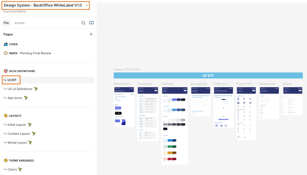
To work on this step, you must use the Design System document (UI Kit appears in the first section) and the Layouts document available in the repository in Figma. Follow the links to access them and read Tasks execution below to learn which tasks you must perform.
Step 2 - UI Kit Document
The UI kit (User Interface kit) is an initial approach to the look and feel of the app interface, where the visual guidelines are presented and validated with the client. It includes a collection of pre-designed elements to streamline the design process, ensuring consistency and efficiency.
The UI kit consists of:
Brandbook details: the brand identity (logos), fonts, color palettes, icons, animations, images and illustrations.
Assets: Resources such as images, video files, audio files or icons, that are part of the design and aesthetics of the app. For example, the images related to the client's logo, banners or icons that are part of the client's brand.
Basic components: text inputs, text labels or buttons. These components do not show functionalities or behaviors, but just how they will look like in their basic form. Then, based on this information and once the client approves the UI kit, the designer defines the atomic components in the Design System and configures the app theme with the styles for each of them (that can be applied when the components are configured in the app screens).
Note
For all of the above, an accessibility check is required.
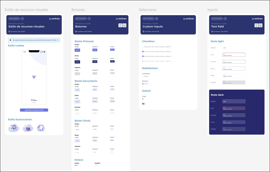
Reference screens: basic screens that don't show functionalities but are prepared to demonstrate the basic design aspects of the screens and their interaction.
Layouts: Structures that define how visual elements are arranged in a screen or a part of a screen. This definition is based on the project requirements and the purpose of the app to be built.
The different layouts available are defined in Layoutsthe Layouts document that is part of the project's documentation repository. This document specifies each layout purpose and use.
Important
This document now includes layouts for mobile and web apps.
In this step, the UX Designer must execute the following tasks:
Go to the Design System file in the project's documentation repository duplicated and then go to the UI Kit subsection (in UX/UI Definitions) to complete it following the template.
Important
The UX Designer must stick to the contents in the template and complete all the sections accordingly. They must not add additional information or remove content from the duplicated template.
Transfer the information from the brandbook, as specified in the description above, and import the client logos.
Important
The UX Designer must ensure that resources are provided by the client. If not, they will define a set of assets for the app based on the project requirements and needs. Logos are always provided by the client.
Define the basic components that will be used in the app screens.
Run the accessibility color check to check if the color palette and fonts defined in the brandbook pass the accessibility test. Read Understanding Visual Accessibilityto learn more about this task.
In the Layouts section, define the layouts that will be used in the app. This includes:
Select the layouts from the templates available in the Layouts document, based on the project requirements.
Copy and paste each layout selected in a different subsection. In the case of a web app, you must select at least three layouts. Then, you must perform different actions depending on whether the app is mobile or web:
For a web app:
Review and define each layout area size - if the default size does not meet the project's requirements, change sizes following recommendations on the Design System and do not exceed the size specifications explained for each area in the Layouts Documentation. Refer to Veritran's Understanding Layouts to learn more.
Important
Changes in areas sizes must be specified and be clear enough for the implementer to easily understand them.
Define the distribution percentage for each area considering each breakpoint to be used. Do not exceed the size specifications explained for each area in the Layouts Documentation
Note
Each prebuilt layout in the Layouts template section in Studio has the breakpoints already configured in the CSS File field.
Include the configuration of the flex containers and their attributes. The information on layouts will be then used by the implementer to make the changes in Studio (during the third stage of the process). Read Understanding Layouts to learn more.
For a mobile app:
Review and define each layout structure and include the configuration of the flex containers and their attributes. In addition, specify the behavior of the screen structure. The information on layouts will be then used by the implementer to make the changes in Studio (during the third stage of the process). Read Understanding Layouts to learn more.
Note
The UX Designer and the implementer usually have discussions to agree on screens structures definitions.
Create the reference screens that will be sent for client's approval.
In the case of a mobile app, go to the Store app icons subsection and follow the instructions specified to define the icons that will be used in app stores when the app is published.
Note
The first version of the app stores icons may change throughout the app building process.
Once this version of the UI kit document is ready, the UX Designer must send it to the client for their approval. Even though there can be changes throughout the app building process, approval is required so that the team ensures that they will work on a design that fits the client's needs.
Important
The team must not start working on the Design System until the client approves the UI kit.
Understanding Layouts
Layouts are included in two steps in the design process stages: first, the UX Designer decides which of the prebuilt templates will be used for the app, and defines their areas and final space occupied by each of them. These definitions are specified in the Figma file. Then, the implementer makes any changes required (if applicable) in Studio.
A layout is the visual structure of a digital design - it is the way in which visual elements are arranged in a screen or a part of a screen. It defines how graphic elements (such as images, texts or buttons) are distributed in a digital area, thus creating a visual hierarchy and facilitating user navigation.
Veritran layouts for web apps
The Layouts document included in the documentation repository describes the six main layouts that can be used for web apps. Each layout has specific variants that contain different areas together with their configuration. Each structure describes the sizes of each area, together with the sizes applicable in their responsive design versions (both vertical and horizontal sizes). In addition, it includes use cases for you to visualize how these structures are applied in apps.
Note
In total, there are 22 layouts that can be used for web apps.
Responsive layouts
To include the responsive versions, layouts are built under four different breakpoints predefined for Veritran Studio, as follows:
Extra-extralarge: screens with a resolution higher than 1401px;
Extralarge (screen resolution from 1201px to 1400px): applicable to extra-large screens or TV screens;
Large (screen resolution from 992px to 1200px): applicable to large screens or desktop devices;
Medium (screen resolution from 769px to 991px): applicable to small screens like iPads and tablets; and
Small (screen resolution from 481px to 768px): applicable to mobile devices.
Important
Breakpoints cannot be modified.
Veritran layouts for mobile apps
Mobile apps can only have one layout, called General Mobile. However, this layout can have multiple structures depending on the areas you need to include to each screen. These structures are defined in the screens editor through the use of the flex container component, the repeater component and their attributes. This means that all screens of your mobile app will have the same layout and, for each of them, you have to configure different flex container components (and/or repeater components) depending on the structure you want to set.
The Layouts document included in the documentation repository describes seventeen potential structures with the General Mobile layout that are applicable to different use cases. These structures are divided into four main categories that vary according to the screen behavior:
Full scroll: use it if you need the scroll feature available for the whole screen information.
Content scroll: use it if you need the scroll feature available only for content area.
Content with repeater: use it if you need the scroll feature available and a repeater component.
Floating content: use it if you need to include floating content in the screen.
Tip
The mobile layouts section includes a QR code that you can download to see the structures applied to different use cases.
Each structure specifies the areas it includes, the components you must add to the screen to set such areas, and how to configure them in the right panel.
Note
You can choose between four or five screen structures for your mobile app.
Understanding Visual Accessibility
To determine that the app is visually accessible, the team member in charge of the design must evaluate the elements in Figma and confirm that the app complies with AA and AAA guidelines regarding color contrast.
Important
Accessibility contrast guidelines, such as those defined by the WCAG (Web Content Accessibility Guidelines), require that text and background have a minimum contrast ratio to ensure readability for all users, including those with visual impairments or color perception difficulties. This contrast ratio is measured as a proportion, with a minimum of 4.5:1 recommended for regular text and 3:1 for large or bold text.
For this purpose, the team has three tools available:
a new Figma functionality;
the Stark plug-in in its free version; or
the A11y plug-in.
The use of these tools ensures that the text is readable for users by adhering to WCAG (Web Content Accessibility Guidelines) standards.