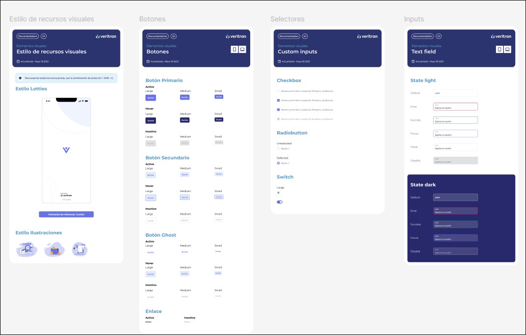
UI Kit Generation
Previous steps
To generate the UI kit, the UX Designer must have previously created the project's documentation repository and obtained the brandbook that represents the client's brand identity.
Who participates in the UI kit generation instance?
The UX designer is in charge of preparing and defining the UI kit document.
Where do you work?
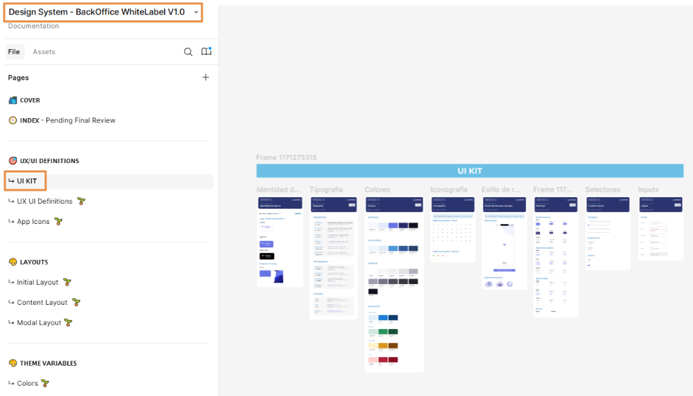
To work on this step, you must use the Design System document (UI Kit appears in the first section) and the Layouts document available in the repository in Figma. Follow the links to access them and read Tasks execution below to learn which tasks you must perform.
Step 2 - UI Kit Document
Understanding Visual Accessibility
To determine that the app is visually accessible, the team member in charge of the design must evaluate the elements in Figma and confirm that the app complies with AA and AAA guidelines regarding color contrast.
Important
Accessibility contrast guidelines, such as those defined by the WCAG (Web Content Accessibility Guidelines), require that text and background have a minimum contrast ratio to ensure readability for all users, including those with visual impairments or color perception difficulties. This contrast ratio is measured as a proportion, with a minimum of 4.5:1 recommended for regular text and 3:1 for large or bold text.
For this purpose, the team has three tools available:
a new Figma functionality;
the Stark plug-in in its free version; or
the A11y plug-in.
The use of these tools ensures that the text is readable for users by adhering to WCAG (Web Content Accessibility Guidelines) standards.
Understanding Layouts
Layouts are included in two steps in the design process stages: first, the UX Designer decides which of the prebuilt templates will be used for the app, and defines their areas and final space occupied by each of them. These definitions are specified in the Figma file. Then, the implementer makes any changes required (if applicable) in Studio.
A layout is the visual structure of a digital design - it is the way in which visual elements are arranged in a screen or a part of a screen. It defines how graphic elements (such as images, texts or buttons) are distributed in a digital area, thus creating a visual hierarchy and facilitating user navigation.
Veritran layouts for web apps
Responsive layouts
To include the responsive versions, layouts are built under four different breakpoints predefined for Veritran Studio, as follows:
Extra-extralarge: screens with a resolution higher than 1401px;
Extralarge (screen resolution from 1201px to 1400px): applicable to extra-large screens or TV screens;
Large (screen resolution from 992px to 1200px): applicable to large screens or desktop devices;
Medium (screen resolution from 769px to 991px): applicable to small screens like iPads and tablets; and
Small (screen resolution from 481px to 768px): applicable to mobile devices.
Important
Breakpoints cannot be modified.

