Create or Edit a Theme
Best practice
If you are working on a new project, you must always create a new theme.
To create a new theme, you must previously obtain the information of the design system defined for your project. Based on this, you will configure each of the variables and styles for the components in your app, and configure, if applicable, custom styles and CSS data for a specific style.
Refer to the instructions below to learn how to configure a new theme.
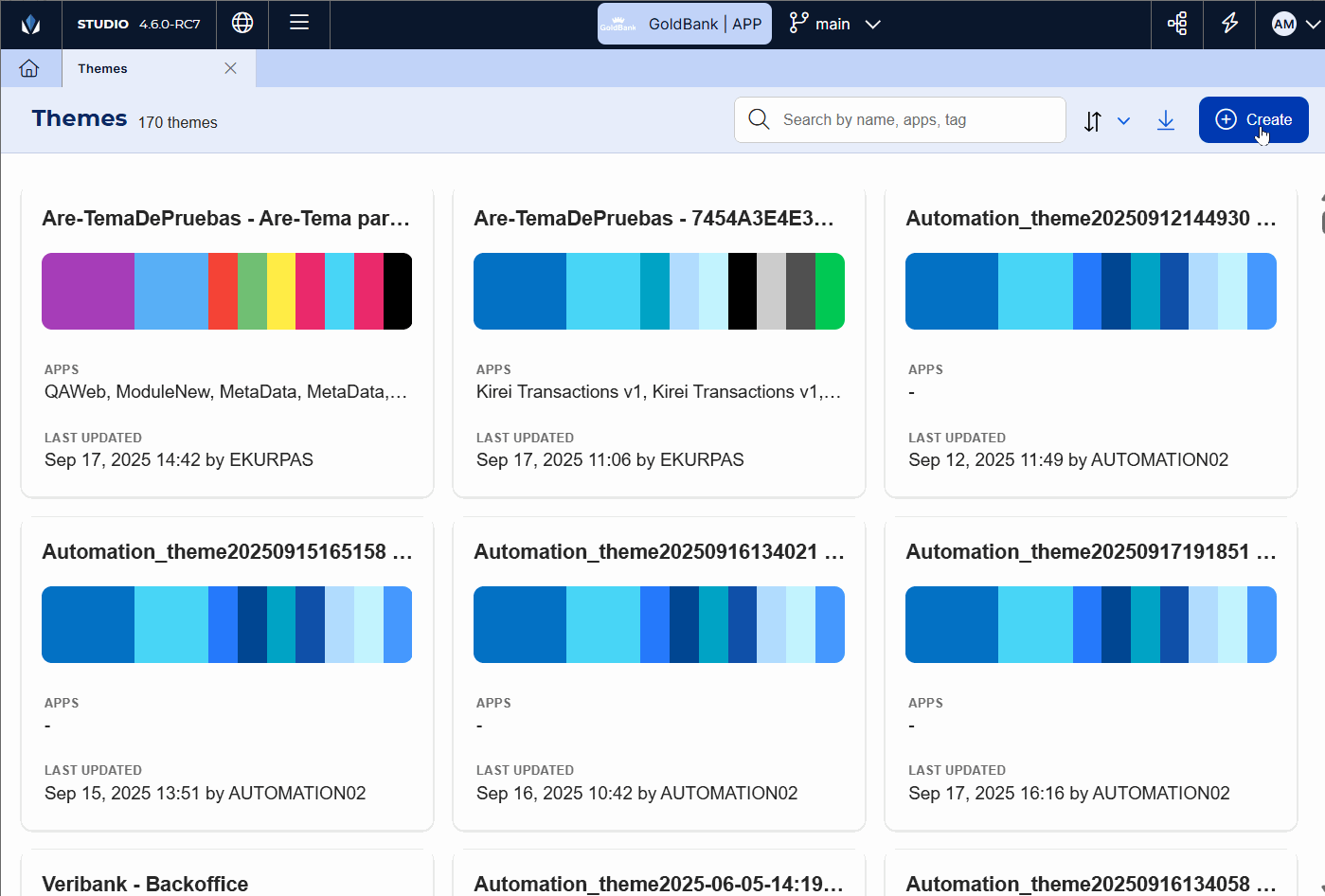
In the Themes page, click Create.
Best practice
The new theme has elements and values configured by default that are aligned with Veritran use standards.
The new theme opens in the Variables tab, where default configurations are defined. Configure each tab according to the Design System created for your project based on use standards. Start by configuring the Settings tab.
Refer to Theme Configuration to learn more about each section, how to configure each value and create new configurations.
Note
The Preview panel to the right allows you to see how a basic screen in a mobile app will look like if the theme is applied to it.
Click Save to save the theme and go back to the Themes page.
Go to your app settings and apply the theme to your app. To learn more, read Themes.
Theme Configuration
The sections below explain the different configurations available for a theme, and their purpose. To set basic styles, you must configure the Variables and Styles tab. You will configure the Custom and CSS tabs based on the design system of your project, and whether it is a mobile or web app.
Important
Remember to configure only the tabs as specified in the design system of your project. If you have any questions, discuss it with your design team members.
Refer to the sections below to learn more about each tab.
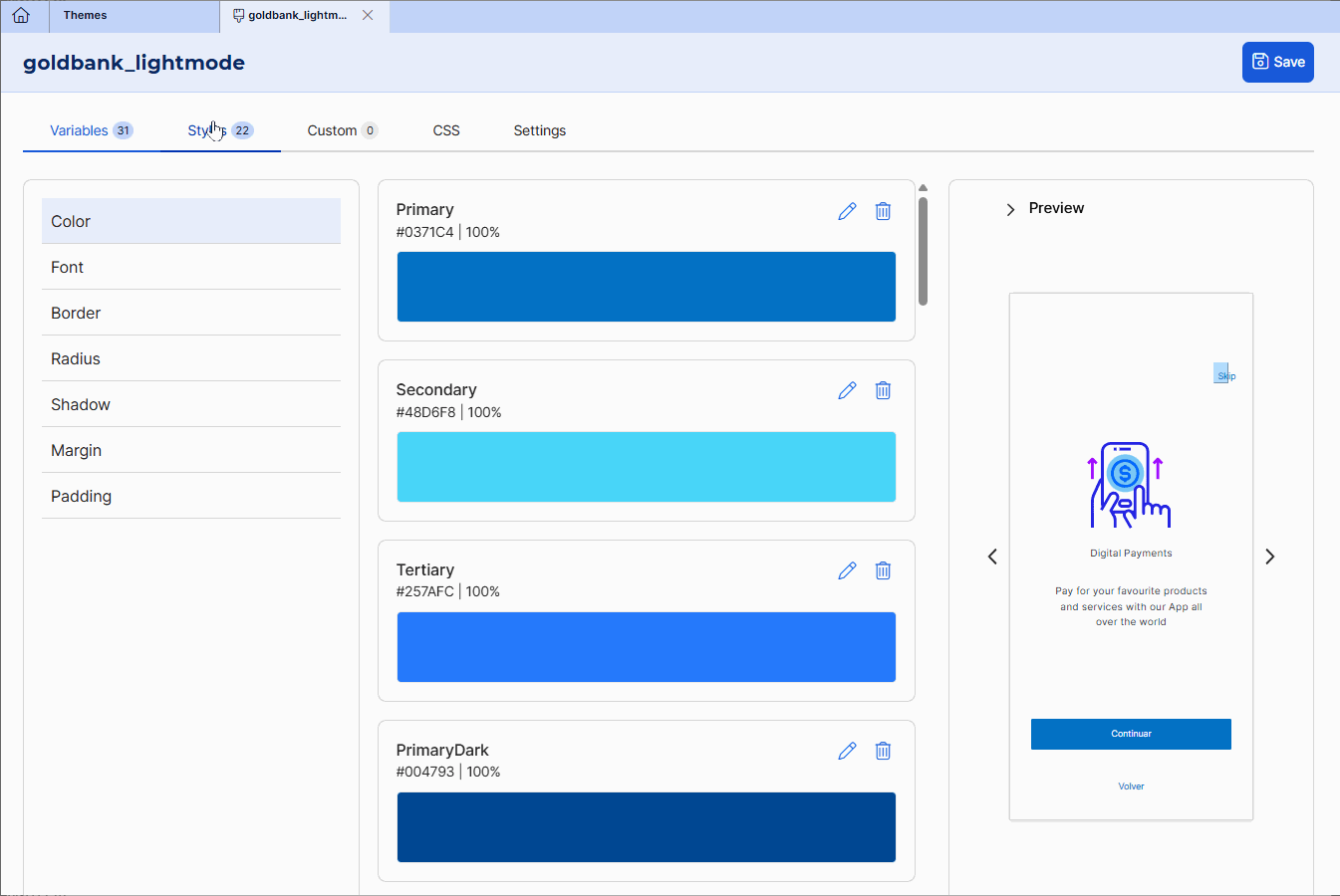
Variables
Variables are sets of values applied to the style attributes of the app. Click the pencil icon ( ) to open the variable configuration modal. To delete a variable, click the trashcan icon (
 ).
).
Note
In all cases, you can change the variable name.
Learn more about how to configure them in the table below.
Color. Variables that define colors (including shades of grey) applicable to different component attributes. Each variable card shows the name, hexa color code and opacity defined. | To define the color, select a color from the color picker or enter the Hexa color code in the Hexa field. Once you enter the color, the Opacity field will be automatically configured in 100%. Click the field and change the opacity as required. can also type the color code. Click Save. If your project requires more colors than those included, click Add color. The Color modal opens, where you complete the fields as specified above. 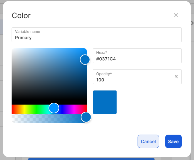 |
Font. Set the values of style properties that will be applied to the texts of the app components. | To define a font, go to the Font field and select an option from the drop-down menu. Then, select a size and unit of measurement. Click Save. If your project requires more fonts than those included, click Add font and complete the fields as specified above. 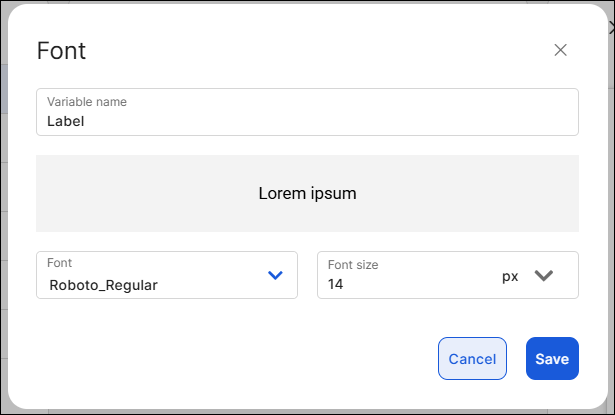 |
Border. Set the values of style properties that will be applied to the borders of the app components. | To define a border, click the Width field and enter the width number. Then, select a unit of measurement from the drop-down to the right. By default, the border is activated. To remove the border, click the linked chain icon and disable the borders. Click Save. TipAs best practice, leave px selected. To add an additional border, click Add border and complete the fields as specified above. NoteThe sizes defined for each border will appear in the sample component above. 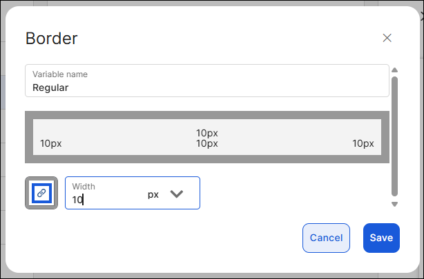 |
Radius. Set the values of style properties that will be applied to the corner radius of the app components. | By default, all radius properties are selected to configure them with a single value. To do so, click the Radius field and enter the number or use the slide bar to reach the desired number. Then, select a unit of measurement. To set each the radius of each corner individually, click the desired corner, then click the Radius field and enter the number or use the slide bar to reach the desired number. Then, select a unit of measurement. TipAs best practice, leave px selected. To add an additional radius value, click Add radius and complete the fields as specified above. NoteThe sizes defined for each radius will appear in the sample component above. 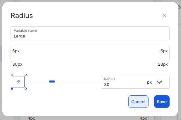 |
Shadow. Set the values of style properties that will be applied to the shadows of the app components. | To define the shadow, first enter the values in the X and Y fields, that determine the shadow with regard to the X (horizontal) axis and the Y (vertical) axis, respectively. Then, select the unit of measurement for each axis. In the Blur field, you can define the blur level of the shadow. In the Spread field, you can define the spread radius of the shadow, where the higher the value, the higher the size of the shadow. In both cases, enter the number and select the unit of measurement. Lastly, in the Color field, select the color variable applicable to the shadow. Click Add. NoteEach axis considers the center of the component as a starting point. To add an additional shadow, click Add shadow and complete the fields as specified above. 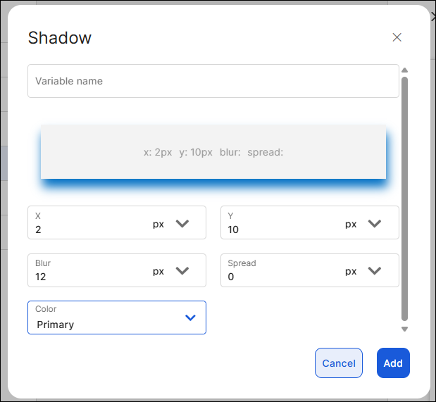 |
Margin. Set the values of style properties applied to margins of the app components - that is, the space around the component's border. | To configure the margins, click each field (Top, Right, Bottom, Left) and enter the value. Then, select the unit of measurement located to the right. Click Add. To add an additional margin, click Add margin and complete the fields as specified above. 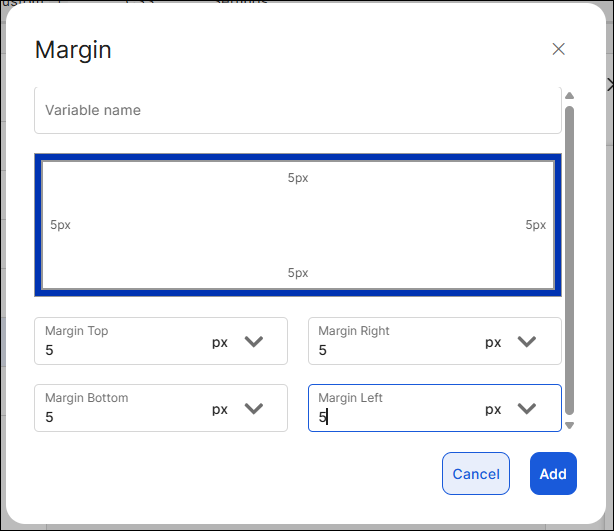 |
Padding. Set the values of style properties applied to padding of the app components - that is, space between the component's border and the component's content (value). | To configure paddings, click each field (Top, Right, Bottom, Left) and enter the value. Then, select the unit of measurement located to the right. Click Add. To add an additional padding attribute, click Add padding and complete the fields as specified above. 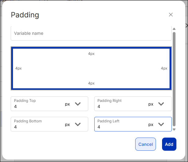 |
Styles
This section contains a set of predefined styles that will be assigned to the components of a screen. It includes different styles for different components, and you must configure each style using the variables previously defined - this means that you will only be able to use the variables configured and cannot create additional variables in the Styles tab.
Important
Styles can only be applied to the components listed in this section. This means that, for example, the Button styles can only be applied to Button components and not to other components such as text inputs or text labels.
Since predefined styles are applied to the CSS Class attribute of the components, all components in the screen acquire all the properties or attributes configured for that style.
Click the pencil icon ( ) to open the style configuration modal. To delete a variable, click the trashcan icon (). In all cases, the component style name can be modified.
Refer to the table below to learn how to configure the available styles of the components (and their states) in your app screens.
Note
The attributes available for each component represent the most used attributes when the component is configured in the right panel.
Button | To define a button style, select the button type you want to configure and click The button style allows you to configure styles for each state of the component: Active, Hover (only applicable to web apps), Pressed and Disabled. You can configure the style for the Active state only (default state of the component) or one or more of the remaining states. If you don't configure the rest of the states, they will inherit the configuration of the Active state. Configure each of the attributes (value and unit of measurement, if applicable) using the variables values previously configured. The attributes available include: Background, Font, Shadow, Padding, Border Color, Icon Color, Height, Border, Icon, Margin, Radius, Font Color and Width. Then, click Save. To add an additional button style, click Add button and complete the fields as specified above. 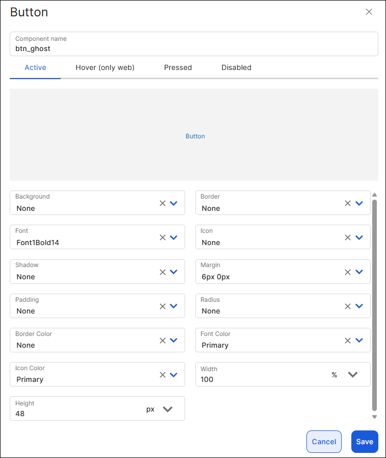 |
Checkbox No checkbox styles appear created by default. | To define a checkbox style, click Add checkbox. The checkbox style allows you to configure the Active state style only. Configure each of the attributes (value and unit of measurement, if applicable) using the variables values previously configured. The attributes available include: Background, Border Color, Font, Height, Border, Margin, Icon Color, Width. Then, click Add. To add a checkbox style, click Add checkbox and complete the fields as specified below. 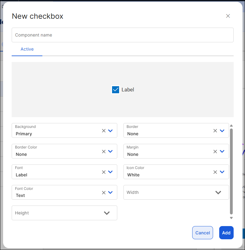 |
Flex
| To define a flex style, select the flex type you want to configure and click The flex style allows you to configure styles for each state of the component: Active, Hover (only applicable to web apps), Pressed and Disabled. You can configure the style for the Active state only (default state of the component) or one or more of the remaining states. If you don't configure the rest of the states, they will inherit the configuration of the Active state. Configure each of the attributes (value and unit of measurement, if applicable) using the variables values previously configured. The attributes available include: Background, Radius, Margin, Shadow, Height, Border, Border Color, Padding, Width. Then, click Save. To add an additional flex container style, click Add flex and complete the fields as specified above. 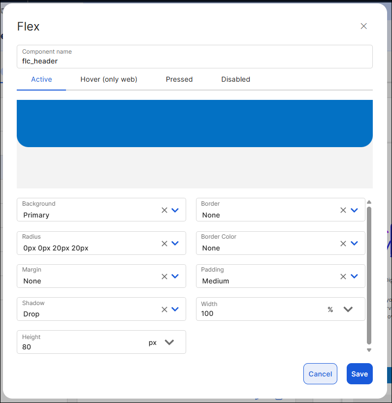 |
Input | To define an input style, select the text input type you want to configure and click The input style allows you to configure styles for each state of the component: Active, Focus, Filled, Success, Error and Disabled. You can configure the style for the Active state only (default state of the component) or one or more of the remaining states. If you don't configure the rest of the states, they will inherit the configuration of the Active state. Configure each of the attributes (value and unit of measurement, if applicable) using the variables values previously configured. The attributes available include: Background, Font Content Color, Border, Margin, Radius, Border Color, Icon Left, Shadow, Height, Font Hint, Left Icon Color, Padding, Icon Right, Font Content, Right Icon Color and Width. Then, click Save. To add an additional text input style, click Add input and complete the fields as specified above. 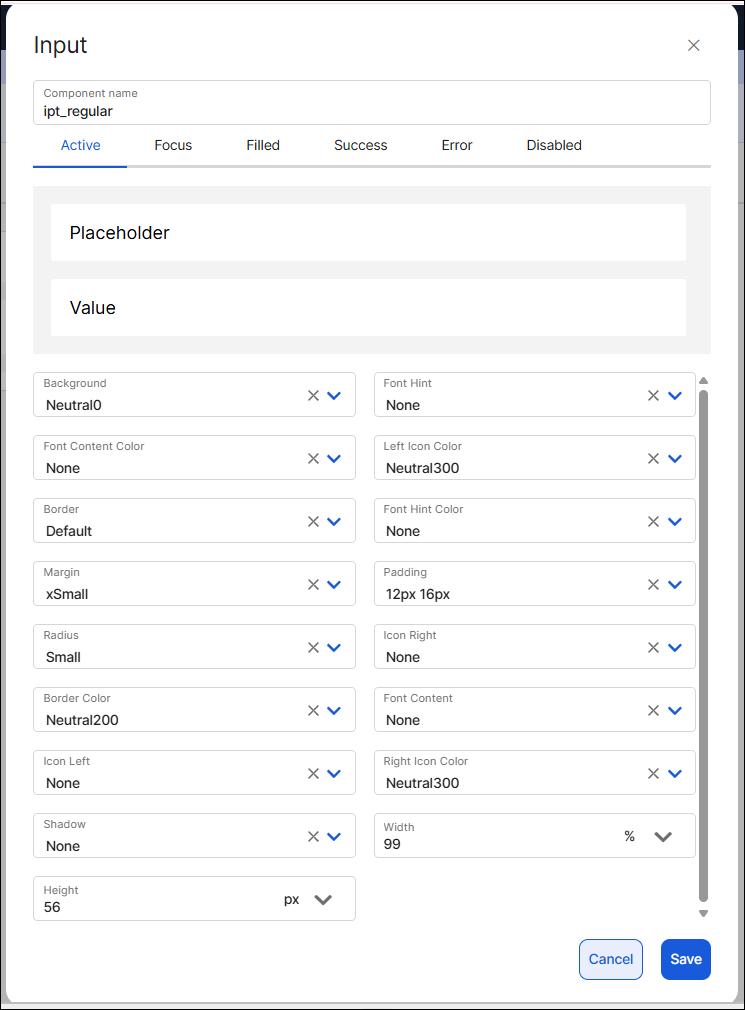 . |
Panel | To define a panel style, select the type you want to configure and click The panel style allows you to configure the Active state style only. Configure each of the attributes (value and unit of measurement, if applicable) using the variables values previously configured. The attributes available include: Background, Border Color, Padding, Border, Margin, Radius. Then, click Save. To add an additional panel style, click Add panel and complete the fields as specified above. 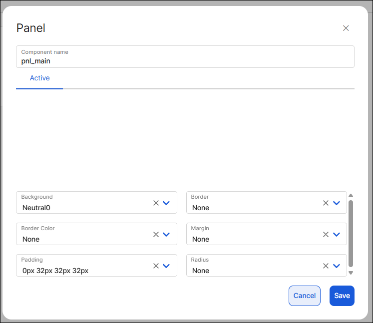 |
Radio No radio button styles appear created by default. | To define a radio style, click Add radio. The radio style allows you to configure the Active state style only. Configure each of the attributes (value and unit of measurement, if applicable) using the variables values previously configured. The attributes available include: Radio Color, Font, Width, Font Color, Margin and Height. Then, click Add. To create a button style, click Add radio and complete the fields as specified below. 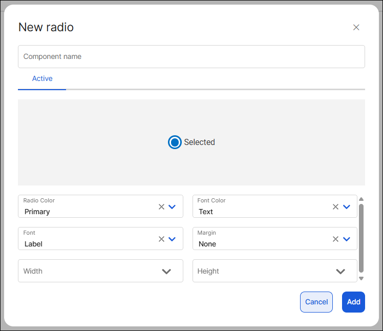 |
Switch No toggle switch styles appear created by default. | To define a radio style, click Add switch. The toggle switch style allows you to configure the Active state style only. Configure each of the attributes (value and unit of measurement, if applicable) using the variables values previously configured. The attributes available include: Background Control, Margin Right, Border Control Color, Font Color, Height, Background Box, Font, Border Box Color and Width. Then, click Add. To create a toggle switch style, click Add switch and complete the fields as specified below. 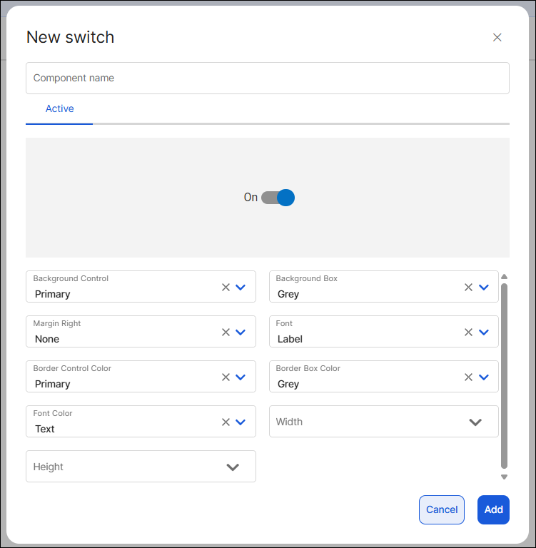 |
Text | To define a text label style, select the type you want to configure and click The text label style allows you to configure styles for each state of the component: Active, Hover (only applicable to web apps), Pressed and Disabled. You can configure the style for the Active state only (default state of the component) or one or more of the remaining states. If you don't configure the rest of the states, they will inherit the configuration of the Active state. Configure each of the attributes (value and unit of measurement, if applicable) using the variables values previously configured. The attributes available include: Font, Margin, Line Spacing, Font Color, Padding and Character Spacing. Click the Text Underline checkbox to add an underline design to the text label. Then, click Save. To add an additional text label style, click Add text and complete the fields as specified above. 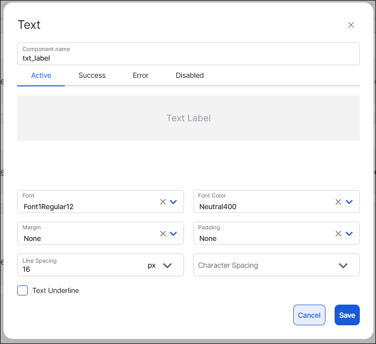 |
Custom
In this section, you can create specific styles to define attributes to be applied to a component. A custom style is used to replace a specific attribute of a component style under a specific circumstance, or to add an attribute that is not available in the component style.
When create a custom style?
Custom styles can be used in the following circumstances:
To create a style for a component that is not included in the Styles section.
To create styles to be applied to any other components in general (since they are not assigned to a specific component).
To concatenate a custom style with a single attribute to an existing style, if required under specific project use cases. To learn more, read How to concatenate styles in a component in Use the theme.
If there are styles created, you can use the search bar and type the style name. Once you find the desired custom style, you can perform different actions. Click to modify existing values or click  to add more attributes to the custom style. To delete a custom style, click the trashcan icon ().
Follow the instructions below to learn how to set a Custom style.
Best practice
Use custom styles only when the predefined styles available in the Styles section don't meet your app's requirements.
Click + Add style.
In the Style name field, enter a name to identify the new style. Use snake_case. For this example, enter: border_error. Leave the Component field blank.
Note
Avoid using style names already in use, since this might cause confusion when configuring the component in the screens editor.
In the Property field, add the attribute you want to configure. Start typing the attribute and select an option from the list.
In the Value, set the respective value applicable to the attribute. For this example, enter #c40306.
Click Save to save the custom style.
CSS
In this section, you can create specific styles for web applications using a CSS code editor. To create a new style, choose one of the two alternatives: uploading a CSS file or writing valid CSS directly.
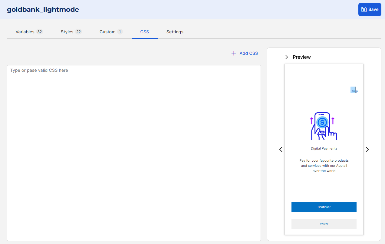
To upload a CSS file, click + Add CSS and select the file you want to upload from your system.
To write CSS, click the caption Type or paste valid CSS here and write valid CSS.
Important
Use this section only to configure specific properties for web applications that are not available in the Styles and Custom tabs.
Settings
The Settings tab contains basic information of the theme to identify it in the Studio environment. To complete it, follow the instructions below:
In the Name field, enter a name that identifies the theme. It must be in snake_case and include the project name and its main aspects or characteristics. For example: veribank_light_mode.
In the Description field, describe the main aspects of the theme; you can expand on the name selected.
In the Tags field, enter any tags applicable to the theme, that will allow other Studio users identify the characteristics.
In the Transitions field, click the arrow and select the effect applied to the screens transitioning. This affects the whole app. Then, click the Duration field and enter a number for the duration of the transition effect (in milliseconds).
In the Logo and Thumbnail fields, click Upload to select an image to represent the theme when it is invoked from other entities; for example, when you apply a theme in the app settings.
Tip
You can use the same image for both fields.