Card Container
The Card Container component allows you to set a carousel of cards. To insert a Card Container component in the screen, go to the Left Panel in the screens editor. Go through the list of components to find the Card Container component or click the search bar and type its name. Then, drag and drop the component into the canvas and configure its attributes in the right panel.
Once you drag the card container into the canvas, you must include several other components within it to be able to use the main component. Follow the steps below to configure the components' hierarchy in the treeview (see image).
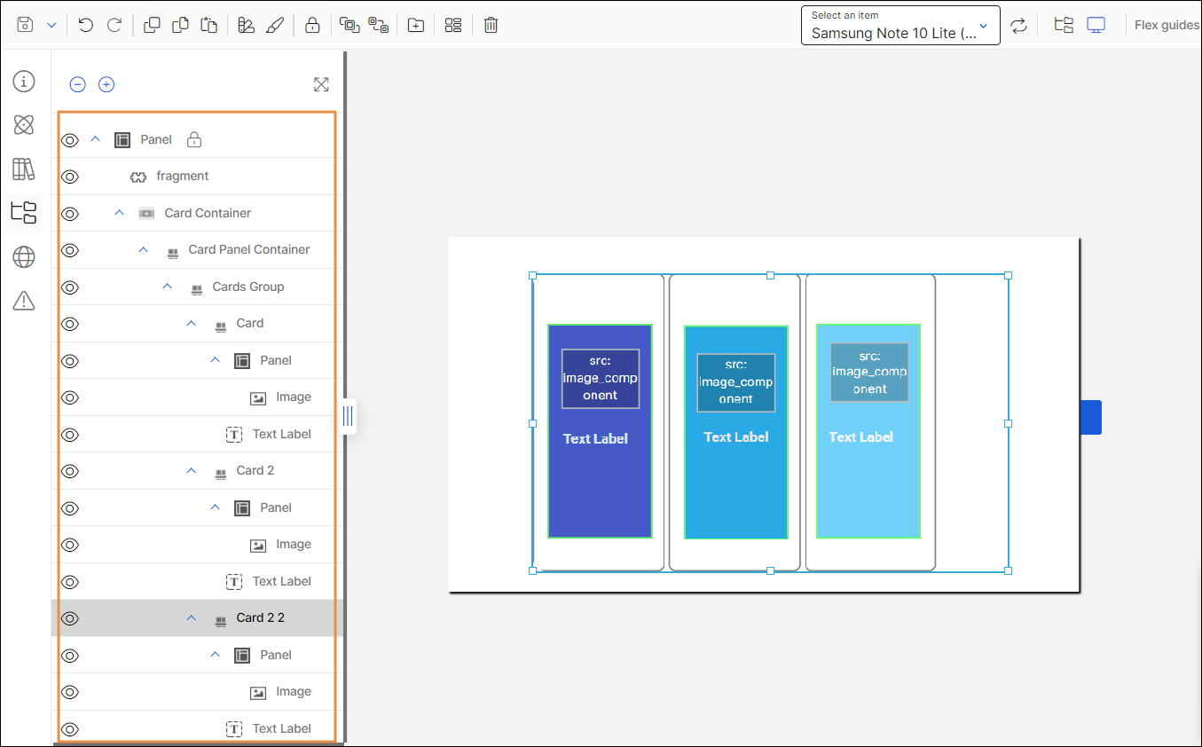
Drag and drop the Card Container component into the canvas.
Drag and drop a Card Panel Container within the Card Container.
Drag and drop a Cards Group component within the Card Panel Container.
Drag and drop as many Card components as necessary within the Cards Group component.
Drag and drop a Panel container within each Card component.
Drag and drop an Image and a Text Label component within each Panel added to each Card component.
Important
The Card Container component can only be used in mobile apps (both for Android and iOS devices).
After defining the structure, complete the attributes of the card container. Refer to the sections below to learn more.
Attributes
In the right panel, you can configure different attributes to customize the component. Refer to the sections below to learn more.
Design
In the Design tab, you can configure the selected component's basic information and the attributes that determine how the component will look like in the app. Refer to the sections below to learn more.
Actions
In the Actions tab, you can set animations for the components in your app's screen and determine how the user invokes effects and triggers actions while interacting with the app. Refer to the sections below to learn more.
Advanced
There are no attributes available for configuration in the Advanced tab for the Card Container component.