Themes
A theme is a group of settings that define the colors, sizes, fonts, backgrounds and other elements of the look & feel of your app and its components. Themes consist of variables and styles that are applied to each of the elements of the app:
Variables: Values applied to the style attributes of components. They can be Simple or Complex, depending on whether one or more values are fixed for each variable, respectively. Variables are divided in six categories: Color, Grey, Font, Border, Radius, and Shadow.
Styles: Components with a group of properties applied and their respective values, which can be fixed or variable.
You can access the list of themes by clicking Style > Themes.
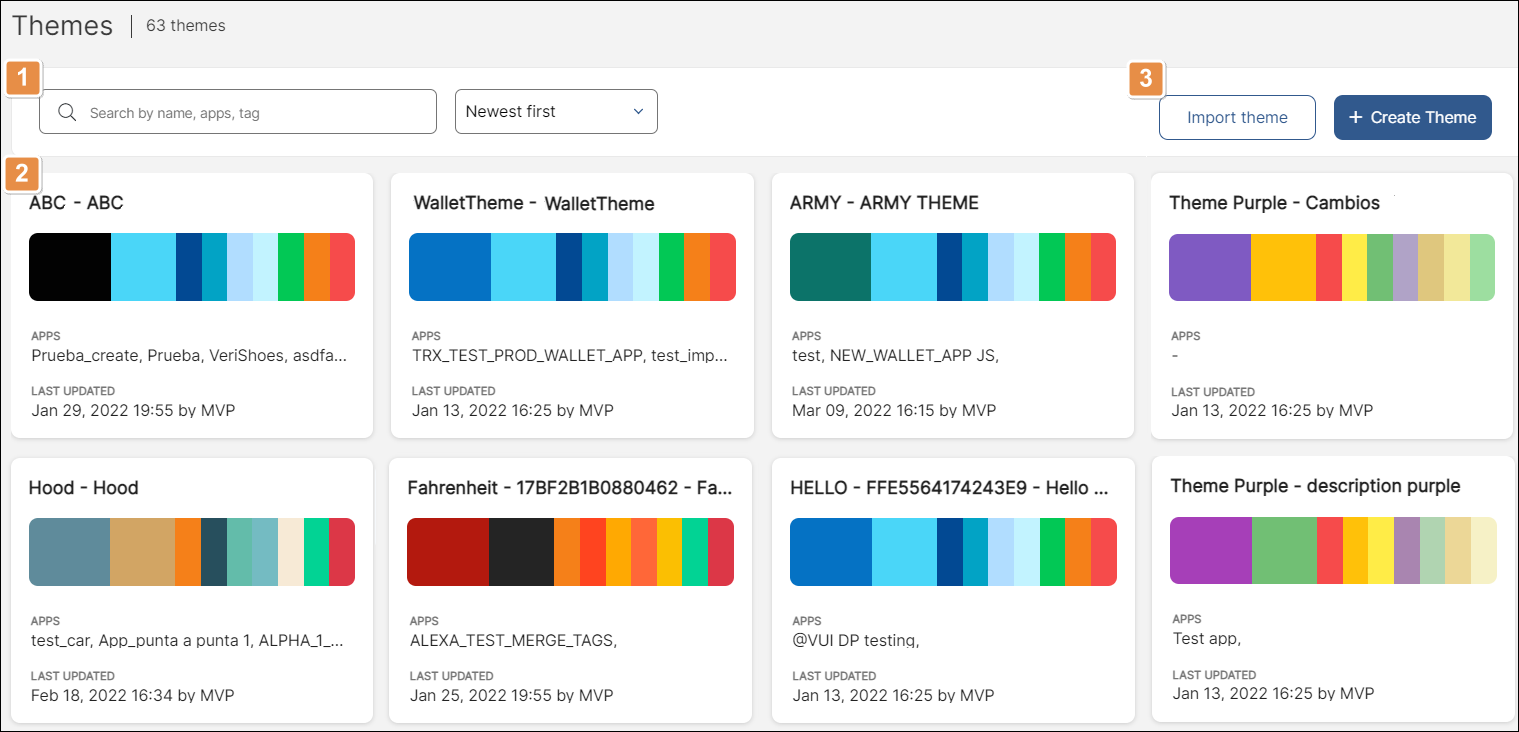
Refer to the annotated image below to learn more.

Search bar and filtering criteria. Search themes by name, app in which it is used, or a tag. Click the drop-down arrow to sort themes by creation date or alphabetically.
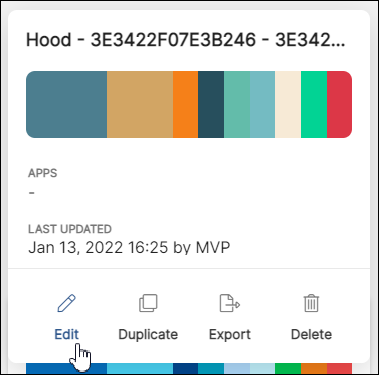
List of themes. Shows the themes used in card view. Hover over each card to display an extra set of actions you can perform on the theme:

Edit
Click to edit the theme. Read Create or Edit a Theme to learn more.
Duplicate
Click to duplicate the theme. In the popup that appears, enter a name for the duplicate theme and click Duplicate to confirm.
Export
Click to export a theme. The system downloads the theme as an .xml file to your computer.
Delete
Click to delete a theme. In the popup that appears, click Yes, delete to confirm.
Actions available in the Themes page.
Import Theme
Click to import a theme.
+ Create Theme
Click to create a new theme.