Create or Edit an Interface
To create or edit interfaces, go to Global > Modules. Find the corresponding module, click the vertical three-dot icon and click Interfaces.
To edit an existing interface, find the interface you want to edit and click Edit. The Edit Interface Configuration page opens. You are able to modify the sections explained below, as if you were creating a new interface.
To create a new interface, click + New interface to open the New Interface Configuration page. Refer to the image and table below to learn how to configure the interface.
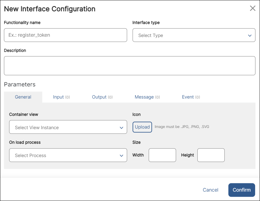
Functionality name | Complete with a name to identify the interface. You will see this name in the Components section located in the left panel of the Visual Builder when the interface is instanced in the main app. It will also appear in the module's interfaces list. |
Interface Type | Choose an option from the drop-down menu: Screen or Component. Select Component if you want the component to take a portion of the screen or select Screen if you want to create a flow including the whole screen or more than one screen. |
Description | Write a short description of your interface explaining what it will be used for. |
Parameters | You can set the configuration for five different types of parameters: General, Input, Output, Message and Event. The General tab is open by default. Read the Parameters section below to learn how to configure each type of parameters. |
To save any changes made to the basic information or parameters, click Confirm. To go back, click Cancel or Close.
Parameters
The General section must always be completed. The remaining four sections are optional.
General
Contains basic information about the interface and where it is instanced. Interfaces can be instanced through a view instance or through a process. Refer to the table below to learn how to complete the fields in this section.
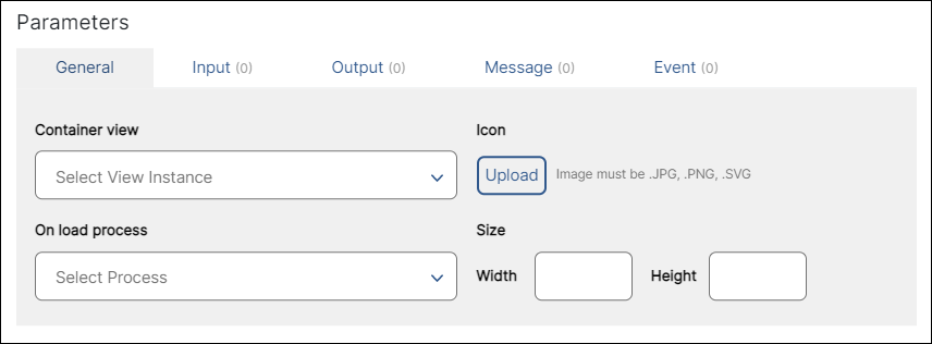
Container view | In the case of component-type interfaces, screen where the component was used. In the case of screen-type interfaces, initial screen where the screen flow starts. Select one of the screens available in the drop-down menu. |
On load process | Process to be executed when the interface loads in the mobile device or browser. Select one of the processes available in the drop-down menu. NoticeIf the module starts through a view instance, only the Container view field must be completed. If the module starts through a process, both the Container view and the On load process fields must be completed. |
Icon | Image to identify the component-type interface that will be displayed as a component in the left panel of the Visual Builder. The icon selected will only be visible in the Visual Builder for component-type interfaces and not for screen-type interfaces. |
Size | Relative width (rw) and relative height (rh) of the module interface. Complete with the desired size depending on whether it is a screen-type interface or component-type interface. In the case of a screen type of interface, the size must be 100rw x 100rh. ImportantType rw after the relative width number and rh after the relative height number. |
Input
Set the configuration of the parameters through which the interface receives data, including the registers required for its use. Refer to the annotated image below to learn how to configure input parameters.
Important
Registers ranging from 1 to 1000 are global, which means that they are available for all the apps within the same Studio environment. Registers higher than 1000 are local, and therefore, they are specific for the main app or module selected.
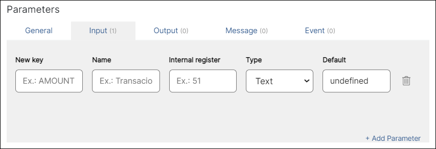
New key | Parameter name. Enter a name to internally identify the component. | ||||||||||
Name | Name seen by the user in the Design > Basic Input section, which is located in the right panel of the Visual Builder when the interface is invoked in the main app. Enter a name to identify the input parameter created. | ||||||||||
Internal register | Register that receives the parameter value when the interface is invoked in the main app. Enter the register's number, not including the structure | ||||||||||
Type | Select any of the options below from the drop-down menu, depending on the attribute of the component that you want to appear available for configuration when the component interface is instanced.
| ||||||||||
Default | Default value. Enter the value that will appear as default. It depends on the type of data selected before. | ||||||||||
Delete | Click the trashcan icon next to a parameter to delete it. | ||||||||||
+ Add Parameter | Click to create a new input parameter and complete the fields described above. |
Output
Set the data that will be returned in the configured register to the main app. Refer to the table below to learn how to configure output parameters.
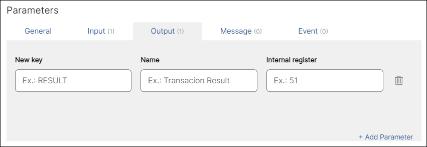
New key | Enter a name to internally identify the output parameter. |
Name | Enter a name to identify the input parameter value. The name appears in the Design > Basic Output section, which is located in the right panel of the Visual Builder, when the interface is invoked in the main app. |
Internal register | Register that will be returned once the data is saved in the interface. Enter the register’s number without the |
Delete | Click the trashcan icon next to a parameter to delete it. |
+ Add Parameter | Click to create a new output parameter. |
Message
Configure parameters for processes triggered from the main app and executed within the interface. Refer to the annotated image below to learn how to configure each parameter.
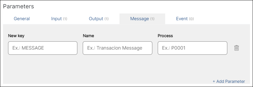
New key | Enter a name to internally identify the parameter value. |
Name | Enter a name to identify the parameter value. The name appears in the Visual Builder when the module interface is invoked. |
Process | Enter the process to be executed from the main app. |
Delete | Click the trashcan icon next to a parameter to delete it. |
+ Add Parameter | Click to add a new message parameter. |
Event
In this section, you define the events that the interface makes available to the main app. The configured events will be executed as defined by the interface. Once the interface is instanced, you can see these events in the Actions tab, located in the right panel of the Visual Builder.
Refer to the annotated image below to learn how to configure event parameters.
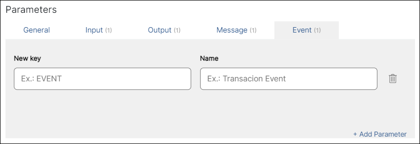
New key | Enter a name to identify the parameter. |
Name | Enter a name for your event. This name appears in the Actions > Events & Actions section, which is located in right panel of the Visual Builder when the interface is invoked in your app. |
Delete | Click the trashcan icon next to a parameter to delete it. |
+ Add Parameter | Click to add a new event parameter. |
Tip
Once you create a new interface or save any changes made to the configuration of an existing one, a green sign that reads NEW will appear next to the name of that interface.