Instancing a Component-type Module
Instancing a component-type module allows you to use the components created as interfaces within the module in the different screens of an app while editing the screen in the Visual Builder. You can use these components as you would do in the case of any other component available in the Visual Builder in the same Studio environment.
To invoke component interfaces of modules from the Visual Builder, you must first link the module to the app in the app's dependencies. Enabling dependencies allows you to use the module’s content in the Visual Builder for main app selected. To learn more about how to enable dependencies, read App Settings.
Once dependencies are activated, open the screen you want to edit in the Visual Builder. Click the Components tab, located in the Left Panel and go through the list of components to find the module previously linked to the app. The components tab contains all the components available in Studio as well as component-type interfaces, created within linked modules, that will be displayed as separate components. To add a module's component-type interface, drag and drop the desired component at any position in the canvas. Then, you can configure the attributes of the selected component in the right panel.
Important
If the theme applied to the module, and therefore, to its component interfaces, is different than the app theme, the module theme prevails and the look and feel of each component will be defined by the theme configured for the module. If no theme has been set for the module containing the component interface, that interface inherits the app theme. To learn more, read the Theme Inheritance section below.
The values that were previously configured in the parameters of the component-type interface are displayed in different sections of the Attributes Editor (right panel):
Input and Output values. These values appear in the Basic Inputs and Basic Outputs sections of the Design tab of the right panel and can be edited from the Visual Builder.
Events values. These values appear listed in the Events & Actions section of the Actions tab of the right panel and cannot be edited from the Visual Builder.
Messages values. To see these values, go to the Events & Actions section in the Actions tab of the right panel, click the vertical three-dot icon and select Event from the drop-down menu. Then, the configured Messages values will appear in the Actions drop-down menu. These values cannot be edited from the Visual Builder.
Theme Inheritance
There are a set of rules applicable to theme inheritance that vary according to the theme applied to the apps, the modules and the different elements within them.
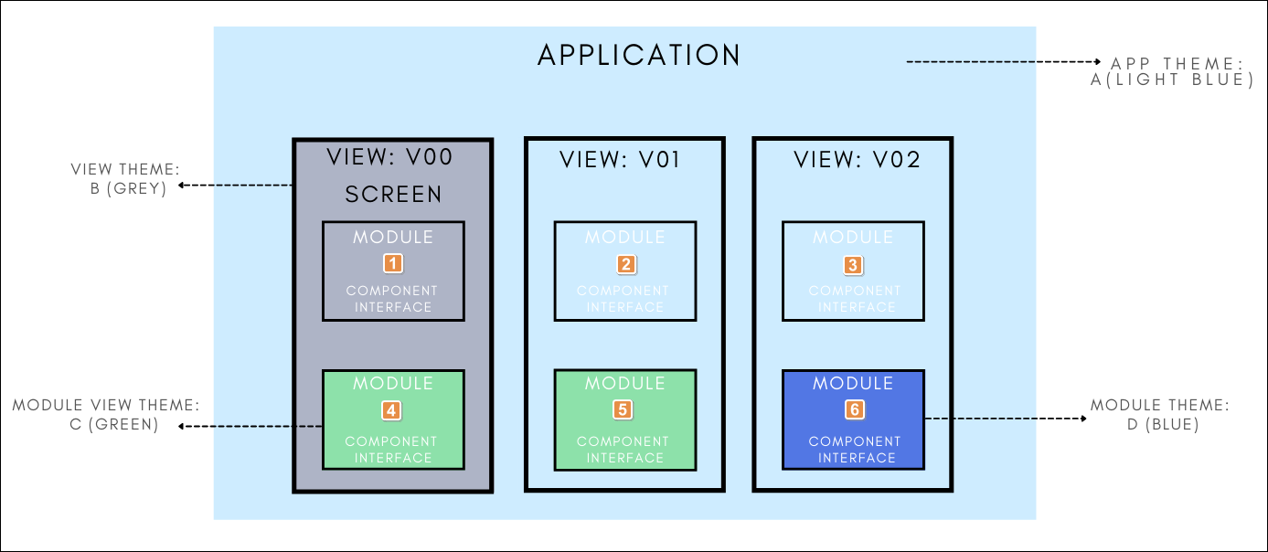
The diagram below explains different cases that illustrate how the system defines which theme will be applied to the component-type interface used as a component in the main app.
Tip
For illustrative purposes, the app, the app site views, the app screens, the modules site views, and the component-type interfaces have different themes applied.
Component-type interfaces—displayed as components in the Visual Builder—that have a theme applied in their modules will have that same theme when invoked in the main app.
However, if the module where that component-type interface was built does not have a theme applied, the component used in the Visual Builder will inherit the main app theme.

The main app has the A theme applied. The app site view containing the screen has the B theme applied. Given that the neither the module nor the site view module in which it the component interface is included have a theme applied, the component interface inherits the theme of the main app site view.
The app has the A theme applied but the app site view containing the screen has no theme. Given that neither the module nor the site view module in which the component interface is included have a theme applied, the component interface inherits the theme applied to the main app.
The app has the A theme applied but the app site view containing the screen has no theme. Given that neither the module nor the site view module in which the component interface is included have a theme applied, the component interface inherits the theme applied to the main app.
The app has the A theme applied. The app site view containing the screen has the B theme applied. The module has no theme. However, given that the module site view containing the screen in which the component interface was built has the C theme applied, the component interface inherits the module site view's theme.
The app has the A theme applied but the app site view containing the screen has no theme. The module has no theme either. However, given that the module site view containing the screen in which the component interface was included has the C theme applied, the component interface inherits the module site view's theme.
The app has the A theme applied but the app site view containing the screen has no theme. The module has the D theme applied but the site view containing the screen in which the component interface was included has no theme applied. Therefore, the component interface inherits the module's theme.