Attributes Editor
The right panel of the Visual Builder allows you to set different types of attributes for each component. The attributes to be configured will specifically depend on the selected component.
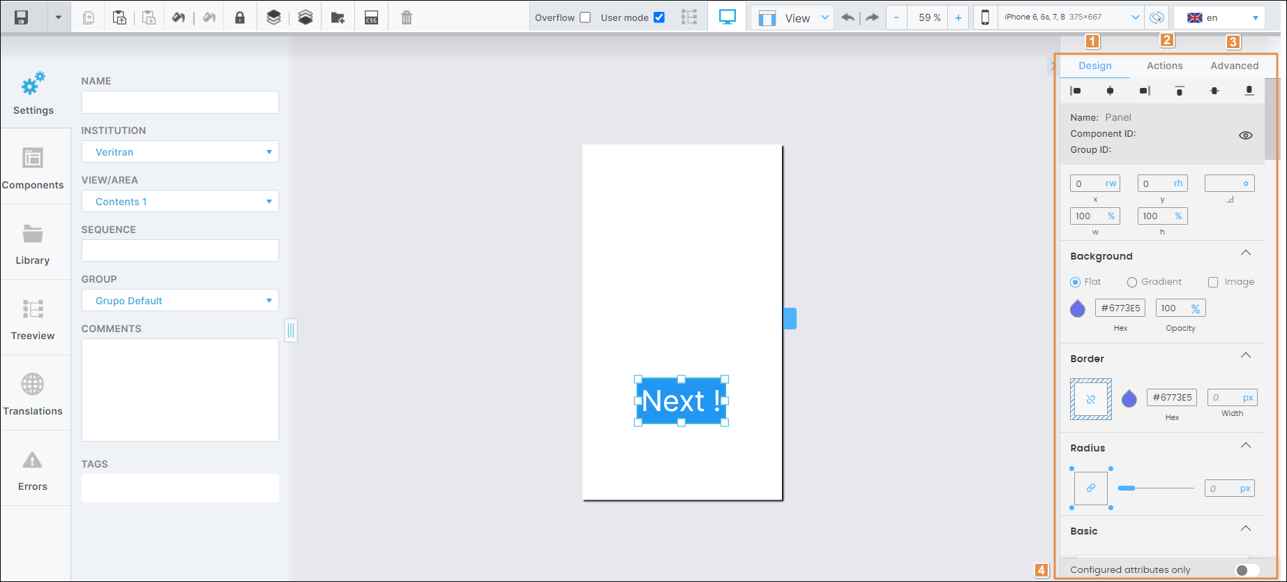
Refer to the annotated image below to learn more.

Design tab. Tab that contains the selected component's basic information and the attributes that determine how the component will look like in the app.
Actions tab. Tab that contains the attributes to set animations for a component in the screen of your app and determines how the app user invokes different effects and triggers different actions while interacting with the app.
Advanced tab. Tab that contains advanced attributes for the selected component.
Configured attributes only. By default, the toggle is deactivated (gray). If the toggle is activated (blue), the right panel only shows the attributes that are preconfigured or have been previously configured by another user. Click the toggle switch to activate or deactivate it.
Tip
Click the arrow located to the left of the Design tab (see image above) to hide the right panel. To unhide it, click the arrow again.