Components
The Components tab shows every component that can be used in your screen. It includes the components within the built-in library, additional default components and any components created and published specifically for the app you are working on.
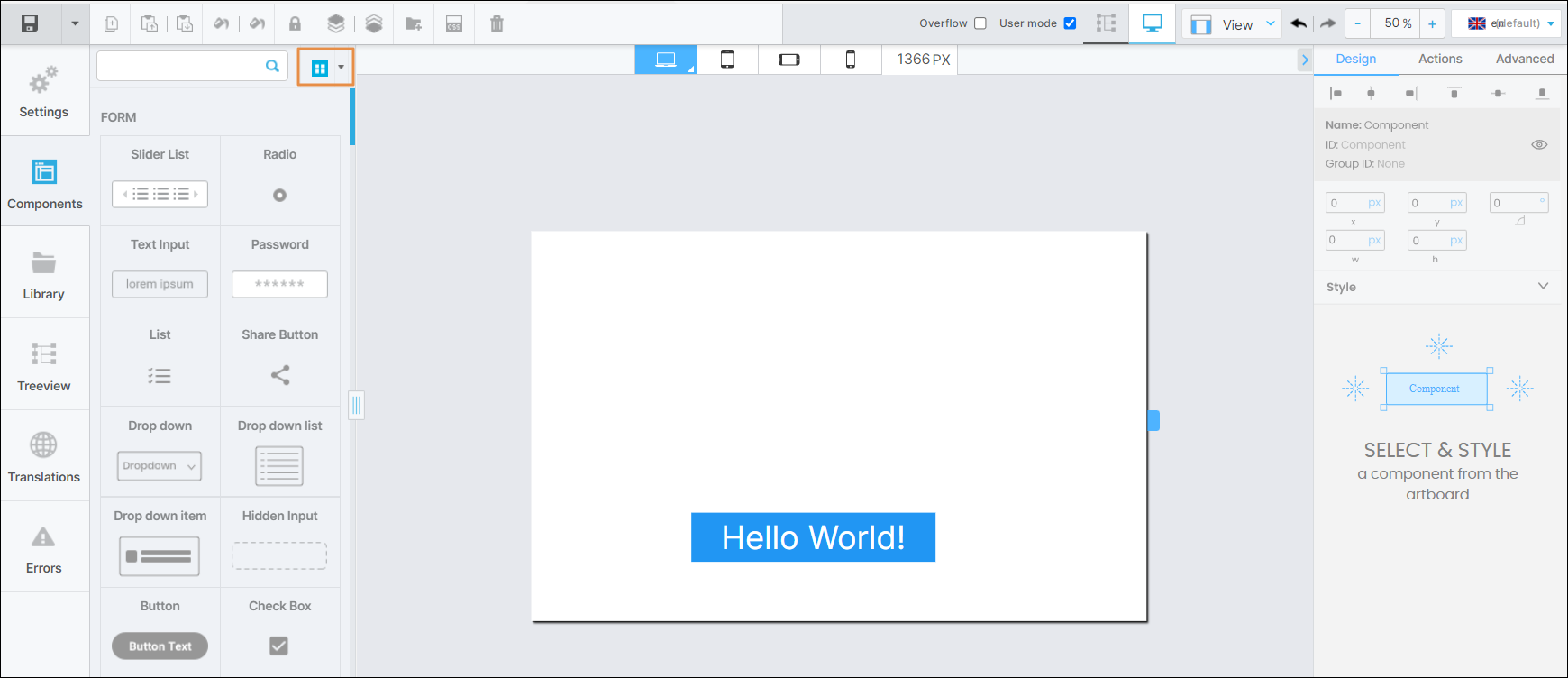
By default, components are displayed in grid view. To see the library components in list view, hover over the arrow to the right of Grid view ( ) and click List view (
 ). To find a component, use the scroll bar to go through the list of components or use the search bar to find a component by typing its name.
To add a component to your screen, drag it from the left panel and drop it into the canvas. When you select a component in the canvas, the right panel displays its attributes, which can be edited to customize its appearance, set functions and add animations. These attributes vary depending on the component selected. Refer to Attributes Editor to learn more.
In addition to the components available in the Visual Builder, you can use the components created within the modules previously linked to the app in the Dependencies section of the App Settings. Read Instancing a Component-type Module to learn more.