Screens Editor Navigation
The Screens Editor contains the canvas and other four main parts: a toolbar (top left), the canvas options (top right), the left panel and the right panel. From the left panel, you can add a description and tags to easily identify the screen and help you and your team understand why you created the screen. In addition, you can drag and drop components or component libraries to the screen, identify errors and translations of each component (if applicable) and see and modify how components are displayed. In the Right Panel, you configure the attributes of each component in the screen according to your needs.
The sections below provide information about the features in each area of the screens editor's interface. You can use this information as guidance throughout your screens building process, but bear in mind that you will have to use the different options according to your project's requirements and your needs when creating or modifying screens.
The toolbar contains essential tools that you can use on the components when building a screen. Refer to the table below to learn more.

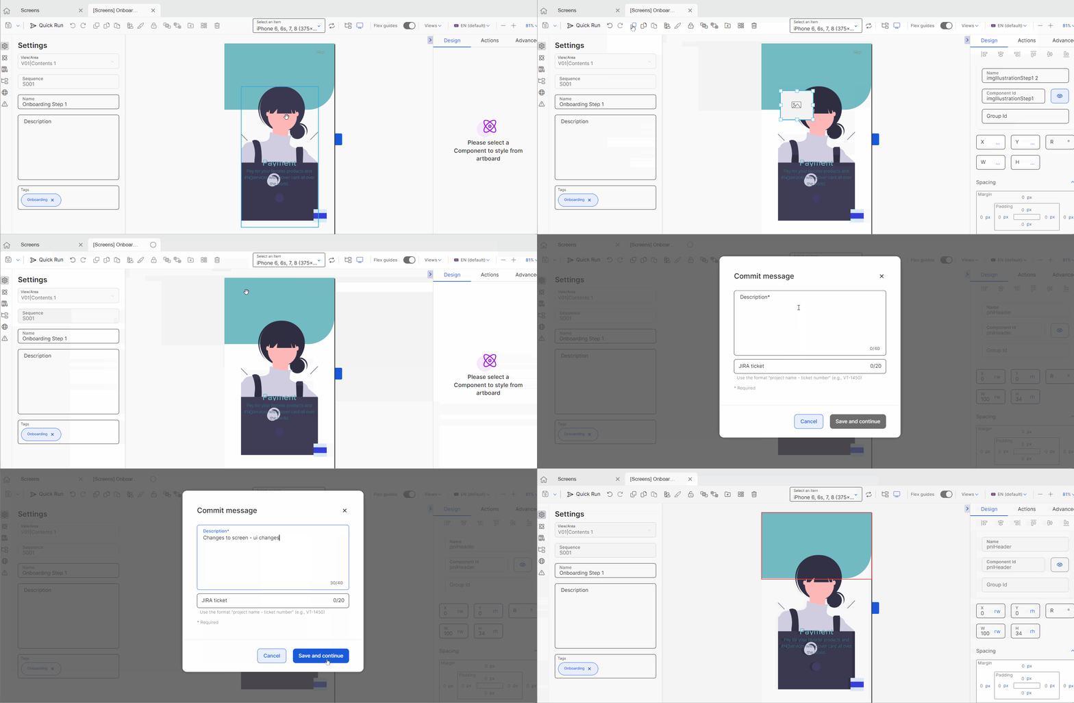
 | Save options. Click Save and continue (floppy disk icon) to save changes and continue working. Click the arrow to access more saving options, as explained below.
In all cases, the Commit message modal appears. Enter a description to identify the changes made, so that the members of your team are aware of the modifications and determine whether they need to merge those changes to another branch of your app. TipIf there are unsaved changes, a circle appears in the screens editor tab, to the right of the screen's name. As a best practice, save the screen each time you make major changes such as adding new components or configuring attributes that affect the behavior of the component in the app. | ||||||
| Quick Run. Click to run a real-time test to see the changes made in the screen of your app. For example, if you configured an animation in the On Click attribute so that a text input component appears when the app user clicks on the screen, you can run a test using quick run to see if the animation is working according to your needs. Refer to Quick Run to learn how to use it. ImportantThe Quick Run feature is only available for mobile apps. If you are working on a web app, this option won't appear in the screens editor. | ||||||
 | Undo and Redo. Click to undo or redo the last action performed in the canvas. You may have to undo an action if, for example, you made a mistake moving a component throughout the screen and you need to place it back to where it was originally located. | ||||||
 | Duplicate. Click to duplicate a selected component. TipFor example, you can use it to duplicate a configured flex container with its children components and make any necessary changes to them, instead of draggina and dropping all the components in a new flex container. | ||||||
 | Copy and Paste. Click to copy and paste the selected component and its attributes, respectively. | ||||||
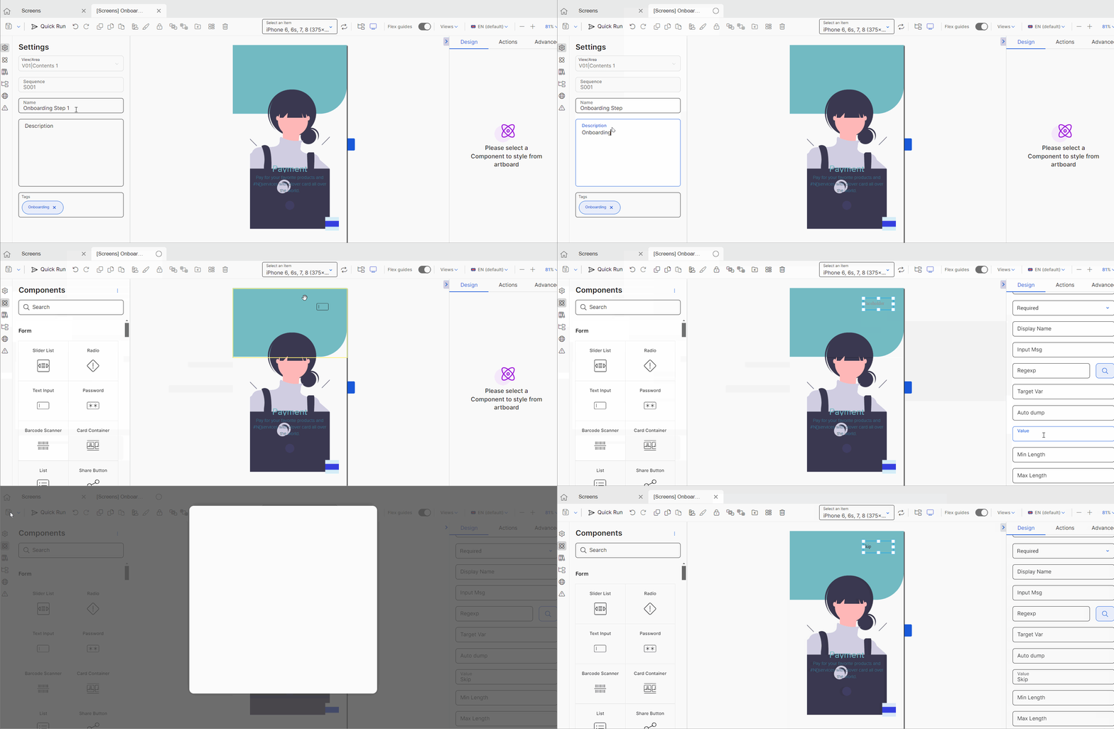
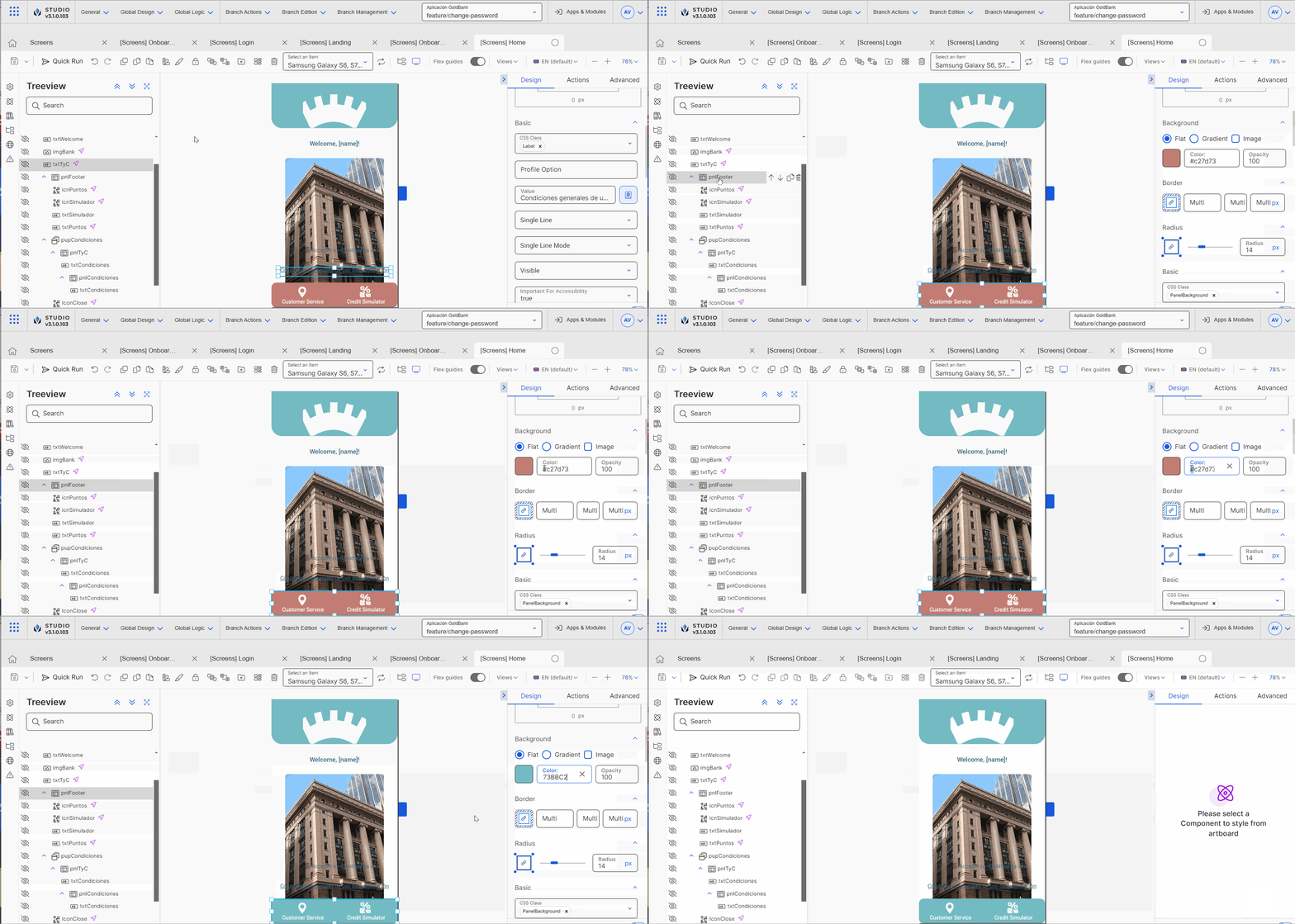
 | Copy styles and Paste styles. Click Copy styles to copy the style of the selected component. Then, click the component to which you want to apply the copied style and click Paste style. | ||||||
 | Lock. Click to disable changes to the selected component. All the sections in the right panel are grayed out to prevent changes. When a component is locked, the icon turns into an open lock. Click it to unlock the component. | ||||||
 | Arrange up or Arrange down. Click to move the selected component upwards or downwards in the treeview, respectively. | ||||||
 | Create Library. Click to create a new library component from the component selected. Once the New Library Component modal opens, you must enter a name for the component library, to identify it. In addition, you can add a thumbnail for the library in the Thumbnail image field. To add an image, click the upload button, select an image following the file types and dimensions and click click Open. Then, click Save to save the new component library. TipCreate new library components, for example, whenever you create components with complex configurations or components you may need to reuse throughout the different screens of your app. | ||||||
 | Create theme. Click to create a new style and apply it to the selected component. Once you configure the new style panel and save it, it will be available for reuse in other components. You can select it in the CSS Class drop-down menu in the Basic section of the Design tab of Right Paneland you can also find it listed in the Custom tab of the theme selected for your branch. | ||||||
 | Delete. Click to delete the selected component from the screen. |
Important
All buttons, except for the Save options, are only enabled after you select a component within the canvas or the treeview.
The canvas options section contains options that allow you to see how the screen will look like when the app is published and that help you identify the areas within the screen for you to better organize the components within it. Refer to the table below to learn more.
| Device view and Rotate device options. If you are working on a mobile app, you can select a device to see in the canvas how the screen will look like in the published app. Click the arrow to open the drop-down menu and select a device or group of devices from the list. Each option includes the name of the device or devices and their screen resolution in pixels. NoteThe devices drop-down menu and the Rotate Device option are only available for mobile apps but the Rotate device option is not implemented. If you are working on a web app, the drop-down menu described above won't appear. However, you can see how the screen will look like in the published app by selecting an option with the type of breakpoint. Breakpoints are customizable widths that determine how your responsive layout behaves across devices. Each breakpoint refers to a maximum width (in pixels). Once you select the option, select a device from the drop-down menu that opens. The table below describes the options available.
| ||||||||||
| Treeview mode. Click to hide the canvas and open the treeview tab only. You won't be able to see the components in the simulator. Use this option to better visualize the screen and identify any errors in the organization of components, for example, to check whether the correct components are included within a flex container. | ||||||||||
| Simulator Mode. Click to open the treeview tab without hiding the canvas. By default, this option is selected. | ||||||||||
| Flex guides. Lines that behave as guides to delimit the sections within the structure of a flex component. By default, these guides are disabled. ImportantFlex guides only become available if you have flex components in the canvas, such as a flex container. | ||||||||||
| View modes. By default, the three view modes are selected (see image below). Click the arrow and select or unselect any options. Refer to the chart below to learn more about the views available.
| ||||||||||
| Languages. Click the arrow and select a language from the drop-down menu. ImportantThe Languages drop-down menu contains the languages selected in you app's settings. If no languages were set, English will be the default language for the app and the Languages menu won't be displayed in the in the screens editor. | ||||||||||
| Canvas zoom. Click - or + to decrease or increase the zoom on the canvas, respectively. You can also click the percentage field to type a custom percentage or click the arrow and choose an option from the drop-down menu: 25%, 50%, 100%, 200% or Fit Canvas. |
The left panel Left Panelof the screens editor provides a set of tabs that allow you to build and customize your screen. Read Left Panel to learn more.

The canvas is the simulator that allows you to see what the screen of your app will look like while adding or removing components and setting their attributes. It can also simulate the screen on different devices and with different resolutions. As you drag certain types of components through the canvas, you can see the distance between them in pixels to help you design your screen.

The right panel of the screens editor allows you to set different types of attributes for each component. The attributes to be configured will specifically depend on the selected component. Read Right Panel to learn more.


