Screens Editor
The screens editor is a Studio low-code tool that allows you to create and edit the screens of your branch, while visualizing those screens as if you were in the app. In addition, you can add logic to the screens of your app by configuring attributes in their components that allow you to connect with processes, other screens, events or external links. For example: in a button component of a login screen, you can set a process so that, when the user clicks on the button, that process validates the user and password entered and shows the account information.
The screens editor contains a canvas that allows you to see what the screen of your app will look like while adding or removing components and setting their attributes. Component's attributes are the characteristics that define their appearance and contain logic that allows you to connect with other screens or functionalities of the app.
With the canvas, you can also simulate the screen on different devices and with different resolutions. As you drag components through the canvas, you can see the distance between them in pixels to help you design your screen.
How to Use the Screens Editor
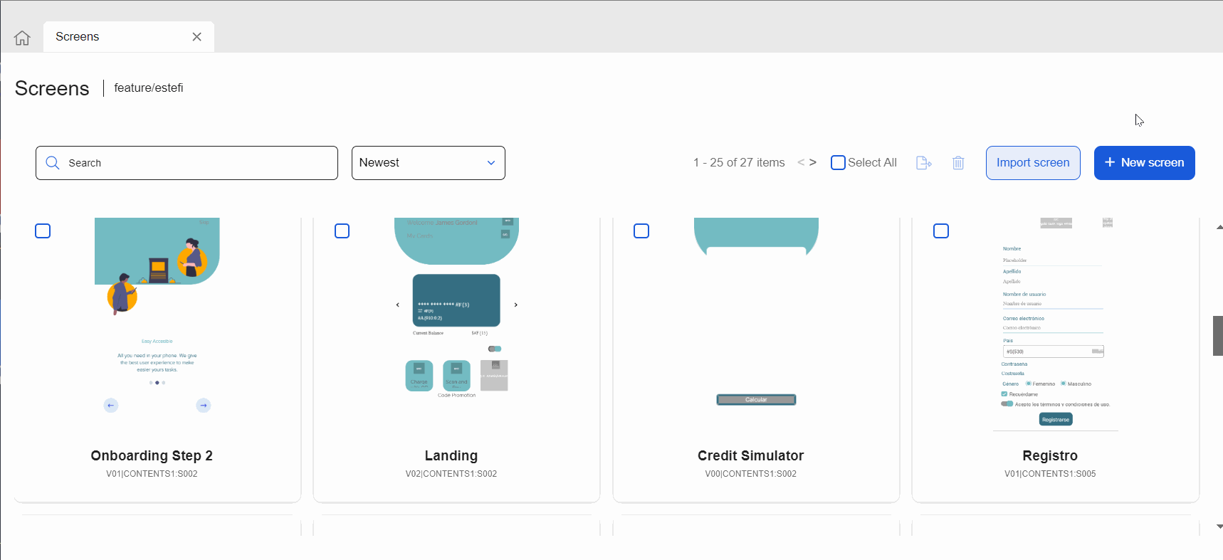
To access the screens editor, first go to the Screens page: click Screens in the Overview or go to Branch Edition > Screens. To work on an existing screen, find it in the list and click Design or double click on the screen's card. To work on a new screen, click + New screen. In both cases, the screens editor opens.
Before working on the canvas, you can edit the screen settings in the Info section of the left panel. In this section, you can add the sequence, a description of the screen and tags that allow you and your team to easily identify why the screen was created.
Tip
The name and sequence defined for your screen will be displayed in App Flow whenever you review the flow of your app.
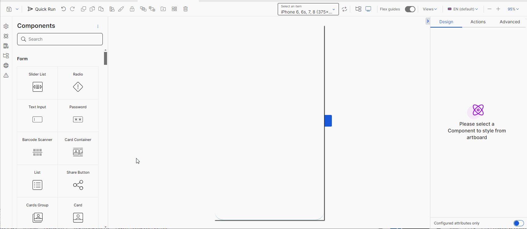
Then, start dragging and dropping components from the left panel into the canvas and configure, according to your project's requirements, each component's attributes in the right panel. The tools in the toolbar allow you to execute actions on the components defined, such as duplicating them, working with styles and arranging them in the treeview. You can also use the canvas actions available to define the settings of the screen canvas.
Below you can find an example of how you navigate across the screens editor based on a client request.
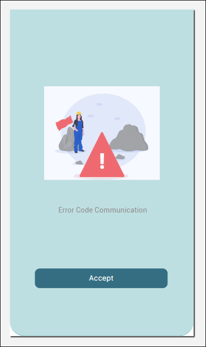
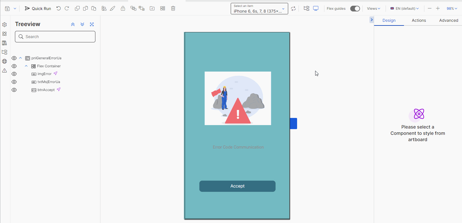
GoldBank asks Gabriel, the builder of the Goldbank project, to create a new screen to appear upon a transaction error in the app. He is working on a mobile app, and the client asked him to confirm that the error is correctly displayed in iPhone, Samsung and Xiaomi devices. In addition, Goldbank requires that the screen shows an image indicating an error, a message describing that an error ocurred and a button so that the app user accepts the error message. Refer to the images below to see how Gabriel navigates the editor.
First, Gabriel acceses the Screens section (Branch Edition > Screens) in Studio and clicks + New screen. Then, he goes to the Info section in the left panel and defines the name Transaction error, the description New screen that appears when a transaction error occurs in the app and the errors tag for the new screen. After configuring the Info section, he will save the screen to make sure the first changes are applied.
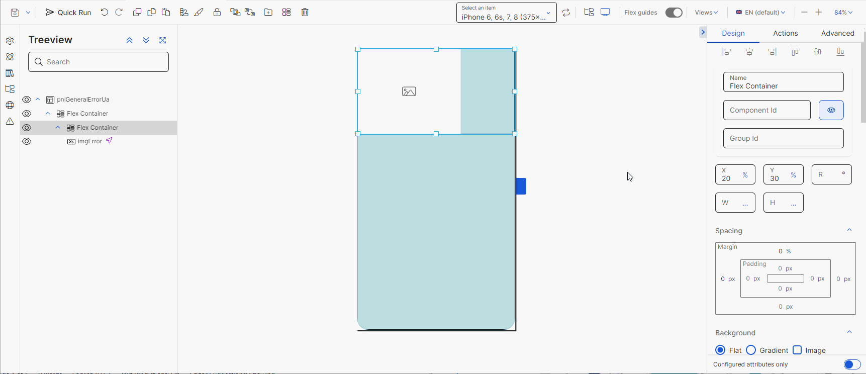
Then, he goes to the Components section in the left panel, where he looks and then drags and drops the first component to the canvas. Gabriel will add each component and configure it before adding another component. First, he adds a flex container, to act as the main container of the rest of the components within the screen. As a first step, he modifies the position and size attributes and sets the Position Type attribute in Relative.
After configuring the parent flex container, he will add one flex container per component to be added to the screen. In this case, he will add: a flex container and an image component, a flex container and a text label, and a flex container and a button component.
Tip
As a best practice, you must add a component and configure it before adding another component into the canvas.
Once he adds each component into the canvas, he configures the attributes in the right panel according to the look and feel defined by the client. He will also use the assets previously provided by the client, such as the image that represents the error identified.
Gabriel can also use the actions available in the toolbar to undo any actions, in case he makes mistakes related to the positioning or the configuration of a component, duplicate any components or delete them.
Once the components are configured, he will use the devices list section to see how the screen will look like in several devices, as requested by the client.
Once Gabriel checks all the configurations and determines that the screen is ready, he will use the Quick Run option in the toolbar to see how the screen will look like and behave when the app is published. If all the changes are correct, he will go the save options and click Save & close. The Commit message modal opens, where he completes the description of the last changes made and, if applicable, the details of the JIRA ticket involved.
Note
The description added in the Commit message will be displayed in the Commits History page.