Left Panel
The left panel of the screens editor provides a set of tabs that allow you to build and to customize your screen. First of all, you can see and edit the details referred to the screen, such as its name, description and related tags.
From the left panel, you drag and drop new components or library components (components that have been created previously and saved for reuse) in the canvas to further configure them, and you can also see them arranged in a treeview to identify the order in which they are set. You can also configure the translations applied to components that include text whenever the app language is changed and to identify errors in the configuration of a component attribute. Refer to the sections below to learn more about each tab available.
The Settings tab  contains configuration details about your screen that are defined upon creation and additional details that you can edit any time. If you are creating a new screen, you must give it a name to identify. In addition, you must set the Sequence field with an ID following the structure S and is then three digits (for example, S097); this id sets an order number for the screen and also establishes an order in the progression of screens. You also set the View/Area field, Visual area of the screen you are editing and the site view it belongs to. Both the site view and layout applied must be already pre-configured on your app and screen. Depending on the area of the screen you are editing, the rest of the canvas will be grayed out and won’t be editable.
Warning
The Sequence and View/Area fields cannot be edited once configured upon creation of the screen.
Optionally, you can configure the screen description and add tags. The description is a short text to explain the goal of the screen or why it was created; tags are key words related to the purpose of the screen that can be used to easily find it in the Screens page.
The Components tab  shows every component that can be used in your screen. It includes the components within the built-in library, additional default components and any components created and published specifically for the app you are working on.
By default, components are displayed in grid view. To see the components in list view, click the vertical three dot icon and click View List ( ). To change the view again, click View Grid (
 . To find a component, use the scroll bar to go through the list or use the search bar to find a component by typing its name.
To add a component to your screen, drag it from the left panel and drop it into the canvas. When you select a component in the canvas, the right panel displays its attributes, which can be edited to customize its appearance, set functions and add animations. These attributes vary depending on the component selected. Refer to Right Panel to learn more.
In addition to the components available in the screens editor, you can use the components created within the modules previously linked to your branch in the Dependencies section available in Settings. Read Instancing a Component-type Module to learn more.
The Library tab shows every reusable component created in the environment you are working on. Library components are reusable components that you can include in a screen by duplicating them or by referencing the original element. You can add an individual component to the library, or a container component that includes several components.
By default, library components are displayed in grid view () and the sorting criteria is Sort by type  . To change the default view to list view, hover over the arrow to the right of the grid icon () and click List view (). If you want to change the default sorting criteria to define the order of the library components, click the vertical three dot icon and select Sort alphabetically (
 ) or Sort by Feature Template (
 ).
).
To find a reusable component, use the scroll bar to go through the list or use the search bar to find a component by typing its name. To use a reusable component, drag and drop it from the panel into the canvas. A pop-up window opens with two options:
Link: Invokes the original component into your screen. You are not able to modify a linked library component, and any update made to the original component will then be reflected in every screen where it was invoked.
Duplicate: Creates an exact copy of the original component. You can edit the attributes of the duplicated library component.
Create a Library Component
Tip
Library components are created from existing components. Before creating a library component, check that the original component's attributes are correctly configured.
To create a new library component, select the component you wish to reuse from the canvas or the treeview. Then, click Create library on the toolbar, as shown in the image below.

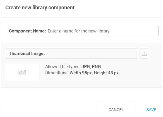
A pop-up window appears, where you need to add a name to the new library component and a thumbnail. The thumbnail image must be in .jpg or .png format and smaller than 95 (height) by 48 (width) pixels. Click Save.
The new library component appears in the library tab and you can now start using it in any screen.
This tab shows individual and container components added to the screen and allows you to organize them according to their hierarchy, similarly to arranging files in a folder.
Once the tab is opened, you can click  to hide te canvas and only see the treeview and the components tab opened. This will allow you to focus on the list of components and drag and drop any additional components you may require to the treeview. In addition, you can click
  or
or  to expand or collapse container components (such as a panel or flex container) and show or hide the components within it.
To rearrange a component in the list, you can use one of two options. To rearrange the component manually, click and hold a component and drag it up to take it to the back or down to pull it to the front of the screen, until it is in the position you need. You can also click the up and down arrows to the right of each component to move them to the back or front of the screen, respectively. In addition, you can click  to duplicate a component or a container component with all its children components in the treeview.
The Translations tab  contains a list of the translations applied to the components in the screen. In this tab, you find a specific translation by going through the list or click the vertical three dot icon to the right and click All to see all translations defined or Missing to see the translations missing for the component selected in the canvas.
The information listed depends on the language selected in the canvas options. If the language selected is the default language of the app, the list contains the text entered for each component in the Value field of the Basic section (Design tab of the right panel). If the language set is one different than the default language, the list will show the translations to such language defined for each component. If you select a language and you do not define translations, the list will show the text values in the default language and a warning sign to the right indicating that the translation is missing.
Note
This tab is only available if there is more than one language enabled in the branch settings. In the settings, you can add the languages you want to enable or change the default language for your app.
Add or Edit Translations
Important
Translations apply to components that contain text data that can be configured in different languages.
To add one or more translations to the text in a component, select the component from the treeview or canvas. Then, go to the Design tab in the right panel. In the Basic section, go to the Value field and click the translations dictionary icon ( ). Click + Add to open the Add new entry to translations dictionary modal, where you can add the translations for the component's text.
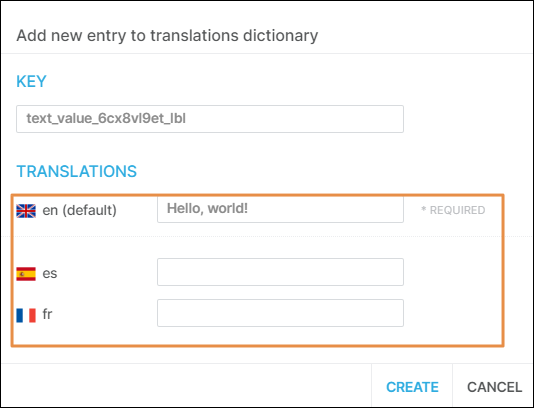
In the Key section, the system automatically sets a key for the translation entry. In the Translations section, the default language field contains the text entered in the Value field of the Basic section specified above. If other languages were defined in the settings of your app, you must complete each field with the respective translation to the specified language. If you don't complete a translation for a specific language, and you select that language in the canvas options, the translations tab will show the text in the default language with a warning icon to inform you that the translation to that language is missing.
Once you complete the translations, click Create. The translations are added to the dictionary to be reused.
Tip
Any time you click the translations dictionary icon of a component that has translations defined, Studio suggests the translations that are stored in the translations dictionary.
To edit a translation, you can either modify it from the left or right panel. From the left panel, go to the translations tab and click the maximize icon. From the right panel, go to the Design tab; then go to the Value field in the Basic section and click  to the right of the field.
In both cases, the Edit entry modal opens, where you can modify the text of the translations, add any missing translations and see where the translation is used.
The Errors tab  shows a list of expression errors encountered in the screen you are editing. If there is an error in an expression in a component’s Value attribute (like a misspelled register or a missing punctuation mark at the end of the expression), the Errors tab shows the name of the component that contains the incorrect value. See an example in the image below.
Tip
If an error is identified, the system shows a list of suggestions to help you enter the correct expression.