Visual Builder
The visual builder is a low-code tool that allows you to create or edit the screens of your app. To access the visual builder, go to Global > Applications, find the card for the app you want to work with, hover over the card and click Screens. To create a new screen, click + New screen. To edit an existing screen, find it in the list and click Design or double click the screen's card.
The visual builder opens in a new tab, and shows the new screen or the screen you selected to edit. Refer to the annotated image and sections below to learn more about the visual builder’s interface.
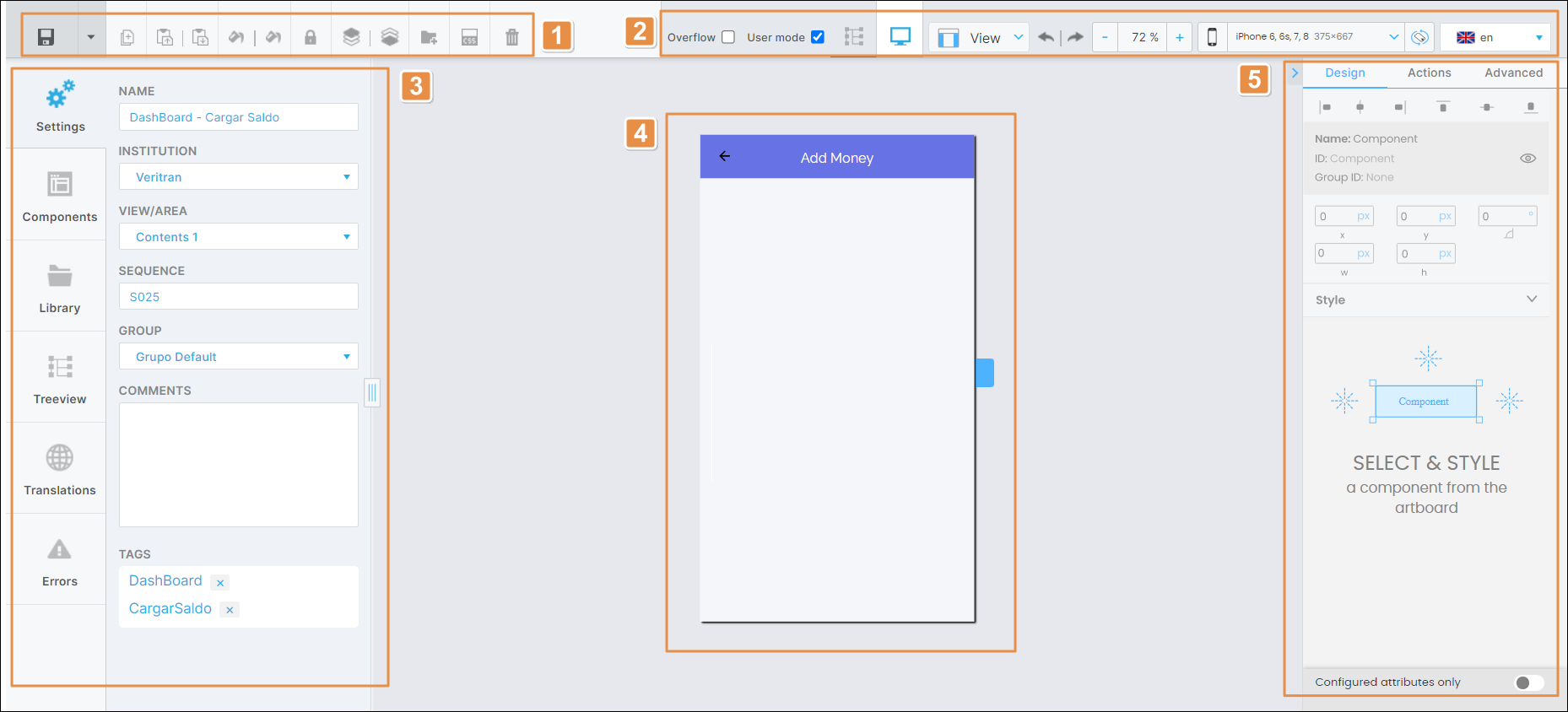
Toolbar
The toolbar contains a set of essential tools you can use while building your screens. Tools are explained below in order of appearance.
 | Save. Click the Save icon to save changes and close the tab, or click the down arrow to see the following options:
When there are unsaved changes, a dot appears in the visual builder tab, to the right of the screen's. After you save changes, the dot disappears. | ||||||
 | Duplicate. Click to duplicate a selected component. This tool doesn't allow you to duplicate screens. | ||||||
 | Copy. Click to copy the selected component and its attributes. | ||||||
 | Paste. Click to paste the copied component in the selected screen. | ||||||
 | Copy style. Click to copy the style of the selected component. | ||||||
| Paste style. Click to apply the copied style to the selected component. | ||||||
 | Lock. Click to disable changes to the selected component. All the sections in the right panel are grayed-out to prevent changes. When a component is locked, the icon turns into an open lock. Click it to unlock the component. | ||||||
 | Arrange up. Click to move the selected component upwards in the treeview. | ||||||
 | Arrange down. Click to move the selected component downwards in the treeview. | ||||||
 | Create Library. Click to create a new library component for the component selected. The New Library Component window appears, where you must complete the following parameters:
Click Save to save changes or Cancel to return to the Visual Builder without saving. | ||||||
 | Create theme. Click to create a new style to apply to the selected component. Once you save the new style (click CREATE to save), it is available for reuse in other components. You can select it in the CSS Class drop-down menu in the Basic section of the Design tab of the attributes editor, and you can also find it listed in the Custom tab of the theme selected for your app. | ||||||
 | Delete. Click to delete the selected component from the screen. |
Important
All buttons, except for the Save options, are only enabled after you select a component within the canvas.
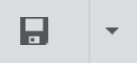
Canvas Options
Canvas options affect how you view the screen. Refer to the annotated image below to learn more about each option.
Simulator view modes:
Overflow
Check this option to see the components of a screen that occupy more space than the canvas of the simulated screen for the device selected. Click the checkbox to show the components placed outside the canvas.
User mode
Check this option to see the simulated images and texts of the components within the screen. It allows you to see how the values specified in the attributes of the components will look like in the app, instead of seeing only the space these components occupy in the screen.
Screen view modes

Treeview. Click to hide the canvas and open the treeview tab only. You won't be able to see the components in the simulator.

Simulator. Click to open the treeview tab without hiding the canvas. By default, this option is selected.
View. View modes show the position and alignment of objects. The only option available in the drop-down menu is Show Guides. It is selected by default.
Undo and Redo buttons.
Canvas zoom. Click - or + to decrease or increase the zoom on the canvas, respectively. You can also click the percentage field to type a custom percentage or click the arrow and choose a fixed option from the drop-down menu: 25%, 50%, 100%, 200% or Fit to Canvas.
Device options and orientation. These options are only available for universal apps. By selecting a device and orientation, you will be able to see in the canvas how the screen will look like in such device.
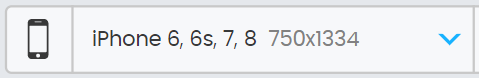
Click to open the drop-down menu and select a device or group of devices from the list. Each option includes the name of the device or devices and their screen resolution in pixels.

Click to switch orientation from landscape to portrait and vice-versa.
Languages. Click the arrow and select a language from the drop-down menu.
Important
The Languages drop-down menu contains the languages selected in you app's settings. If no languages were set, English will be the default language for the app and the Languages menu won't be displayed in the in the Visual Builder.
Device view. These options are only available for web apps.

Click to view the screen as a mobile-first project in smartphone portrait mode with the default device settings.

Click to view the screen as a mobile-first project in smartphone landscape mode with the default device settings.

Click to view the screen as a mobile-first project in tablet portrait mode with the default display settings.

Click to view the screen as a desktop-first project with the default display settings.
Once you select any of the device views, the icon is highlighted in blue and you can click the arrow to open a list of more devices and their resolutions. Click any device from the list to select it.
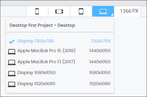
The number in pixels that appears next to the device view options is the width of the currently-selected device's resolution.
Building Tabs and Left Panel
The left panel of the Visual Builder provides a set of tabs that allow you to build and customize your screen. Read Building Tabs and Left Panel to learn more.
Canvas
The canvas is the simulator that allows you to see what the screen of your app will look like while adding or removing components and setting their attributes. It can also simulate the screen on different devices and with different resolutions.
As you drag certain types of components through the canvas, you can see the distance between them in pixels to help you with design.
Note
Certain changes made to the attributes of components (like changes to the angle and component shadows) will not be reflected in the canvas as you are working. These changes will only appear in the screen upon publishing the app.
Attributes Editor (Right Panel)
The right panel of the Visual Builder allows you to set different types of attributes for each component. The attributes to be configured will specifically depend on the selected component. Read Attributes Editor to learn more.