Components
The components list contains all components that come built-in with Studio and new components that users create. Components that appear in this list are available for use in the Components tab (left panel of the Visual Builder).
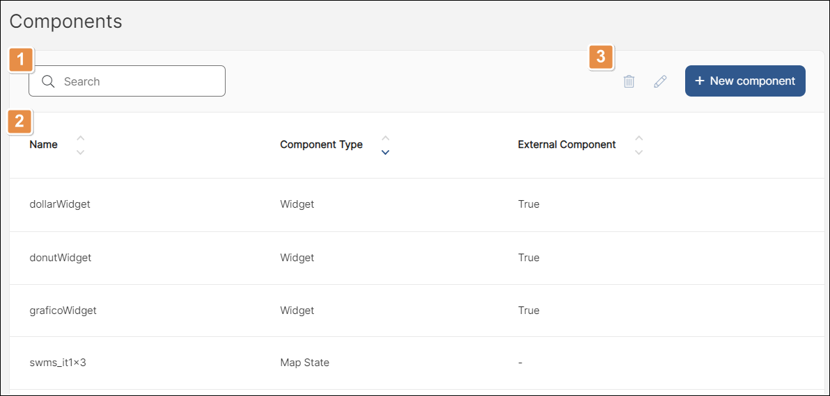
To access the components list, click Resources > Components. Refer to the annotated image below to learn more.

Search bar. You can search by name, short description, component type and service class.
List of built-in components. The table contains a row for each component and columns that show the component's name, type and whether or not it's an external component.
Actions. Select a component from the list to perform an action. If the actions appear grayed out, either no component is selected or more than one component is selected. Each icon is explained in order of appearance.
Delete
Delete the selected component.
Edit
Open the component library form where you can edit the component.
+ New component
Add a new component.
Create a Widget Component
The widget component is the only type of component that is frequently created from this page. Widgets need to be coded outside Studio, but can then be imported to the Components [List] page. Once imported, they are available for use in the Visual Builder.
Note
Widget components are available to be used in both mobile and web apps.
To create a Widget component, go to the components list page (Resources > Components) and click New. The New Component page opens. Click the drop-down menu in the Component Type field and select Widget. Complete the following fields:
Zip File | Click to open the file browser and select the zip file that contains the widget. |
ID | Add a unique component ID to your widget. This name cannot be repeated in Studio. |
The rest of the fields retrieve information automatically from the widget's code stored in the zip file. Click Save to see your component available in the components list page and in the Components tab of the Visual Builder.