Create or Edit an App Layout Template
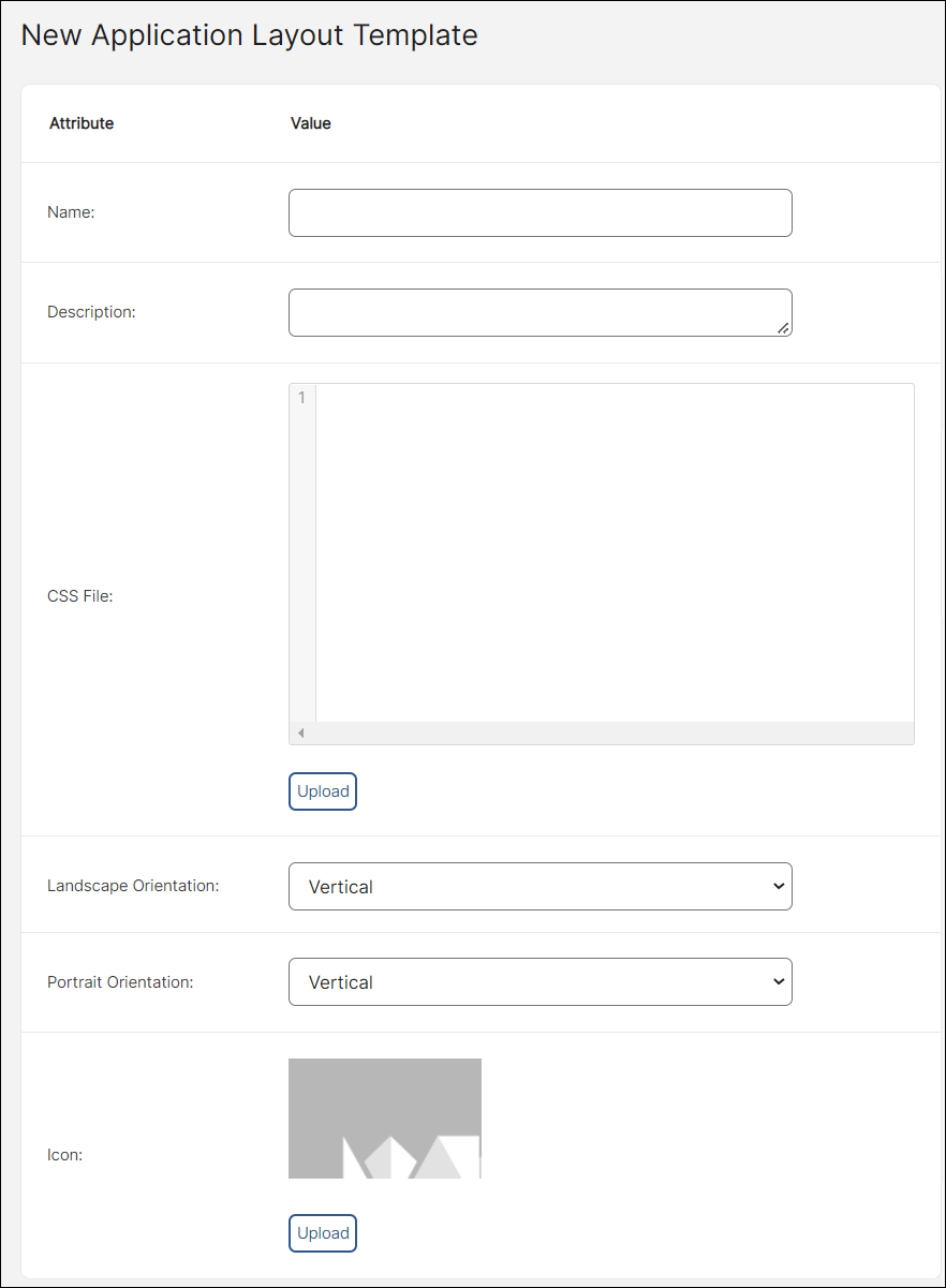
To create a new layout template, go to Style > App Layout Template and click New layout template. A creation screen appears, where you need to complete the following fields:

Name | Insert a layout name or ID. As a general rule, the name begins with the prefix LYT_ followed by a layout name. |
Description | Enter a short description to help you identify the layout template. |
CSS File | This field is not currently used. |
Landscape Orientation | Select an option from the drop-down menu to set the orientation you want your app to have when the device is in horizontal position. You can choose vertical or horizontal. |
Portrait Orientation | Select an option from the drop-down menu to set the orientation you want your app to have when the device is in vertical position. You can choose vertical or horizontal. |
Icon | Add an image that represents the design. |
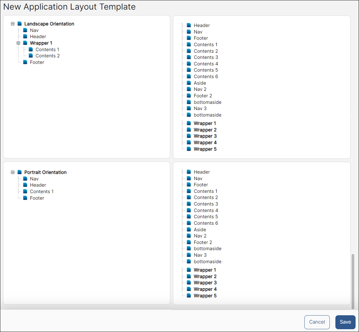
Next, there are two additional settings: Landscape Orientation and Portrait Orientation, which will allow you to add component areas in your layout template.

For each orientation box, drag and drop the component areas you want to include in your app to the corresponding field, depending on whether you are setting the layout for a landscape or a portrait orientation. The order in which the elements are organized will be reflected on the layout.
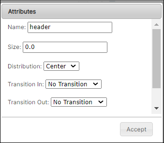
Then, set attributes for each component area you drag and drop to the left field. To edit them, double click the component you want to edit. When the pop-up window appears, complete the fields explained in the table below.

Name | Component name. This field cannot be edited. |
Size | Define a size for the selected component, being 100.0 the maximum number. The size is determined by the setting selected for Portrait and Landscape Orientation during the first step. If the setting is Vertical, it will refer to the component’s height. Sizes set for every component must add up to 100, which represents a full screen. You can read an example at the end of this article. |
Distribution | Click the drop-down arrow to choose how the component is aligned in its portion of the screen. This field is not widely used. |
Transition In | Click the drop-down arrow to choose how the component transitions into the screen. This field is not widely used. |
Transition Out | Click the drop-down arrow to choose how the component disappears from the screen. This field is not widely used. |
Transition Time | Enter a value expressed in miliseconds that will represent how much time the transitions last. This field is not widely used. |
The Wrapper component behaves differently from regular components such as the navigation or footer. The wrapper is frequently used in landscape orientations. It groups the components that are placed within it and, when editing it, allows you to assign a horizontal orientation. By doing this, every component that is part of the wrapper is displayed one next to the other. In this scenario, the size attribute for the components inside the wrapper would refer to width, and they must add up to 100.0 to cover the full screen.
To save your changes, click Save. Repeat this step with every component added to your app, for each orientation.
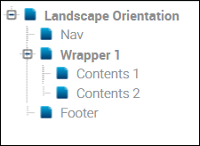
For example, if you set the Landscape Orientation as Vertical in the first step of the creation process, the size of every component within your layout template must be determined according to the height of the screen (add up max. to 100.0). For example, you can add the following components: a navigation (10.0), a header (20.0), a wrapper (60.0) and a footer (10.0). Edit the wrapper again and set its orientation to Horizontal. Inside the wrapper, drag and drop contents1 and contents2, and set their size to 50.0 each. In this case, size equals width, since height was already defined on the wrapper component. Content components are compressed inside the wrapper horizontally.
