Right Panel
The right panel of the screens editor allows you to set different types of attributes for each component. The attributes to be configured will specifically depend on the selected component. Refer to the annotated image below to learn more.
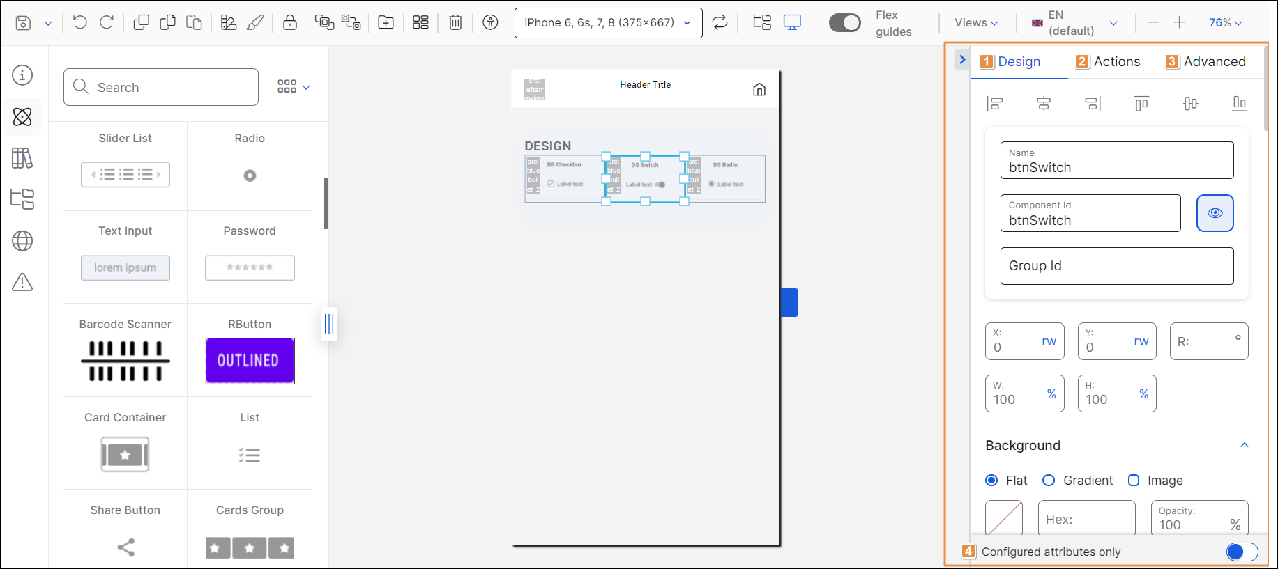
Design tab. Tab that contains the selected component's basic information and the attributes that determine how the component will look like in the app.
Actions tab. Tab that contains the attributes to set animations for a component in the screen of your app and determines how the app user invokes different effects and triggers different actions while interacting with the app.
Advanced tab. Tab that contains advanced attributes for the selected component.
Configured attributes only. By default, the toggle is deactivated (gray). If the toggle is activated (blue), the right panel only shows the attributes that are preconfigured or have been previously configured by another user. Click the toggle switch to activate or deactivate it.
Tip
Click the arrow located to the left of the Design tab (see image above) to hide the right panel. To unhide it, click the arrow again.
In the Design tab, you can configure the selected component's basic information and the attributes that determine how the component will look like in the app.
Important
Sections and attributes in the Design tab depend on the component selected. To learn how to configure a specific component, go to the Built-in Library section.
For all components, you can see and edit their basic details and alignment and size attributes. Refer to the image below to learn more.
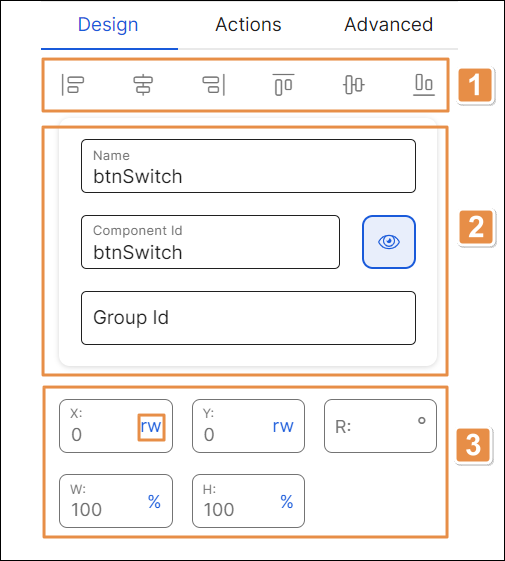
Alignment. Component alignment with regard to the X and Y axes of the canvas or the container component. Click any of the six alignment icons to place the component in the desired position. You can also set the position of your component by clicking it and moving it across the screen.
Note
The values of the X and Y fields in the position attributes section (item 3 below) will change depending on the alignment selected or the position in which you place the component in the canvas.
General information. Refer to the chart below to learn more.
Name
Name given to the component when created. To edit the name, hover the cursor over the field and, once the pencil icon appears, click it and make any required edits.
Component Id
ID given to the component when created. To edit the ID, hover the cursor over the field and, once the pencil icon appears, click it and make any required edits. The value set for the Component ID must be unique, meaning that no other components can have the same ID.
Group Id
ID given to the component when created. To edit the ID, hover the cursor over the field and, once the pencil icon appears, click it and make any required edits.
Important
Click the eye icon to hide the component within the screen. The open-eye icon closes to show that the component is now hidden. To show the component again, go to the Treeview tab in the left panel, find the component and click the closed-eye icon.
Position attributes.
X
Position of the component with regard to the X axis (horizontal line). Complete with the desired position and choose one of the units of measurement available in the drop-down menu. If you previously chose an alignment and then edit this field, the new value will override the alignment previously selected.
Y
Position of the component with regard to the Y axis (vertical line). Complete with the desired position and choose one of the units of measurement available in the drop-down menu. If you previously chose an alignment and then edit this field, the new value will override the alignment previously selected.
R
Angle with the vertical axis in which the component is positioned. If necessary, enter the desired angle.
Note
Changes made to this attribute will not reflect in the canvas.
W
Component width. Complete with the desired width of the component.
H
Component height. Complete with the desired height of the component.
In the X, Y, width (W) and height (H) fields, you can change the unit of measurement specified. To modify it, click the unit of measurement in each field (blue-colored text) and select an option from the drop-down menu. Refer to the list below to learn more about the units of measurement available.
%. Percentage.
mm. Millimeters.
in. Inches.
px. Pixels. In the case of mobile devices (including both Android and iOS operating systems), the px unit of measurement is interpreted as dp (density-independent pixels). By selecting this unit of measurement, visual components on screen are displayed consistently, regardless of the screen's density.
r. This unit of measurement should not be used.
rw. Relative width.
rh. Relative height.
br. This unit of measurement should not be used.
Important
As a best practice, you should use the px (pixels) or % (percentage) units of measurement. Remember that px is interpreted as density-independent pixels in mobile devices.
Refer to the sections below to learn more about potential categories that may appear for configuration depending on the component selected and their main purpose.