Library
The Library tab shows every reusable component created in the environment you are working on. Library components are reusable components that you can include in a screen by duplicating them or by referencing the original element. You can add an individual component to the library, or a container component that includes several components.
By default, library components are displayed in grid view. To see the library components in list view, hover over the arrow to the right of the grid icon ( ) and click List view (
 ). You can also change the sorting criteria to determine the order of the library components displayed in this tab. By default, the sorting criteria selected is Sort by component (
 ). To change it, click the arrow to the right of the opposite sides arrows icon and select Sort alphabetically (
 ) or Sort by Feature Template (
 ).
).
To find a reusable component, use the scroll bar to go through the list of components or use the search bar to find a component by typing its name.
To use a reusable component, drag and drop it from the panel into the canvas. A pop-up window opens with two options:
Link: Invokes the original component into your screen. You are not able to modify a linked library component, and any update made to the original component will then be reflected in every screen where it was invoked.
Duplicate: Creates an exact copy of the original component. You can edit the attributes of the duplicated library component.
Create a Library Component
Tip
Library components are created from existing components. Before creating a library component, check that the original component's attributes are correctly configured.
To create a new library component, select the component you wish to reuse from the canvas or the treeview. Then, click Create library on the toolbar, as shown in the image below.

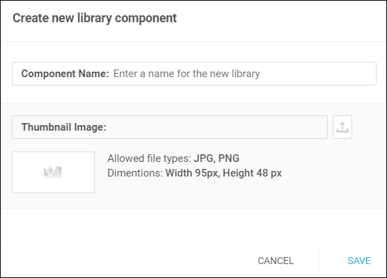
A pop-up window appears, where you need to add a name to the new library component and a thumbnail. The thumbnail image must be in .jpg or .png format and smaller than 95 (height) by 48 (width) pixels. Click Save.

The new library component appears in the library tab and you can now start using it in any screen.