[en] Repeater
[en] Platforms | [en] Mobile apps |
[en] Operating Systems |
[en] The Repeater component is a container component that allows you to build layouts in an efficient and effective manner while using dynamic data through an array. It consists of two components, the Repeater and the Repeater Item (its main child component), which represents the structure that is repeated a specific number of times.
[en] The number of times the item is repeated depends on the information configured in the array it invokes - that is to say, depending on the array data and the app user, the repeater may show different information in the published app. As opposed to other components used to create layouts, the repeater allows you to list elements using the same structure in a repetitive way and use arrays.
[en] The dinamic feature of the repeater refers to the fact that it allows you to configure only one structure and show different information for each user of the app. This results from the use of an array, that contains configured information that allows you to customize the information shown to each user according to their profile. The customized information may refer to differences in the logic or the appearance of the data. In addition, if you need to make changes to the information shown in the app, the changes must be applied to the array and you won't need to modify the configuration of the repeater in the screens editor.
[en] Depending on the project requirements, you can use one of the three structures that the repeater can have: grid, horizontal or vertical. For example, you can use the grid structure to create a main menu with the transactions that can be performed by the app user, the vertical structure to display the list of last transactions, or horizontal structure to display payment options with different means (for example, credit card or debit card).
Sugerencia
[en] You should only use a Repeater component if you need to trigger information from an array.
[en] The main benefit of this component is that it makes building efficient where you need to repeat a structure and agile since it uses an array to dinamically add information to the structure. In addition, it simplifies the treeview, given that the main structure is configured once, and makes it easier to update the components whenever required, since you need to make the changes to only one structure.
[en] To use the repeater in the screens editor, you have to add the Repeater component to the canvas and then add the Repeater Item component within the repeater. You only have to add and configure one Repeater Item component and, based on the configuration of both the Repeater and the Repeater Item, the rest of the grid will be drawn in the app.
Importante
[en] The Repeater component can only be added within a Panel or a Flex Container. As a best practice, add the repeater within a flex container to start building the screen.
[en] The Repeater component contains characteristics similar than those of the data grid and the flex container components but has several differences related to their purpose and how they are build. First of all, the repeater is the only container component that can trigger information from an array. In addition, there are other differences identified:
[en] Differences between flex container and repeater:
[en] Flex Container
[en] Repeater
[en] Allows the building of a grid but does not allow the use of arrays.
[en] Alows the building of a grid and can trigger information from an array.
[en] Allows you to build flexible layouts to position different visual structures.
[en] Repeats the same visual structure a specific number of times.
[en] Differences between data grid and repeater:
[en] Data Grid
[en] Repeater
[en] In the app screen, renders all the information without exception at the same time. In terms of efficiency, it takes more time for the information to appear on screen.
[en] In the app screen, renders the information once the user scrolls to makes them visible. If compared to the data grid in terms of efficiency, it takes less time for the information to appear on screen.
[en] Can only be configured vertically.
[en] Can be configured vertically, horizontally and as a grid with a specific number of columns.
[en] Enables the configuration of dynamic layouts using an array but cannot be displayed in grid format.
[en] Enables the configuration of dynamic layouts using an array in grid format.
[en] Since it does not allow the building of a grid, screen accessibility attributes do not work properly for screen readers.
[en] Accessibility attributes work properly and the screen reader can read the information of each component within the grid in an organized manner (from top to bottom, from left to right).
[en] As it is a container component, the repeater structure can only contain specific components as children components. First of all, the Repeater component can only contain a Repeater Item as child within it. Then, the Repeater Item can only contain certain components - some components can't be added to a repeater item and, if added, the app won't render them. Refer to the chart below to learn more.
[en] Repeater Item can contain | [en] Repeater Item cannot contain |
|---|---|
[en] Flex Container | [en] Animated |
[en] Text Label, | [en] Barcode Scanner |
[en] Image | [en] Calendar Period |
[en] Icon | [en] Card Container |
[en] ButtonDS | [en] Data Grid |
[en] CheckBoxDS | [en] Data Table |
[en] Switch DS Radio | [en] DS Progress Indicator |
[en] Map | |
[en] Panel | |
[en] Photo, | |
[en] Text Input | |
[en] Vertical Bar Chart | |
[en] Video | |
[en] Configured components |
[en] How to use a repeater component in your app
[en] This section includes a use case that explains how you should use and configure a repeater component to fulfill a request made by Goldbank, your client.
[en] GoldBank asks you to redesign the services main menu within the app homepage. This request involves adding a new screen, with a grid menu that contains all the transactions (Pay with QR, Withdrawal, Transfer) that can be performed by the app users. In addition, GoldBank specified that the services that appear in the app will depend on the app user profile - the profile definition is made by the client. The background of the screen must be the same accross the entire app, a specific shade of grey (#eeeeee). but each transaction available must be shown on a white background and have rounded corners. Each transaction must contain an icon and a text representing the action that the user can execute.
[en] For this example purposes, the use case will only give you instructions on how to build and configure the main menu of the screen, which contains the repeater component. Refer to the instructions below to learn more about how to configure the screen according to the client's requirements.
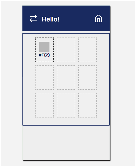
[en] In this case, you should use the repeater component for two main reasons:
[en] The repeater will allow you to set a grid menu with an organized and repetitive structure within it, and will allow screen readers to read the information set in the component in a proper manner (from top to bottom, from left to right).
[en] The repeater will allow you to configure only one structure and trigger information from an array; the array will have dinamic information set, and based on that configuration, each user will see different information in the app based on their category. As a result, you won't need to configure one repeater structure per user category.
[en] Once you get the information about the project requirements and the design of the screen, you must set the array that will contain the information to be consumed by the repeater component.
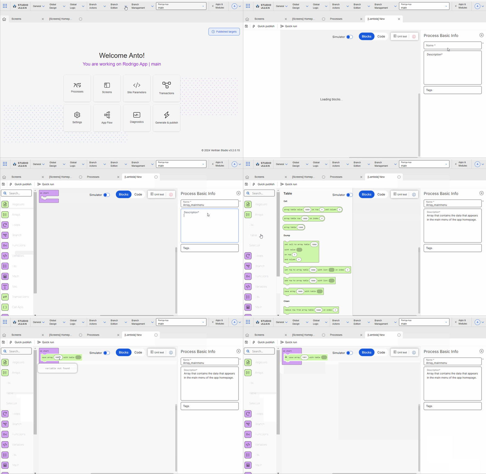
[en] In the Overview, go to Branch Edition > Processes.
[en] In the Lambda processes tab that opens, Click + New lambda process.
[en] Configure the settings of the process:
[en] In the Name field enter Enter Array_mainmenu .
[en] In the Description field enter Array that contains the data that will appear in the main menu of the homepage.
[en] In the On start block, start configuring the process:
[en] Go to the blocks list and click Arrays.
[en] Click Table and drag and drop the Save array with table block.
[en] In the blank field, enter 1001, which represents the number that will identify the array when invoked from the screens editor.
[en] In the save array block, enter the block array of and then add 7 more array of blocks, where you will add the information that represents the icons and text labels that will appear in the main menu of the app homepage.
[en] Considering the information provided by the client, configure the fields of each row in the array. Information in the array is represented in columns. In this case, the first column represents the order of the data, the second represents the names of the transactions available for users, and the third represents the names that identify the icons that appear for each transaction. Enter the information as shown in the image below.
Importante
[en] Icons must be uploaded in the Assets section (Global Design > Assets) when the project begins. Then, they can be invoked by their name.
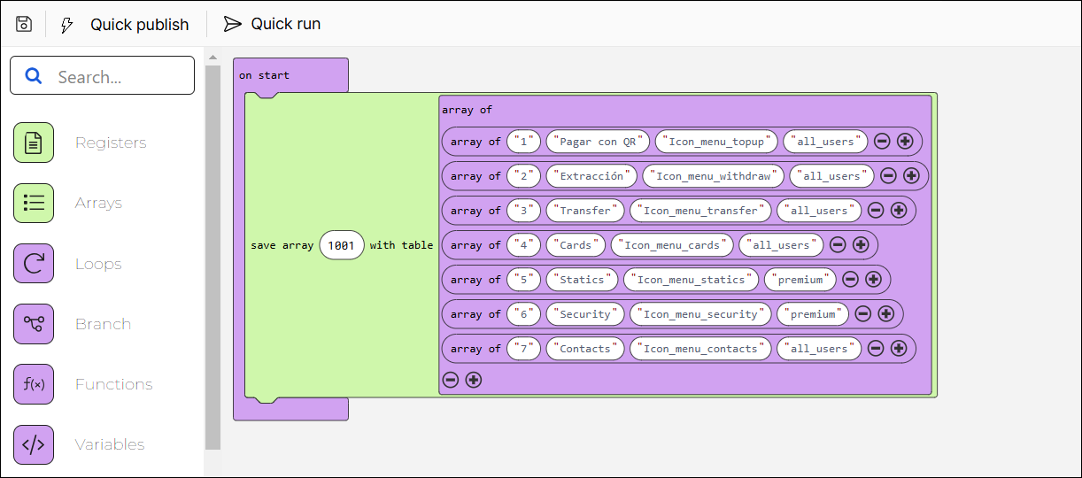
[en] To learn more about lambda processes and how to configure them, read Lambda Processes .
Nota
[en] The array data invoked from the screens editor will appear on screen when the app is published. The information and icons won't be displayed in the screens editor.
[en] Once you have defined the array, you can start working on the screen building process.
[en] Go to the GoldBank app. In the Overview, click Screens.
[en] Click + New screen to open the screens editor.
[en] In the screens editor, go to the left panel and then go to the Info tab. Add a name to identify the screen, for example: Homepage_mainmenu, and a description including information about the purpose of the screen, for example: Screen that includes the transactions that users can perform in the app. In addition, add the sequence. You can also add tags to easily find the screen in the screens list in the future, for example: repeater and transactions main menu .
[en] Click Save (diskette icon) to save the Info changes before editing the screen. The Commit message modal opens, where you have to enter a description informing why the screen was created or edited for the branch previously selected. You can also add the Jira ticket where the request was defined, if applicable. Then, click Save and continue.
[en] As the best practice, you must add the parent flex container to the canvas and configure it. Within this flex container, you will add secondary flex containers that will represent the sections within the screen. In this case, you will add only one secondary flex container, where you will include the repeater component.
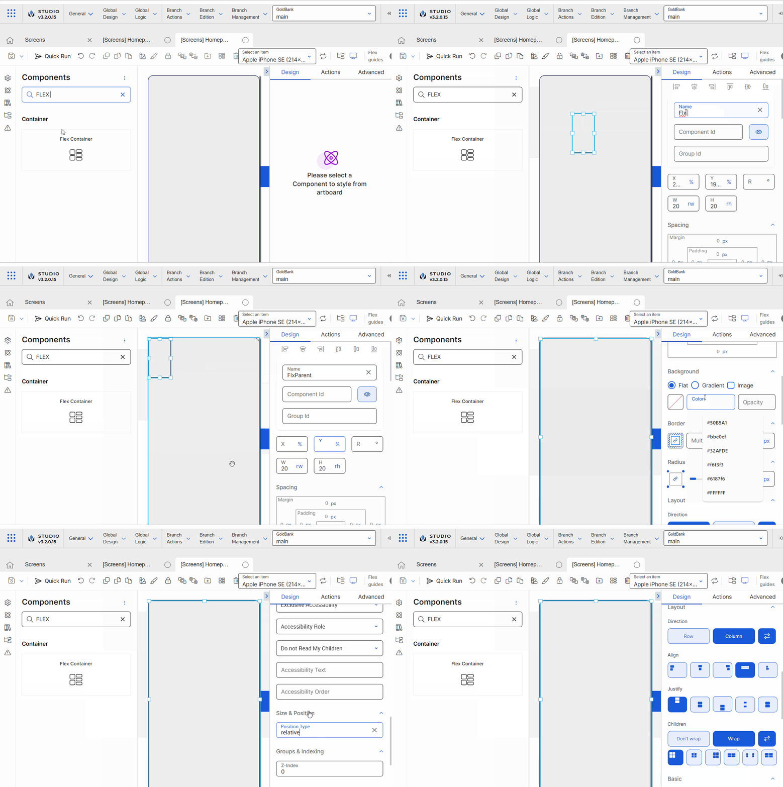
[en] Go to the left panel and go to the Components tab. Type Flex Container in the search bar or find it in the list. Then, drag and drop it into the canvas to use it as a main flex to contain any other flex containers within it.
[en] Go to the right panel and change the Name attribute to FlxParent.
[en] Go to the position and alignment section. Delete the values in the X and Y attributes. In the W and H attributes, enter 100 and select % (percentage) as unit of measurement, so that the flex container covers the entire screen (both in length and width).
[en] As required under the project's design, go to the Background section and enter a color for the flex container's background. In this case, enter #eeeeee, which is the hexadecimal code that represents the shade of grey defined for the app according to the client's requirements.
Sugerencia
[en] As a best practice, enter the hexadecimal code for the color required instead of selecting a color from the color picker.
[en] Go to the Layout section. In the Children section, select Wrap so that, if the components within the flex container exceed its maximum width, they are placed below the rest of the components. Then, from the wrapping options that appear, select Start.
[en] In the Direction subsection, select Column, so that the components within the flex run from the top to the bottom of the container.
[en] In the Align subsection, select stretch, so that the components inside the flex container are aligned and stretch across the entire space of the container.
[en] In the Justify subsection, select start, so that the components within the flex are placed at the top part of the container.
[en] In the Children section, select Wrap so that, if the components within the flex container exceed its maximum width, they are placed below the rest of the components. Then, from the wrapping options that appear, select Start.
[en] Go to the Size & Position section. In the Position type field, select Relative.
Sugerencia
[en] As a best practice, the parent flex container, secondary flex containers, and children components must have the Position Type defined in Relative. With the Relative positioning, children components are aligned one after the other according to the parent flex container layout (either in columns or rows). In addition, if the size of a child component is modified, relative positioning will allow all the children components to reorganize automatically, to avoid overlapping between them.
[en] Configure the two first secondary first containers that will appear in the top section of the screen. The first flex container will contain a Hello! message for the app user and two icons, that, when clicked, allow the user to switch accounts or go to the homepage, respectively. For purposes of this example, the instructions below only explain how to add the first flex container but not its content. The second secondary flex container will then include the repeater component.
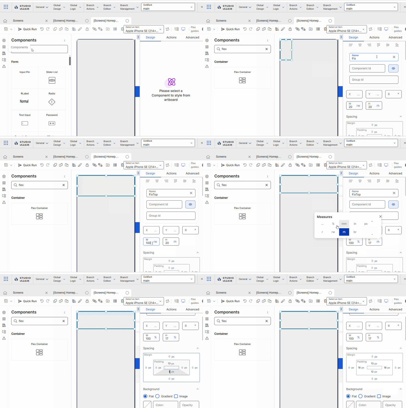
[en] Go to the left panel and add a second flex container, that will include the welcome message and icons. Change the name to FlxTop.
[en] Go to the position and alignment section. Enter 100 in the width (W) attribute and enter 17 in the height (H) attribute. For both attributes, select % as unit of measurement.
[en] Go to the Spacing section. Enter 13 in the top paddingand 12 in the bottom padding. Then, enter 18 in the left and right padding.
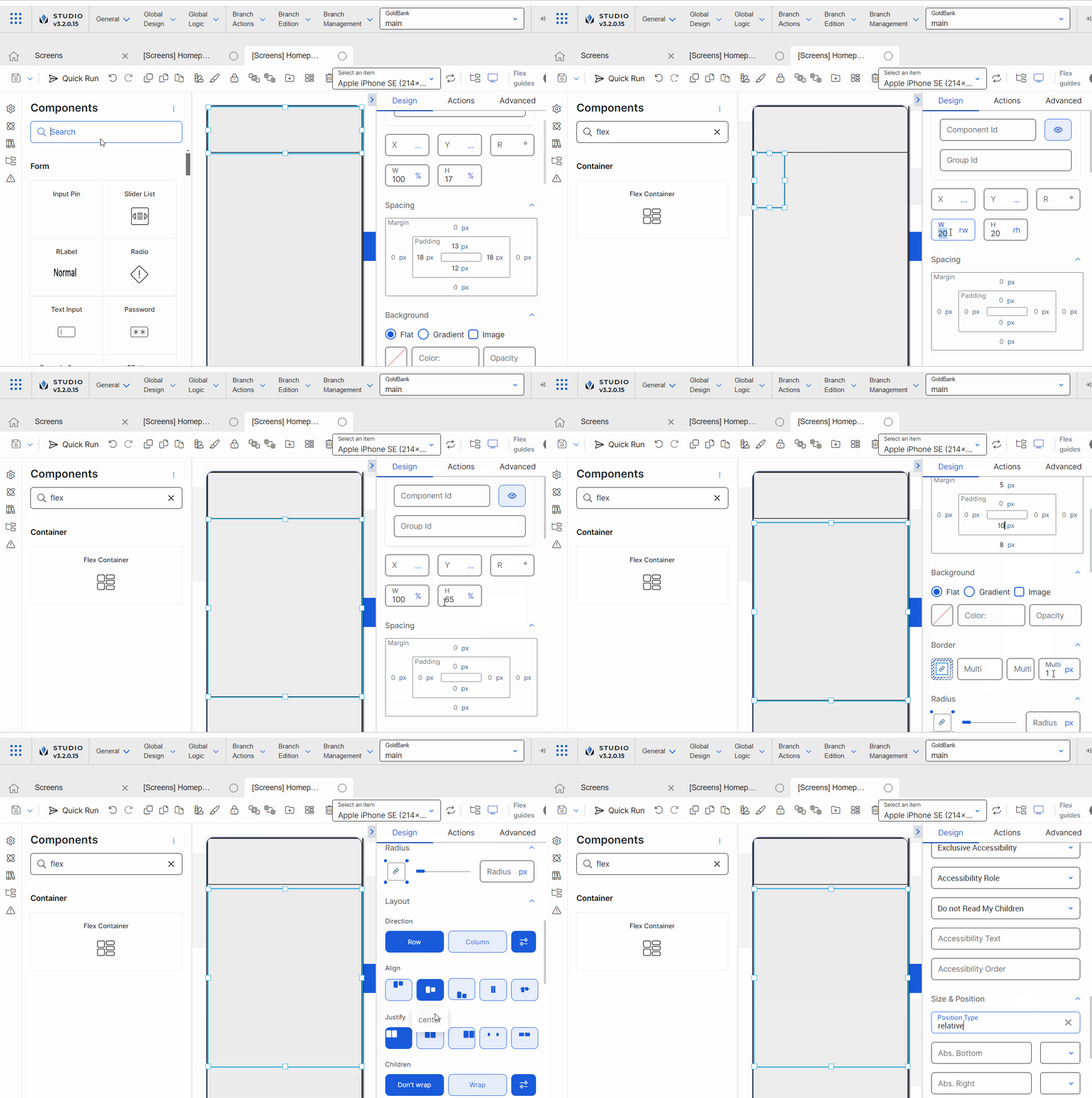
[en] Go to the left panel and add a third flex container, that will include the main menu. Change the name to FlxMenu.
[en] Go to the position and alignment section. Enter 100 in the width (W) attribute and enter 65 in the height (H) attribute. For both attributes, select % as unit of measurement.
[en] Go to the Spacing section. Enter 5 in the top margin and 8 in the bottom margin. Then, enter 10 in the bottom padding.
[en] Go to the Border section and delete the number 1 that appears by default.
[en] Go to the Layout section. In the Direction subsection, click Row. In the In the Align subsection, select center, In the Justify subsection, select Space Between. In the Children section, select Wrap and then Start.
[en] Go to the Size & Position section. In the Position Type attribute, select Relative.
[en] Configure the repeater that will set the structure of the grid that represents the main menu in the homepage.
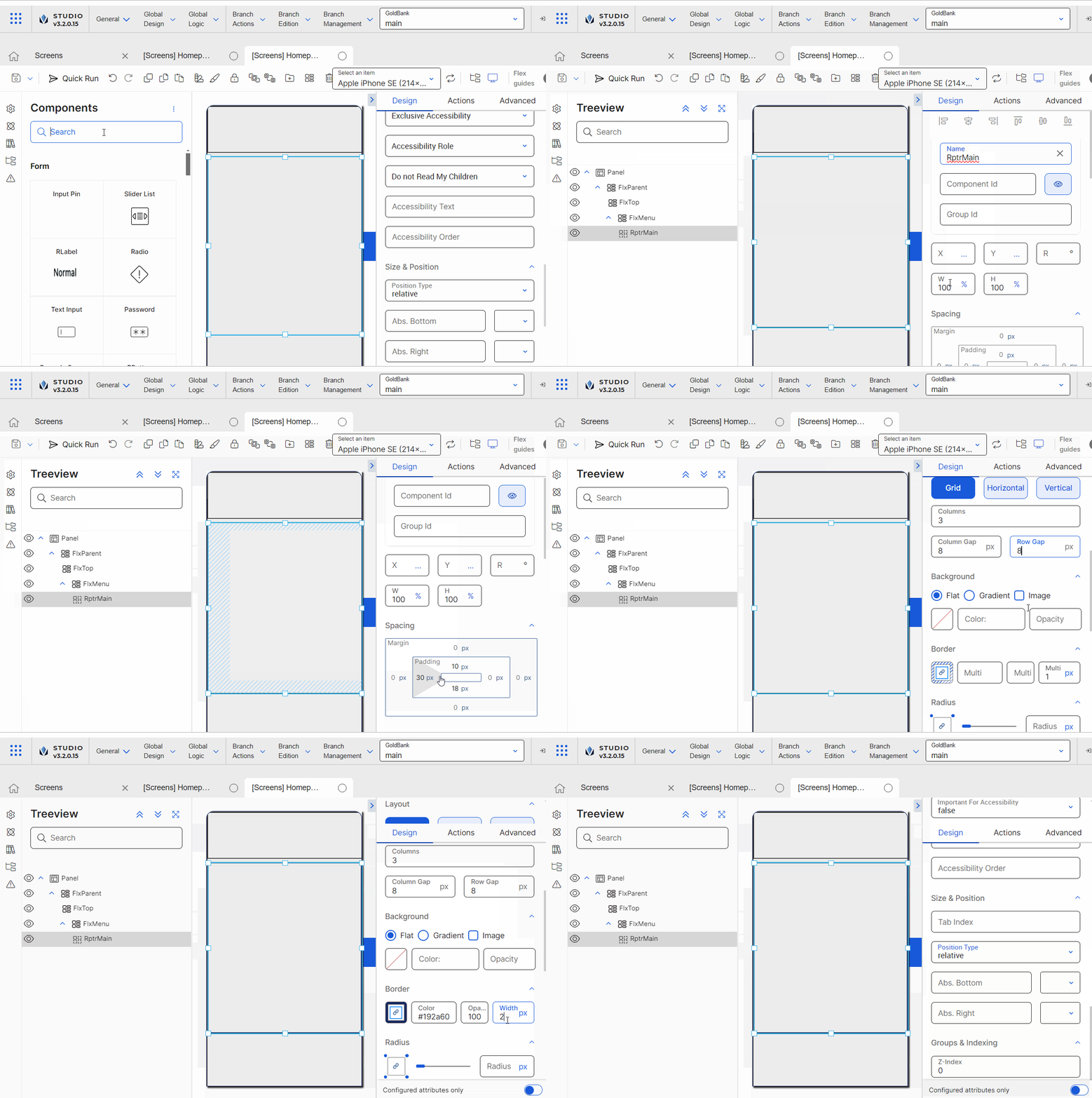
[en] Go to the left panel and go to the Components tab. Type Repeater in the search bar or find it in the list. Then, drag and drop it into the canvas to use it as the container and then add the repeater item within it.
[en] Go to the right panel and change the name to RptrMain.
[en] Go to the position and alignment section. Enter 100 in the width (W) attribute and enter 100 in the height (H) attribute. For both attributes, select % as unit of measurement.
Importante
[en] In the case of the Repeater component, configuring the height (H) is mandatory. Since the content in the repeater structure is dinamic, if the information in the repeater item occupies more space than the height defined, the component will automatically allow the user to scroll down without configuring other attributes. As a result, the app user will be able to scroll down to see all the data it contains.
[en] Go to the Spacing section. Enter 10 in the top padding and 18 in the bottom padding, and 30 in the left and right paddings.
Nota
[en] The definition of margins and paddings depends on the design of the app and the specifications given by the app designers from the beginning of the project.
[en] Go to the Layout section.
[en] In the direction section, select Grid, so that the structure of the repeater is displayed as a grid menu.
[en] In the Columns field, enter 3 so that the grid contains three columns.
[en] In the Column Gap field, enter 8px, so that the gap between the three columns is 8px.
[en] In the Row Gap field, enter 8px, so that the gap between the rows of the grid menu is 8px.
Nota
[en] Based on the configuration of the Spacing section, and the values entered in the Layout section, the repeater will display the number of items that fit in it, considering the space it has with regard to the flex container in which it is included.
[en] Go to the Border section. In the Color field, enter the hexa code #192a60. In the Width field, enter 2 and leave the px unit of measurement selected.
[en] Go to the Basic section. In the Array field, enter 1001, which is the id of the array that contains the information related to the transactions that will appear available in the grid menu of the app.
[en] Go to the Size & Position section. In the Position type field, select Relative.
[en] Configure the item that represents each of the items that will be included in the grid menu. This component must only be configured once, and, based on its configuration, the app will trigger the dynamic data as defined in the array invoked.
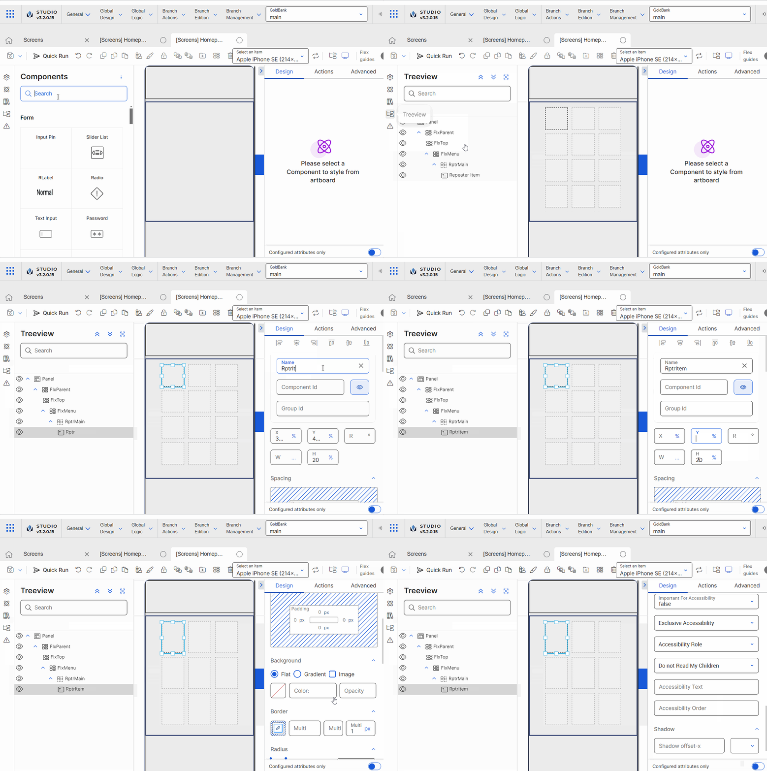
[en] Go to the left panel and go to the Components tab. Type Repeater Item in the search bar or find it in the list. Then, drag and drop it into the repeater component.
[en] Go to the right panel and change the name to RptrItem.
[en] Go to the position and alignment section. Enter 29 in the height (H) attribute and select % as unit of measurement.
[en] Now, you have to configure the two components that represent the transactions available in the grid menu: an icon and a text label. These components will invoke the array previously configured and display the data when the app is published. Additionally, given the purpose of the repeater, the rest of the elements within the repeater will also use the dynamic information specified in the array.
Importante
[en] You only need to configure one repeater item per repeater structure.
[en] Configure the icon that will appear within the repeater item. In the app, the icon will include the image related to the transaction that the user can execute. The label will use the information obtained from the array defined.
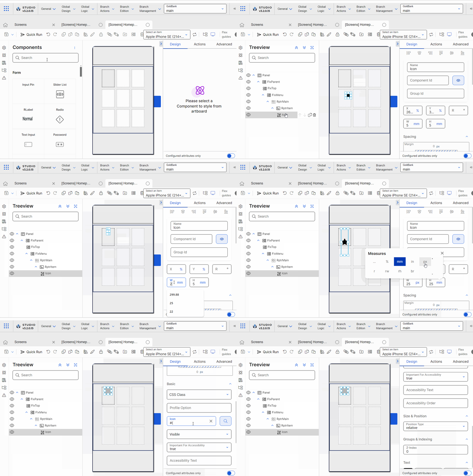
[en] Go to the left panel. Type Icon and drag and drop it inside the repeater item into the canvas.
Sugerencia
[en] Go to the Treeview tab to make sure that children components are correctly placed within each flex container.
[en] Go to the position section. Delete the values in the X and Y fields. Enter 5 in the Y field and leave % as unit of measurement selected. Then, enter 25 in the width (W) attribute and enter 25 in the height (H) attribute and select px as unit of measurement.
[en] Go to the Basic section. In the Icon field, enter #F{3}. This number represents the column in the array where the data must be obtained. Since the repeater item is placed in the first element of the repeater structure, the system will use the first value defined in the array in the third column (from top to bottom of the list). Then, the rest of the of the elements will show the information of the array according to their location within the repeater structure and the column specified. For example, the third element in the repeater structure will show the values set in the third row and third column of the array.
[en] Go to the Size & Position section. In the Position Type attribute, select Relative.
[en] Configure the label that will appear within the repeater item. In the app, the label will include the name of the transaction that the user can execute. The label will use the information obtained from the array defined. For example, Pay with QR.
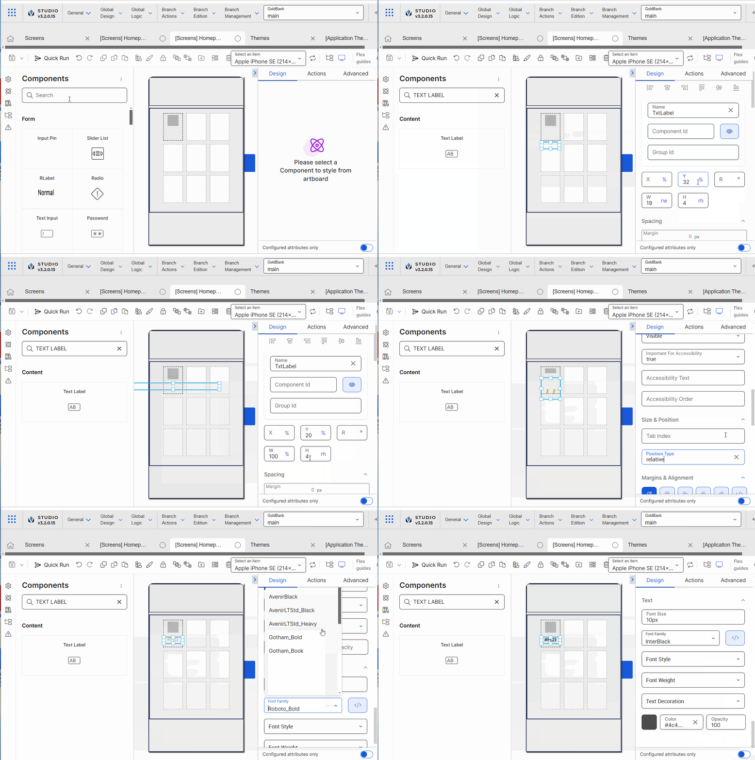
[en] Go to the left panel. Type Text label and drag and drop it inside the repeater item into the canvas.
Sugerencia
[en] Go to the Treeview tab to make sure that children components are correctly placed within each flex container.
[en] Go to the right panel and change the name to TxtLabel.
[en] Go to the position section. Delete the values in the X and Y fields. Enter 20 in the Y field and leave % as unit of measurement selected. Enter 100 in the width (W) attribute and select % as unit of measurement.
[en] Go to the Basic section. In the Value field, enter #F{2}. This number represents the column in the array where the data must be obtained. The system will use the first value defined in the array in the third column (from top to bottom of the list).
[en] Go to the Size & Position section. In the Position Type attribute, select Relative.
[en] In the Margins & Alignment section, select center.
[en] Go to the Text section. In the Font Size field, enter 10px. In the Font Family field select InterBlack. Then, go to the Color field, click the color picker and enter #4C4C4C in the Hexa field.
[en] Attributes Specifications
[en] Refer to the section below to learn more about all the right panel attributes that appear for configuration when you drag and drop the two components that must be used to configure a repeater into the canvas.
Importante
Esta sección es solo para fines informativos. Configura los atributos del componente según los requisitos de tu proyecto.
[en] Repeater
[en] The sections below describe the sections available for confirmation for the Repeater component.
Importante
[en] For the repeater component, the only units of measurement that must be used in the right panel are % and px.
[en] Design tab
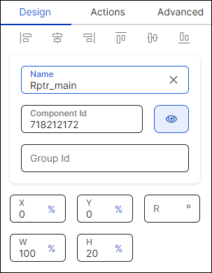
Nota
[en] Alignment attributes cannot be configured.
[en] First of all, you must change the name of the repeater to represent its position within the screen layout. For example, if it is the main repeater, the name can be Rptr_main.
[en] Then, you can configure the position attributes, which affect the position of all the children components within it, as specified in the table below.
X | [en] Position of the repeater in the canvas with regard to the x axis. Enter a number in the field and then select the % or px unit of measurement. |
Y | [en] Position of the repeater in the canvas with regard to the x axis. Enter a number in the field and then select the % or px unit of measurement. |
R | [en] Angle with the vertical axis in which the repeater is positioned. This attribute should not be configured for the repeater component. |
W | [en] Width of the component with regard to the screen size. |
H | [en] Height of the component with regard to the screen size. |
[en] In the case of the repeater component, the Spacing section allows you to define the margin and padding properties.
[en] Padding properties | [en] Space between the component's border and the component's content (value). To configure the paddings, click the number field of each margin (left, right, top, bottom) and enter the desired value. Then, click the unit of measurement located to the right and select the px or % option from the list. |
[en] Margin properties | [en] Space around a component's border. To configure the margins, click the number field of each margin (left, right, top, bottom) and enter the desired value. Then, click the unit of measurement located to the right and select the px or % option from the list. |
[en] Direction | [en] Alignment of the structure of the repeater. The alignment will be represented by the repeater item included within it.
| ||||||
[en] Columns | [en] Number of columns in the repeater. The number depends on the type of direction selected. If you selected Grid direction, the number must be between 2 and 6. In the case of Horizontal or Vertical direction, this attribute appears grayed out: Horizontal does not have columns and Veritcal has 1 defined by default. | ||||||
[en] Column Gap | [en] Space between columns in the repeater. To configure it enter a number followed by the px or % unit of measurement. For example, 2px. This atribute is only avaialble if you selected Grid or Horizontal direction. | ||||||
[en] Row Gap | [en] Space between rows in the repeater. To configure it enter a number followed by the px or % unit of measurement. For example, 2px. This atribute is only avaialble if you selected Grid or Vertical direction. |
[en] Flat | [en] Click the Flat radio button to set a single color for the component's background. To set the color, click the field and type a hexa code or click the rounded-edges square icon to open the color picker. In the color picker, enter the hexa color code. [en] You can also set the opacity percentage outside the color picker in the Opacity field. If you previously selected a color in the color picker, the opacity is set in 100 by default. If no color was selected, this field is empty. To modify it, click the field and enter the desired percentage. Sugerencia[en] As a best practice, if a color is already defined, the opacity field should not be modified. |
[en] Gradient | [en] Click the Gradient radio button to set a color gradient for the component's background. Click each of the rounded-edges square icons to open the color picker. In the color picker, enter the hexa color code in the Hexa field. Click |
[en] Background Image | [en] This atribute should not be used for the repeater component. |
Nota
[en] If you select the Flat background, you cannot choose the Gradient background and vice versa. The Background Image option is available in both cases.
[en] To set all the borders of the component, click the chain link icon in the middle of the square. The chain appears unbroken and all the inner borders of the square turn blue.
[en] To configure the attributes of borders individually, click the desired border of the square icon; the border selected turns blue and the chain link icon appears broken. Remember to configure attributes for each border you want to customize.
[en] Then, you must set the color and width of the border or borders you want to configure. Refer to the table below to learn more.
[en] Color | [en] Border color. To set the color, click the field and type a hexa code or click the rounded-edges square icon to open the color picker. In the color picker, enter the hexa color code. |
[en] Width | [en] Border width. Type a number to set the width. To change the unit of measurement, click the ellipsis (three dots) and select an option from the drop-down menu. |
[en] By default, all the component's corners appear selected. The chain appears unbroken and the dots representing each corner of the square turn blue. If you use this option, the same attributes will be applied to all corners.
[en] To configure the attributes of corners individually, click the desired corner of the square icon; the dot in the selected corner turns blue. Remember to configure attributes for each corner you want to customize.
[en] To increase or decrease the radius size of the borders or a specific border, type the value in the Radius field. To change the unit of measurement, click the unit of measurement selected (blue-colored text) and choose an option from the drop-down menu.
[en] Array | [en] Number that identifies the array that includes the data that will be included in the repeater structure. Enter the respective array number, that you defined when you created the lambda process. |
[en] Selected Item Index | [en] Attribute that defines where the selected item will be stored. Enter a register number. Then, when you invoke the register in any other attribute, the app user will be taken to the item selected. |
[en] Visible | [en] Attribute that defines whether the component is visible in the app. Click the arrow and choose an option from the drop-down menu. Select true so that the component is visible in the app or false so that it is not visible. This attribute is only applicable for mobile apps. |
[en] Visibility | [en] Attribute that defines whether the component is visible in the app. Click the arrow and choose an option from the drop-down menu. Select visible so that the component is visible in the app or none so that it is not visible. This attribute is only applicable for web apps. |
[en] Important For Accessibility | [en] Attribute that defines whether the screen reader reads or ignores the value defined in the Accessibility Text attribute of the component. Click the arrow and select an option from the drop-down menu. Choose true so that the screen reader reads the component or false so that the screen reader does not read the component. The default value is false. |
[en] Accessibility Text | [en] Alternative text. Add a short text to describe the component to users who may not be able to see it. The text will be read by iOS Voice Over or Android Talk Back. You can also add the accessibility text to the translations dictionary or select an existing translation if there are languages selected in your branch settings. |
[en] Accessibility Order | [en] Attribute that tells the screen reader the order in which it must read the components. To configure it, click the field and enter a number to define the order. For example, if this component should be read in third place, enter the value 3. If you don't configure a custom order, components are read from top to bottom and left to right of the screen. |
[en] Tab Index | [en] Order in which the cursor moves from one component to another and focuses on each component by pressing the TAB key on a keyboard. This attribute is only available for web apps. Click the field and enter a value. | ||||||
[en] Position Type | [en] Click the arrow and select a type from the drop-down menu. As a best practice, select Relative. [en] Refer to the table below to learn more about the options available.
|
[en] Z-Index | [en] Property that defines the components' position order. If several components overlap, components with a higher Z-index will be placed over those with a lower index. This field is filled in automatically. |
[en] Actions tab
[en] In this section, you can set events or actions on the component that will be triggered by other certain actions. For example, if the action configured is "On Click", an event or action will be triggered when the app user clicks the component. Refer to the table below to learn more about each action.
[en] On Click | [en] Action involving clicking or tapping the component. |
[en] On end reached | [en] Action to be executed when the user scrolls down. This event enables infinite scroll. |
[en] In all cases, to set the event or action, type the action to be triggered in the corresponding field or click the vertical three-dot icon. The Create new link window opens. Click the down arrow and select one of the link types available in the drop-down menu: View, SW States, Process, Lambda, Pop Up, Toggle, Event, Link, Mail, Module Screen or Interface Message. A new drop-down menu appears. Click the down arrow and select the action or event within the selected type. Then, complete the parameters applicable to the option selected. Once you configure the required parameters, click Accept.
[en] Repeater Item
[en] Design

Nota
[en] Alignment attributes cannot be configured.
[en] First of all, you must change the name of the repeater to represent its position within the screen layout. For example, if it is the main repeater, the name can be Rptr_main.
[en] Then, you can configure the position attributes, which affect the position of all the children components within it, as specified in the table below.
X | [en] Position of the repeater in the canvas with regard to the x axis. Enter a number in the field and then select the % or px unit of measurement. |
Y | [en] Position of the repeater in the canvas with regard to the x axis. Enter a number in the field and then select the % or px unit of measurement. |
R | [en] Angle with the vertical axis in which the repeater is positioned. This attribute should not be configured for the repeater component. |
W | [en] Width of the component with regard to the screen size. Importante[en] If you build a repeater component with a grid structure, you must not configure the width since the component width is defined by the width of the Repeater and if configured, the value won't be considered. |
H | [en] Height of the component with regard to the screen size. Importante[en] The height defined in this attribute will depend on the height defined in the Repeater (parent component). For example, if you configure the repeater item height in 20%, and you previously configured the parent repeater height in 50px, the height of the item will be 20% over the 50px of the repeater. |
[en] In the case of the Repeater Item component, the Spacing section only allows you to define the padding properties, since margins are defined by the Column Gap attribute defined in the Repeater (parent component).
[en] Padding properties | [en] Space between the component's border and the component's content (value). To configure the paddings, click the number field of each margin (left, right, top, bottom) and enter the desired value. Then, click the unit of measurement located to the right and select the px or % option from the list. |
[en] Flat | [en] Click the Flat radio button to set a single color for the component's background. To set the color, click the field and type a hexa code or click the rounded-edges square icon to open the color picker. In the color picker, enter the hexa color code. [en] You can also set the opacity percentage outside the color picker in the Opacity field. If you previously selected a color in the color picker, the opacity is set in 100 by default. If no color was selected, this field is empty. To modify it, click the field and enter the desired percentage. Sugerencia[en] As a best practice, if a color is already defined, the opacity field should not be modified. |
[en] Gradient | [en] Click the Gradient radio button to set a color gradient for the component's background. Click each of the rounded-edges square icons to open the color picker. In the color picker, enter the hexa color code in the Hexa field. Click |
[en] Background Image | [en] This atribute should not be used for the repeater item component. |
Nota
[en] If you select the Flat background, you cannot choose the Gradient background and vice versa. The Background Image option is available in both cases.
[en] To set all the borders of the component, click the chain link icon in the middle of the square. The chain appears unbroken and all the inner borders of the square turn blue.
[en] To configure the attributes of borders individually, click the desired border of the square icon; the border selected turns blue and the chain link icon appears broken. Remember to configure attributes for each border you want to customize.
[en] Then, you must set the color and width of the border or borders you want to configure. Refer to the table below to learn more.
[en] Color | [en] Border color. To set the color, click the field and type a hexa code or click the rounded-edges square icon to open the color picker. In the color picker, enter the hexa color code. |
[en] Width | [en] Border width. Type a number to set the width. To change the unit of measurement, click the ellipsis (three dots) and select an option from the drop-down menu. |
[en] By default, all the component's corners appear selected. The chain appears unbroken and the dots representing each corner of the square turn blue. If you use this option, the same attributes will be applied to all corners.
[en] To configure the attributes of corners individually, click the desired corner of the square icon; the dot in the selected corner turns blue. Remember to configure attributes for each corner you want to customize.
[en] To increase or decrease the radius size of the borders or a specific border, type the value in the Radius field. To change the unit of measurement, click the unit of measurement selected (blue-colored text) and choose an option from the drop-down menu.
[en] Direction | [en] Direction of the item within the repeater. Click Row so that repeated items are organized in rows or click Column so that repeated items are organized in columns. You can also click the two-way arrows icon ( Nota[en] The Alignment and Justify options change depending on the Direction selected. |
[en] Align | [en] Alignment of the item within the repeater with regard to the container's space. If you selected Row in the Direction section, click an option to define the alignment of the items considering them as in a row. If you selected Column in the Direction section, click an option to define the alignment of the items considering them as in a column. The options available are: Start, center, End, stretch, baseline. |
[en] Justify | [en] Justification of the item within the repeater with regard to the container's space. The options available are: Start, center, End, Space Between, Space Around. |
[en] Children | [en] Organization of item when the maximum width of the repeater is reached. Click Don't Wrap so that items exceeding the maximum width of the repeater are not placed below the rest of the items, or click Wrap so that items exceeding the maximum width of the repeater are placed below the rest of the items. Then, select one of the wrapping options so that the items are organized according to a specific area of the repeater. The options available are: Start, center, End, stretch, Space Between or Space Around. You can also click the two-way arrows icon ( |
[en] CSS Class | [en] This atribute should not be used for the repeater item component. |
[en] Important For Accessibility | [en] Attribute that defines whether the screen reader reads or ignores the value defined in the Accessibility Text attribute of the component. Click the arrow and select an option from the drop-down menu. Choose true so that the screen reader reads the component or false so that the screen reader does not read the component. The default value is false. |
[en] Exclusive Accessibility | Atributo que define qué componentes deben ser leídos por el lector de pantalla. Haz clic en la flecha y selecciona una opción del menú desplegable. Selecciona true para indicar al lector de pantalla que dé prioridad a este componente y a sus componentes hijos e ignore todos los demás componentes de la pantalla. Selecciona false para indicar al lector de pantalla que lea todos los componentes de la pantalla. Si no se configura, el comportamiento del atributo por defecto es false. |
[en] Accessibility Role | Atributo que indica al lector de pantalla que lea la función del componente. Haz clic en la flecha y selecciona una opción del menú desplegable. Las opciones disponibles son button, checkbox, image, imageButton, link, none, radioButton, search y switch. Elige la opción que mejor se adapte a la función que desees dar al componente en la pantalla. |
[en] Do Not Ready My Children | Atributo que define si el lector de pantalla debe leer los componentes hijos dentro del componente contenedor. Haz clic en la flecha y selecciona una opción del menú desplegable. Elige true para que el lector de pantalla lea los componentes hijos o false para que no los lea. Para apps móviles, si el atributo no está configurado, el comportamiento por defecto es falso. |
[en] Accessibility Text | [en] Alternative text. Add a short text to describe the component to users who may not be able to see it. The text will be read by iOS Voice Over or Android Talk Back. You can also add the accessibility text to the translations dictionary or select an existing translation if there are languages selected in your branch settings. |
[en] Accessibility Order | [en] Attribute that tells the screen reader the order in which it must read the components. To configure it, click the field and enter a number to define the order. For example, if this component should be read in third place, enter the value 3. If you don't configure a custom order, components are read from top to bottom and left to right of the screen. |
[en] Shadow offset-x | [en] Enter a value for the shadow with regard to the X (horizontal) axis, which considers the center of the component as a starting point. If the value is a negative number, the shadow will point to the left. You can click the arrow located to the right of the shadow field and select a unit of measurement from the drop-down menu. |
[en] Shadow offset-y | [en] Enter a value for the shadow with regard to the Y (vertical) axis, which considers the center of the component as a starting point. You can click the arrow located to the right of the shadow field and select a unit of measurement from the drop-down menu. |
[en] Shadow Blur Radius | [en] Enter a value for the width of the shadow radius. You can click the arrow located to the right of the shadow field and select a unit of measurement from the drop-down menu. |
[en] Shadow Color | [en] To set the shadow color, click the field and type a hexa code or click the rounded-edges square icon to open the color picker. In the color picker, click the Hexa field and type a HEXA color code. |
Atención
[en] Shadow attributes are not implemented for mobile apps.
[en] Actions tab
[en] In this section, you can set events or actions on the component that will be triggered by other certain actions. For example, if the action configured is "On Click", an event or action will be triggered when the app user clicks the component. Refer to the table below to learn more about each action.
[en] On Double Click | [en] Action involving double clicking or tapping the component. |
[en] On Hold | [en] Action involving clicking the component and maintaining it clicked for more than one second. |
[en] On Click | [en] Action involving clicking or tapping the component. |
[en] In all cases, to set the event or action, type the action to be triggered in the corresponding field or click the vertical three-dot icon. The Create new link window opens. Click the down arrow and select one of the link types available in the drop-down menu: View, SW States, Process, Lambda, Pop Up, Toggle, Event, Link, Mail, Module Screen or Interface Message. A new drop-down menu appears. Click the down arrow and select the action or event within the selected type. Then, complete the parameters applicable to the option selected. Once you configure the required parameters, click Accept.
[en] Advanced tab
[en] There are no attributes for configuration in the Advanced tab for the Repeater Item component.


