Instanciar un módulo de tipo componente
Instalar un módulo de tipo componente te permite usar los componentes creados como interfaces dentro del módulo en las diferentes pantallas de una aplicación mientras editas la pantalla en el Visual Builder. Puede utilizar estos componentes como lo haría en el caso de cualquier otro componente disponible en Visual Builder en el mismo entorno de Studio.
[en] To be able to invoke a screens flow from the screens editor, previously create the interface that represents it and link the module to the parent app or module. The instructions below set an example on how to invoke a screens flow from the parent app but apply if you are invoking the flow from either an app or another module.
[en] In this example, you need to reuse an onboarding screens flow. The flow includes three screens. You will invoke the first screen of this onboarding screens flow from the Sign in button that appears in the parent app screen. Then, you will define that the user must be reidrected to the GoldBank app home page when they click on the Ready to start! label that appears in the last screen of the screens flow. To achieve the redirection, you will set a message in the interface configuration that asks the parent app to execute an action: that action will be to show the home page of the GoldBank app.
[en] Go to Apps & Modules. Click Modules to open the tab.

[en] Find the Login_module module and click on the module card to be redirected to the Overview.
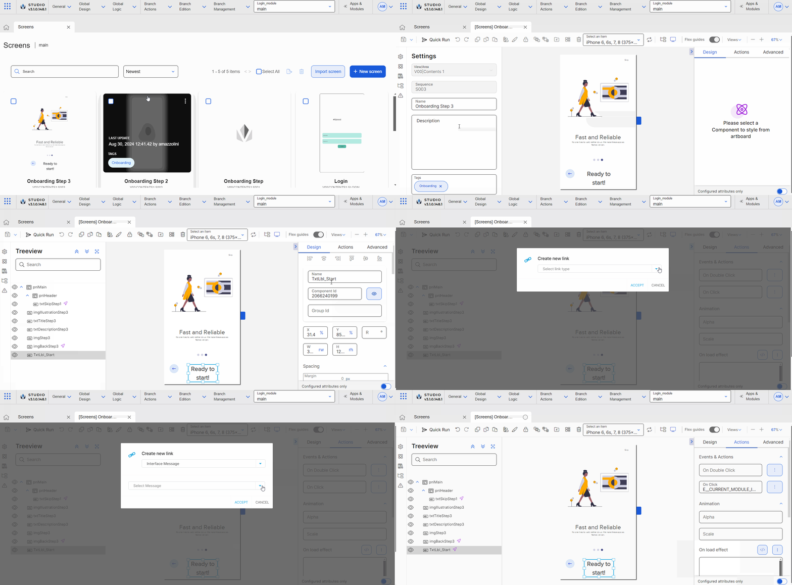
[en] Click Screens. The three screens that are part of the screens flow are Onboarding Step, Onboarding Step 2 and Onboarding Step 3. The three screens are linked between them so when the user clicks on the right arrow, they are taken to the next screen.
[en] Find the Onboarding Step 3 screen and double click on the screen card to open the screens editor.
[en] Go to the left panel and click Treeview to open the tab. Find the TxtLbl_Start component and click it to select it in the canvas.
[en] Go to the right panel and then click Actions to open the tab.
[en] Go to the Events & Actions section. In the OnClick attribute, click the vertical three dot icon. The Create New Link modal opens, where you can invoke the screen flow interface message set, that will allow you to set an action to occur when the user clicks on the Ready to start label. Refer to the instructions below to learn how to invoke the message.
[en] In the Select link type drop-down menu, click the arrow and select Interface Message.
[en] In the Select Message field, click the arrow and select Onboarding_interface@Onboarding_interface: SHOW NEXT.
[en] Go to the saving options and click Save and close. Complete the Commit message with the description Changes to Start label component and click Save and close. Then, click Close in the confirmation message to go to the Screens page.
[en] Go to the Overview and click Apps & Modules. Then, click Apps to open the tab.
[en] Find the GoldBank app and click on the app card.
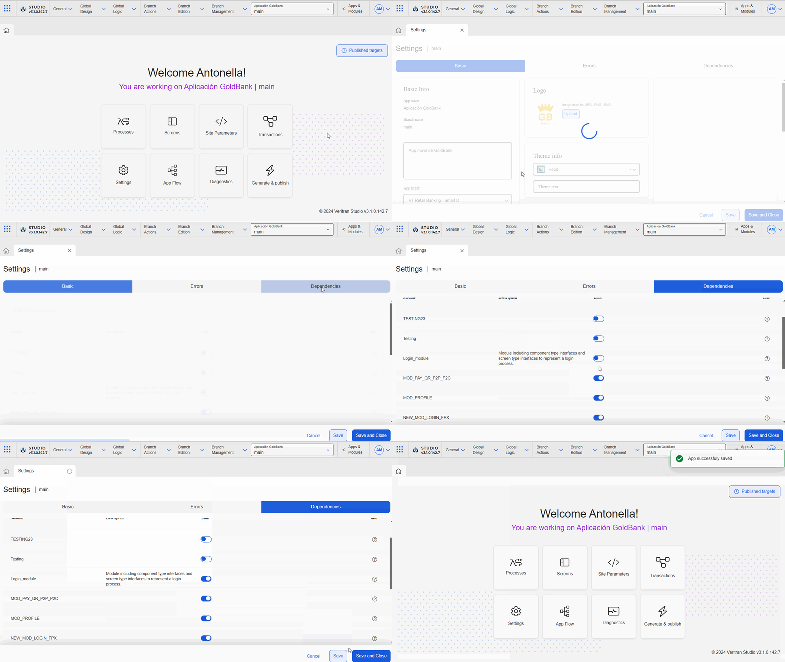
[en] In the Overview, click Settings (Overview > Settings).
Nota
[en] Enabling dependencies allows you to use the module’s content in the screens editor for the app selected. To learn more about dependencies, read Settings.

[en] Click Dependencies to open the tab.
[en] Find the Login_module module and click the toggle switch to link it to the GoldBank app.
[en] Click Save & Close to save changes and be redirected to the Overview.
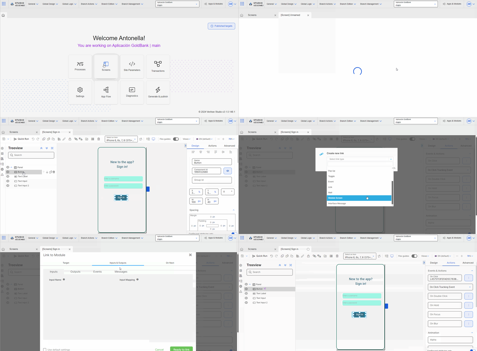
[en] In the Overview, click Screens. Find the Sign in screen and click Design or double click the screen card.
Nota
[en] You can also access the screens of the app in Branch Edition > Screens.

[en] Once the screens editor opens, go to the left panel. Click Treeview . The treeview tab contains a list of all the components in the screen.
[en] Click Button to select the Sign in button component.
[en] Go to the right panel and then click Actions to open the tab.
[en] Go to the Events & Actions section. In the OnClick attribute, click the vertical three dot icon. The Create New Link modal opens, where you can invoke the screens flow and configure it according to the parameters set when you created the interface that represents the flow. Refer to the instructions below to learn how to invoke the screens flow.
[en] In the Select link type drop-down menu, click the arrow and select Module Screen.
[en] The Link to Module modal opens in the Target tab. This modal contains three tabs: the Target tab contains the modules linked as dependencies to the parent app; the Inputs & Outputs tab contains the Inputs, Outputs, Events and Messages parameters configured in the interface representing the screens flow; the Find the Login_module module and click it.
Nota
[en] The Link to Module modal contains three tabs:
[en] Target tab: contains the modules linked as dependencies to the parent app.
[en] Inputs & Outputs tab: contains the Inputs, Outputs, Events and Messages parameters configured in the interface.
[en] On Next tab: allows you to set actions to be triggered after the screens flow finishes. This tab must not be configured.
[en] Go to the Use default settings checkbox and unselect it, so you can configure the screen interface settings.
[en] Go to the Inputs & Outputs tab and click Messages. For this example, you will only work on the Messages tab.
Importante
[en] Event parameters must not be configured for screens flows.
[en] Go to the SHOWNEXT parameter. As configured In the Messages Mapping field, you must enter the syntax that represents the app screen that will be shown once the screens flow finishes. For this example, enter VV01|contents1:S004. Now, when the user clicks on the Ready to start! label mentioned above, the interface message will be triggered, that will in turn invoke the screen defined in this parameter.
[en] Click Ready to link.
[en] Best practice
[en] As a best practice, modules - and therefore, their content (either configured components or screens flows) - should not have a theme applied. Hence, when the module's content is invoked in the screens editor, the configured component or screens flow. Applying a theme to a module affects the reusable nature of the module.