Invoke a Component-type Interface
Invoking a component-type interface allows you to use the components created as interfaces of a module in the screens of an app or module. Interfaces are invoked from the screens editor. You can configure component interfaces as if you were configuring any component in the screen of the parent app.
To invoke component interfaces from the screens editor, previously created the interface and link the module to the parent app or module. The instructions below set an example on how to invoke a component-type interface from the parent app. These instructions apply to any component-type interface invoked from either an app or another module.
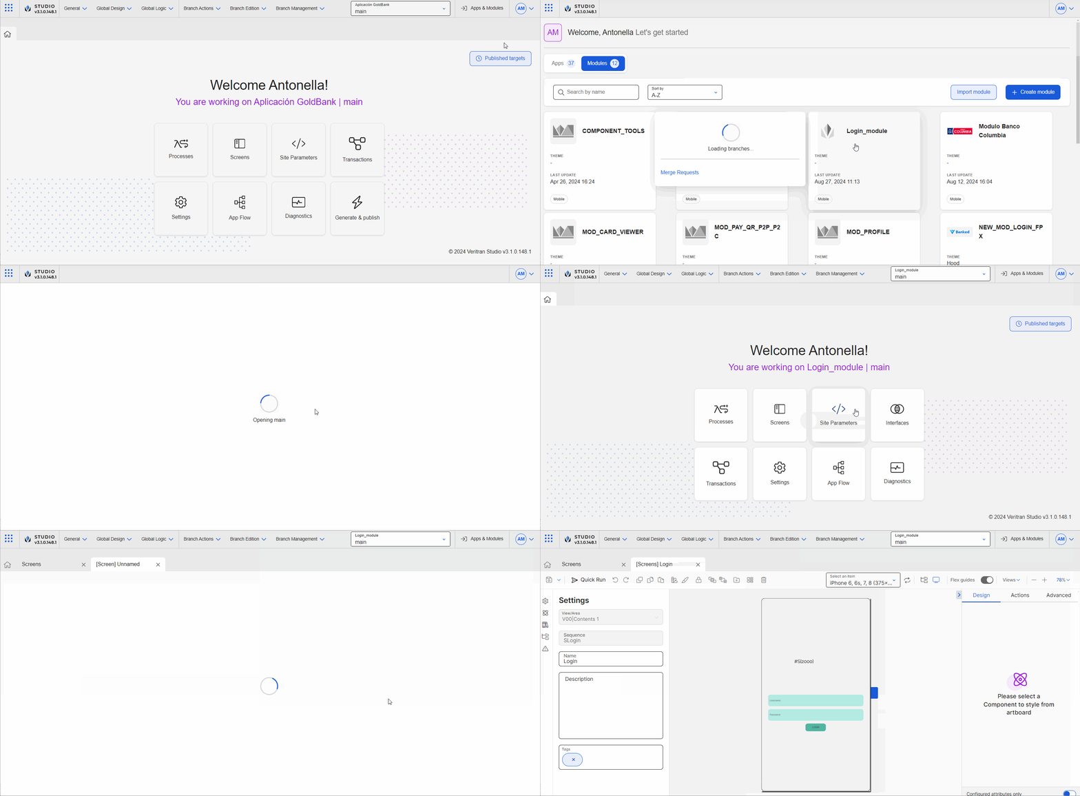
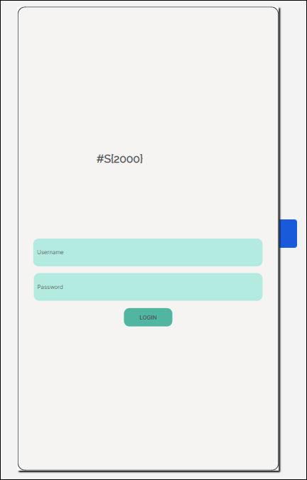
In this example, you will invoke a component interface (see image below) that allows the user to log in the app and sign in in case they are new to the app. Given that the component contains generic fields, you can reuse it (in this app and in any other app you may need it).
Once you selected the GoldBank app, click Settings (Overview > Settings).
Note
Enabling dependencies allows you to use the module’s content in the screens editor for the app selected. To learn more about dependencies, read Settings.
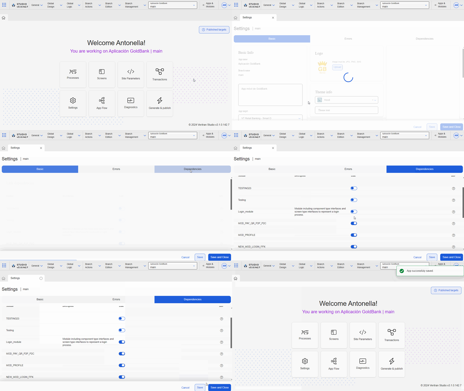
Click Dependencies to open the tab.
Find the Login_module and click the toggle switch to link it to the GoldBank app.
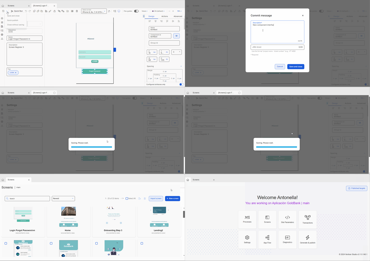
Click Save & Close to save changes and be redirected to the Overview.
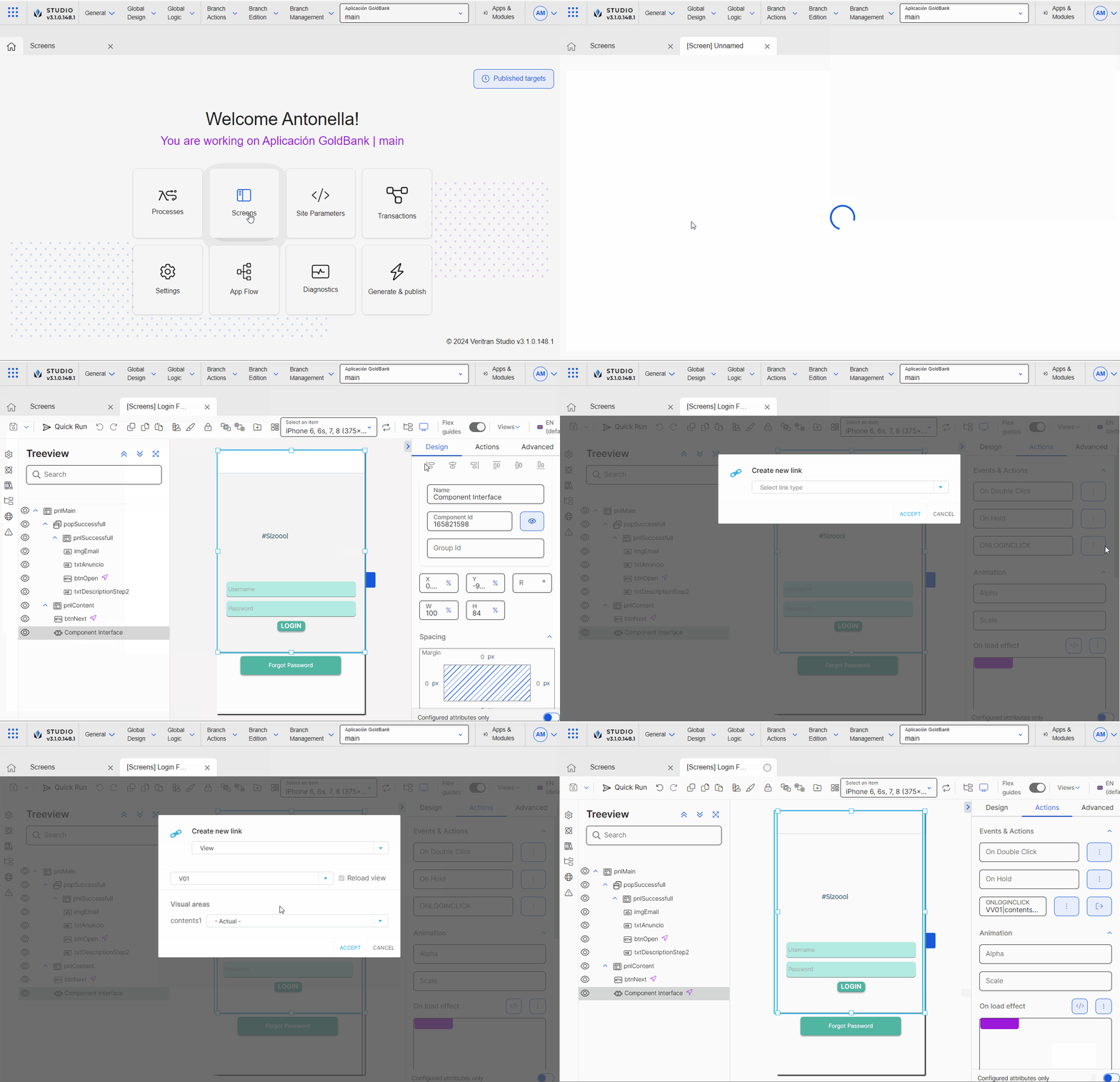
In the Overview, click Screens. Find the Login Forgot Password-m screen and click Design or double click the screen card.
Note
You can also access the screens of the app in Branch Edition > Screens.
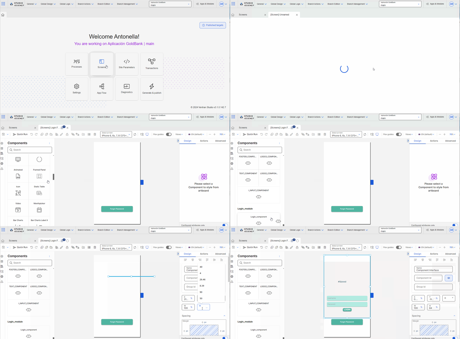
Once the screens editor opens, go to the left panel. Click Components . The components tab contains all the components available in Studio as well as component-type interfaces that will be displayed as separate components.
Scroll down to the bottom of the list and find the module Login_module . It contains the component-type interface called Login_component displayed as a component.
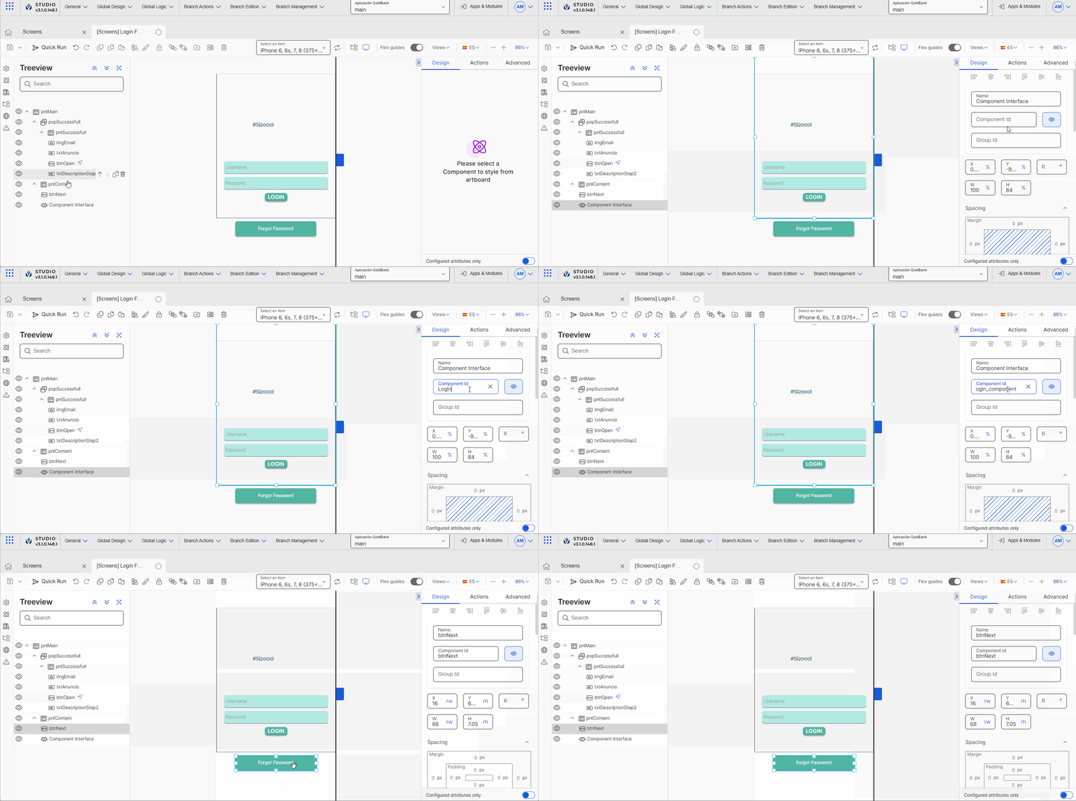
Drag and drop the Login_component component to the canvas.
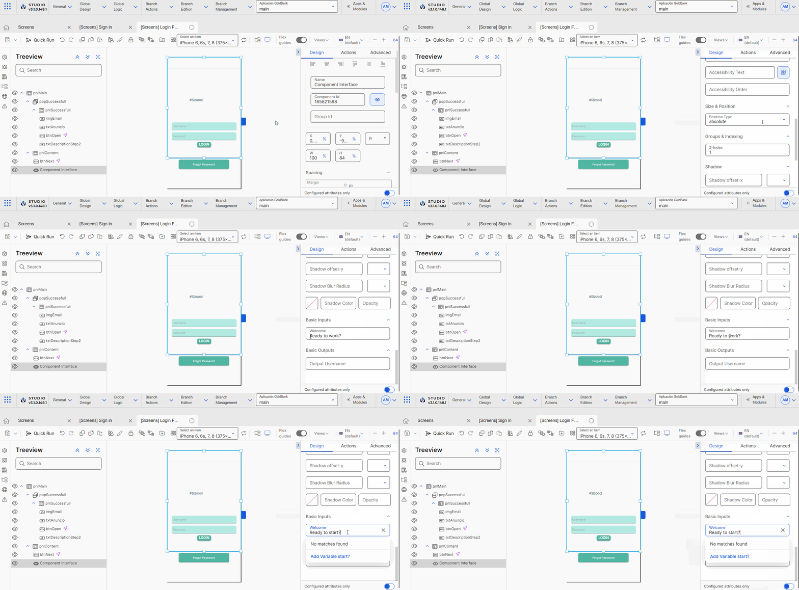
Go to the right panel. Considering the design of the component, configure the width (W) attribute with 100 and the height (H) attribute with 84 , and leave the % unit of measurement selected, so that all the information in the reused component is visualized. Then, place the component in the desired position of the screen.
Note
You can change the size and position and unit of measurements according to the requirements of your project and the design of the screens previously defined.
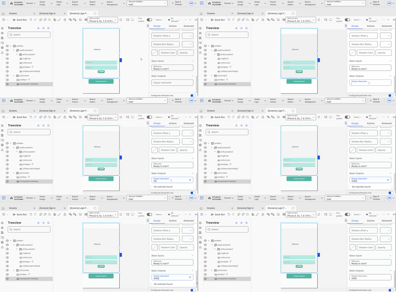
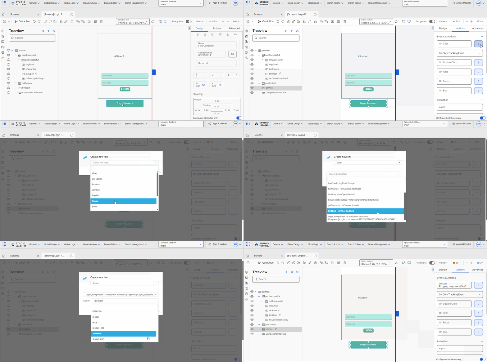
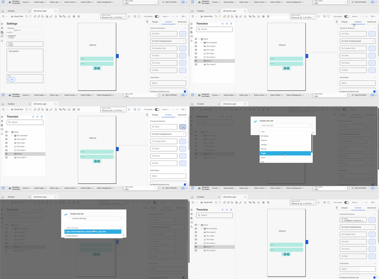
Now you are able to perform different actions depending on which the parameters you set when you configured the interface. The interface parameters are Input Output, Event and Message and appear in different sections of the right panel when you configure the screen.
Best practice
As a best practice, modules - and therefore, their interfaces - should not have a theme applied. Hence, when an interface is invoked in the screens editor, the component or screens flow will inherit the theme applied to the parent app. Applying a theme to a module affects the reusable nature of the module.
