[en] Understanding Layouts
[en] Layouts are included in two steps in the design process stages: first, they are defined and set by the UX Designer. Then, they are modified in Studio according to the designer's specifications by the Implementer.
[en] A layout is the visual structure of a digital design - it is the way in which visual elements are arranged in a screen or a part of a screen. It defines how graphic elements (such as images, texts or buttons) are distributed in a digital area, thus creating a visual hierarchy and facilitating user navigation.
[en] In the following sections, you can learn more about the area levels that can be applied in a layout and the description and use of the layouts available for Veritran projects.
[en] Web app layouts
[en] Layouts for web apps can be configured for different resolutions – that is to say, the layouts have specific structures applicable for the responsive versions of the app. The Layouts template available in Figma describes the structure and purpose of layouts for a web app and include their responsive designs.
[en] To include the responsive versions, layouts are built under four different breakpoints, as follows:
[en] Extra-extralarge: more than 1401px;
[en] Extralarge (from 1201px to 1400px): applicable to extra-large screens or TV screens
[en] Large (from 992px to 1200px): appicable to large screens or desktop devices
[en] Medium (from 769px to 991px): applicable to small screens like iPads and tablets
[en] Small (from 481px to 768px): applicable to mobile devices
[en] Layout areas levels and arrangement
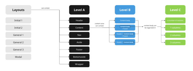
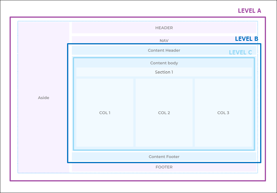
[en] Layouts can have three area levels: Level A, Level B and Level C.

[en] The Layouts Documentation document contains the six layouts made available by Veritran and their configuration in the three levels (such as the example in the image below). Read the sections below to learn more about the how each level is defined.
