[en] Design System Definition and Application
[en] Previous steps
[en] To define the Design System, the UX Designer must have previously prepared the UI kit and obtained the client's approval.
[en] Who participates in the design system definition and application stage?
[en] The UX designer and the Implementer are involved in the three steps in this stage. The third and fifth steps are mandatorily executed by the UX Designer. The fourth step is shared between the UX Designer and the Implementer - the designer sets the assets and theme and the implementer works on the layouts.
[en] Where do you work?
[en] To work on these steps, you must use the Design System document (UI Kit appears in the first section) and the Layouts document in the repository available in Figma. Follow the links to access them and read Tasks execution below to learn which tasks you must perform.
[en] The third stage includes defining and setting the Design System, setting up different elements in Studio, and setting the screens flows document.
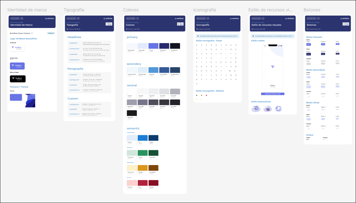
[en] The design system consists of a set of building guidelines and standards that help keep the look and feel of the app and the user experience consistent. The design system of the app includes the app style, UI components, fonts, assets, among other elements. The Design System document for each project consists of:
[en] UI kit section approved by the client. It is defined in the UI KIT subsection within the UX/UI definitions section of the Design System document.

[en] Theme variables: specific values or settings used to define the overall appearance of the app screens components. They are defined in the Theme Variables section in the Design System document.
[en] Atomic components: individual components that will be used in the app screens, together with their statuses and corresponding styles configuration and behavior. Atomic components can be found in the left panel of the screens editor. To define their appearance, you apply styles to them according to the configuration of the app theme. They are defined in the Atomic Components subsection (one per component) in the Components Library section of the Design System document.
[en] Organisms anatomy: set of atomic components that create different components with a specific functionality. They are defined in the Organisms section in the Design System document.
[en] The Design System document contains information on all the sections mentioned above as well as use cases that the team can use as examples and define them based on the project requirements and purpose.
[en] In this step, the UX Designer has to execute the following tasks:
[en] Go to the Design System file in the project's documentation repository.
[en] Ensure that all the approved UI kit subsection is updated.
[en] Go to the Themes Variables section and complete it with the configurations applicable based on the UI kit information.
[en] Go to the Atomic Components section and review the list of components available. Then, configure each component with the status and style applicable in your app. The different options in each component define different styles that will be then configured in Studio.
[en] Define the anatomy of the organisms - sets of atomic components - that will be used in the app screens. This includes the following:
[en] Discuss with the project Technical Lead about which components can be used as atomic components and which must be set as organisms - that is to say, which elements in the app screen require the use of a set of atomic components (that can be reused throughout the app screens).
[en] Review the Organisms section to see the organisms already defined, and define which can be used and configured according to the project requirements.
[en] Modify the anatomy and behavior specified and modify the properties accordingly.
[en] Note
[en] UX Designers must be familiar with anatomy and behavior descriptions to easily understand the definitions in the organisms anatomy templates.
[en] Setting up Studio involves accessing the environment created for the project and start configuring the fundamental entities that define the appearance of the app screens. It includes setting up:
[en] Assets
[en] App theme - including its variables and styles.
[en] Note
[en] Styles are sets of variables that can be applied to the components in each of the app screens. When a component is created in a screen, you can configure the attributes of that component to apply the style set.
[en] Layouts

[en] In this step, the UX Designer has to execute the following tasks:
[en] Important
[en] Depending on the team, these tasks may be executed by either the UX Designer or the Implementer. If the Implementer works on them, the UX Designer must oversee their work and check that all the settings are correctly configured.
[en] Access the Studio environment of the project.
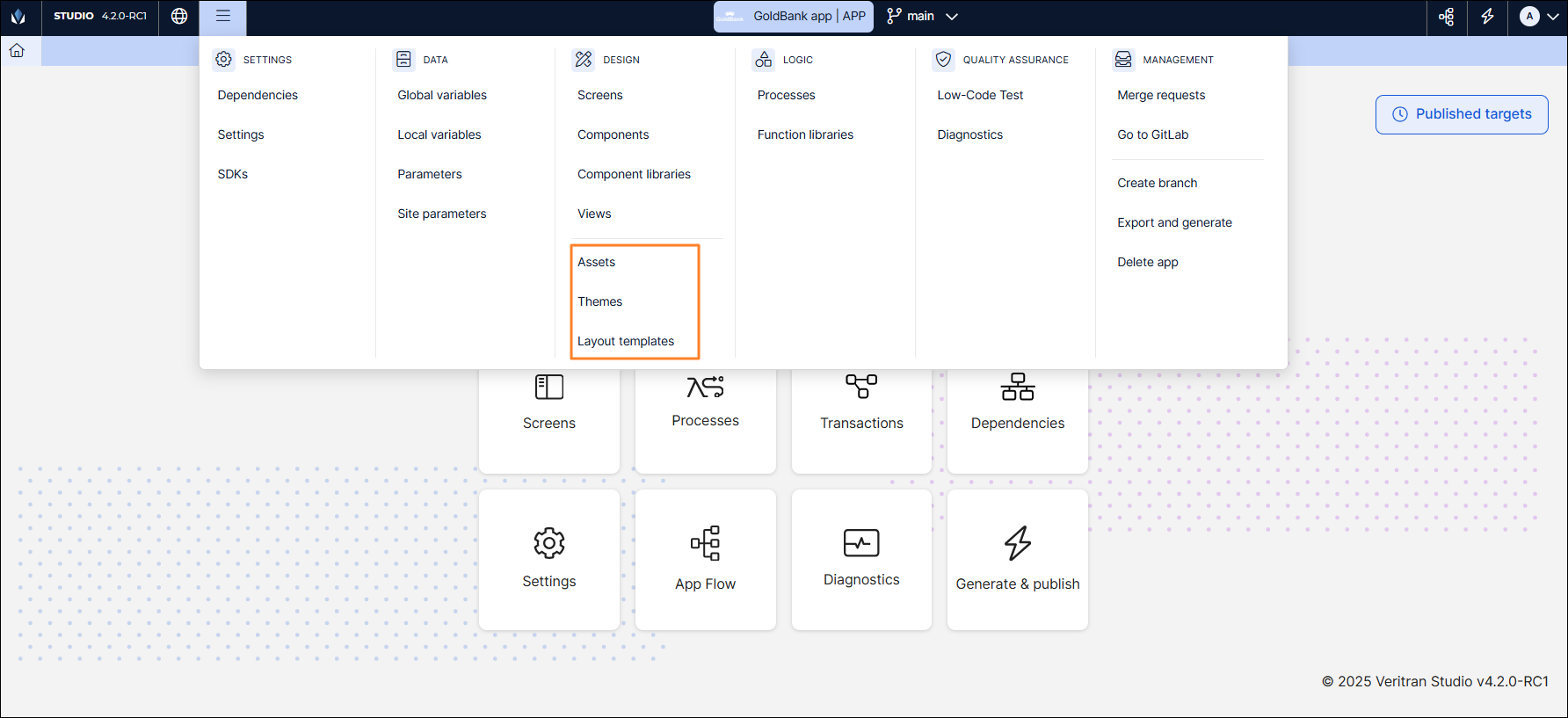
[en] Upload the assets. Depending on the asset type, they may be exported from the UI kit section of the Design System document or directly in the device. To upload assets:
[en] (Menu > Design > Assets).
[en] Double click the first folder that appears in the list. The folder contains the assets of that app branch only.
[en] Click Upload asset.
[en] Click File Upload.
[en] In the file browser, look for the asset and click Open.
[en] In the modal that opens:
[en] The name cannot be modified; Click Save.
[en] In the Include in Application section, select Always;
[en] In the Tags section, enter a tag with the asset format and press Enter (for example, svg).
[en] Click Save.
[en] The asset will be uploaded and appear in the assets list.
[en] Important
[en] Assets upload must comply with the pattens specified for assets. Read Understanding Assets to learn more.
[en] Configure the variables. This includes the following:
[en] Go to the Themes page (Menu > Design > Themes).
[en] Find the app theme prebuilt for your project. The prebuilt has default values that must be modified according to the Design System definitions.
[en] Open the theme.
[en] The theme opens in the Variables tab. Complete the attributes in the Color, Grey, Font, Border, Radius, Shadow, Margin and Padding subsections according to the definitions in the Design System document.
Aviso
[en] If a variable is not defined in the Design System, you must not configure it in Studio - this means that its configuration must remain empty.
[en] Configure the styles that will be applied to the components in the app screens.
[en] Depending on the complexity of the styles defined in the Atomic Components subsection, styles will be configured in the Styles, Custom and CSS tabs of the app theme.
[en] Note
[en] The variables that cannot be configured in the Styles tab are specified under the DEV Info and DEV CSS frames in each of the atomic components' configuration page in Figma. This information will be useful to configure the Custom and CSS tabs as required.
[en] This document explains the configuration of basic styles available in the Styles tab. This includes the following:
[en] In the app theme, click Styles to open the tab.
[en] Complete the Button, Checkbox, Flex, Input, Panel, Radio, Switch and Text subsections according to the definitions in the Design System document.
Aviso
[en] If a component style is not defined in the UI kit, you must not configure it in Studio - this means that its configuration must remain empty.
[en] Then, the Implementer has to configure the layouts selected for the project. This includes the following:
[en] Review the layouts section in the UI kit document prepared by the UX Designer. The implementer must check the information below and then configure any required changes:
[en] the layouts selected;
[en] the sizes and units of measurement of each layout area;
[en] the breakpoints defined for the different resolutions;
[en] the levels in each layout. If the layout has level B and level C arrangement configurations, the implementer will configure them as flex containers during the screens building process.
[en] Access Studio and go to the Layout templates page (Menu > Design > Layout templates).
[en] Duplicate the prebuilt layout templates.
[en] Start working on the layouts, one by one, and follow these instructions:
[en] Open the first layout defined by the UX Designer. For example, open the Initial1 layout.
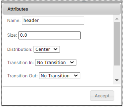
[en] Find the area you need to modify and double click it, for example, the header section. In the Attribute modal that opens, modify the Size field according to the data defined by the UX Designer: enter the number and add .0 to indicate that the unit of measurement is %. Then, click Accept.

[en] The CSS File field will be prebuilt with the breakpoints applicable to each layout. Therefore, the implementer won't have to make any changes.
[en] To learn more about layouts and the CSS file configuration basics, read [en] Configuring Layouts in Studio.
[en] Save the layout changes.
[en] If the layouts have level B and Level C arrangement configurations, the implementer will configure them in the last step, when they create the app screens.
Aviso
[en] Implementers must not modify prebuilt templates and must always work on duplicated versions.
[en] Screens flows are defined in the Design File Starter document in Figma. The screens flows document contains the screens that represent the different functionalities of the app, as defined in the project.
[en] The UX Designer has to build these screens in Figma using the elements available from the Design System document - since it is a library type file, its content can be reused on the screens flow file.
[en] First, the Technical Account Manager (TAM) of the project must explain the specifications to the UX Designer, so as to undestand the app purpose and functionalities.
[en] When defining the screens flows, the UX Designer is in constant contact with the implementers and the of the project, so that all team members are informed of the decisions made.
[en] The screens will be then used by the implementer to build the screens flows in the screens editor in Studio.
[en] In this step, the UX Designer has to define the screens that will be included in the app and their flows, according to the app functionalities. This includes following tasks:
[en] Understand the functionalities that must be included in the app according to the specifications made by the Technical Account Manager (TAM).
[en] Obtain the Screens flows from the Documentation Repository.
[en] Duplicate the Screens flows documentation and add it to the project's repository. This step is not mandatory and can be executed if necessary.
[en] Open the file and start creating the screens, based on the project requirements. To define screens, the UX Designer must:
[en] Divide the document in sections according to the sprints set for the project execution. This means that each sprint will include a set or sets of screens divided, for example, per app feature.
[en] Important
[en] The document contains best practices and patterns that must be applied during the screens design and building. The UX Designer must stick to the templates defined in this document and complete each of the sections with the project information.
[en] Set the screens and the flow that represents the happy path and additional use cases.
[en] Define the accessibility order of the components within each screen. This means specifying the order in which screen readers must read the components. The accessibility order information will be then used by the implementer, when they configure the screens in the Studio screens editor. It is configured per component using the Accessibility Order attribute in the right panel of the editor.