[en] UI Kit Generation
[en] Previous steps
[en] To generate the UI kit, the UX Designer must have previously created the project's documentation repository and obtained the brandbook that represents the client's brand identity.
[en] Who participates in the UI kit generation instance?
[en] The UX designer is in charge of preparing and defining the UI kit document.
[en] Where do you work?
[en] To work on this step, you must use the Design System document (UI Kit appears in the first section) and the Layouts document in the repository available in Figma. Follow the links to access them and read Tasks execution below to learn which tasks you must perform.he UX designer is in charge of preparing and defining the UI kit document.
[en] Step 2 - UI Kit Document
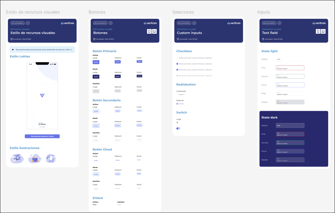
[en] The UI kit (User Interface kit) is an initial approach to the look and feel of the app interface, where the visual guidelines are presented and validated with the client. It includes a collection of pre-designed elements to streamline the design process, ensuring consistency and efficiency.
[en] The UI kit consists of:
[en] Brandbook details: the brand identity (logos), fonts, color palettes, icons, animations, images and illustrations.
[en] Assets: Resources such as images, video files, audio files or icons, that are part of the design and aesthetics of the app. For example, the images related to the client's logo, banners or icons that are part of the client's brand.
[en] Basic components: text inputs, text labels or buttons. These components do not show functionalities or behaviors, but just how they will look like in their basic form. Then, based on this information and once the client approves the UI kit, the designer defines the atomic components in the Design System and configures the app theme with the styles for each of them (that can be applied when the components are configured in the app screens).
Nota
[en] For all of the above, the accessibility check is required.

[en] Reference screens: basic screens that don't show functionalities but are prepared to demonstrate the basic design aspects of the screens and their interaction.
[en] Layouts: Structures that define how visual elements are arranged in a screen or a part of a screen. This definition is based on the project requirements and the purpose of the app to be built.
[en] The different layouts available are defined in the Layouts document that is part of the project's documentation repository. This document specifies each layout purpose and use; layout areas; area sizes and size ranges allowed to make changes; the design of the layout in its responsive capacity together with breakpoint details; and the configuration of each layout in the three levels (if applicable).
[en] In this step, the UX Designer has to execute the following tasks:
[en] Go to the Design System file in the project's documentation repository and then go to the UI Kit section to complete it following the template.
[en] Important
[en] The UX Designer must stick to the contents in the template and complete all the sections accordingly. They must not add additional information or remove content from the duplicated template.
[en] Transfer the information from the brandbook, as specified in the description above, and import the client logos.
[en] Important
[en] The UX Designer must ensure that resources are provided by the client. If not, they will define a set of assets for the app based on the project requirements and needs. Logos are always provided by the client.
[en] Define the basic components that will be used in the app screens.
[en] Run the accessibility color check to check if the color palette and fonts defined in the brandbook pass the accessibility test. This includes installing and using the A11y plugin from Figma. Read Visual Accessibility to learn more about this task.
[en] Note
[en] To learn more about the A11y plugin, read Figma documentation.
[en] Define the layouts that will be used in the app. This includes:
[en] Obtain the Layouts Documentation template in the Documentation Repository.
[en] Select the layouts from the templates available, based on the project requirements. You must at least select one layout.
[en] Review and define each layout area size (Level A areas) - if the default size does not meet the project's requirements, change sizes according to the specifications on the Design System. Additionally, you can refer to Veritran's Understanding Layouts to learn more.
[en] Important
[en] Changes in areas sizes must be specified and be clear enough for the implementer to easily understand them.
[en] Define the distribution percentage for each area considering each breakpoint to be used (for different resolutions of the app in its responsive versions).
[en] Note
[en] Each prebuilt layout in the Layouts template section in Studio have the breakpoints already configured in the CSS File field.
[en] Define the different levels in the layout (Level A, B and C) and, if the layout has level B and level C configurations, include the configuration of the flex containers and their attributes. The information on layouts will be then used by the implementer to make the changes in Studio (during the third stage of the process). Read Understanding Layouts to learn more.
[en] Create the reference screens that will be sent for client's approval.
[en] Once this version of the UI kit document is ready, the UX Designer must send it to the client for their approval. Even though there can be changes throughout the app building process, approval is required so that the team ensures that they will work on a design that fits the client's needs.
[en] Important
[en] The team must not start working on the Design System unless the client approves the UI kit.