Use the theme
This article contains different how-to guides to help you use the theme in your app.
How to apply a theme to your app
Note
Even though themes are global, Studio allows you to create themes only within the context of an app. This means that, when you create an app, you must always apply a theme to it. Apply a random theme and then, once you create your project theme, change it.
To apply a theme to your app, go to the app settings (from the Overview, click Settings or from the Menu, go to Settings > Settings). The Settings page opens in the Basic tab. In the Theme info section, go to the Select theme field and select a theme from the drop-down menu. In the Theme text field, you can optionally enter a description of the theme selected.
Then, click Save to save changes and continue working or Save and Close to save changes and go back to the Overview.
Now, you can add the styles defined in the theme to the components in your app screens.
How to apply a style to a component in an app screen
Once the theme is configured and applied to the app, you can add the styles defined to the components in your app.
Follow the instructions to apply a style:
Go to the app screen you want to edit.
Select a component from the Treeview tab or directly click it in the canvas.
Go to the right panel, that opens in the Design tab. In the Basic section, go to the CSS attribute. If a style is configured, click the x to the right of the style name to remove it. Then, click the field and enter the style name or find it in the list and select it. The component will adopt the appearance of the style selected.
Save your screen to save changes and continue working.
How to concatenate styles in a component
As explained in Create or edit a theme, you can set styles for specific components. If, under a specific circumstance of the project, you need to modify only one attribute of a specific component style, but you don't want to apply that change to the style, you can add that change through the Custom tab and then concatenate styles in the screens editor. For example: you already set a style for all primary buttons (btn_primary), but, in the error screen, you want the button border to appear in red. In that case, you won't modify the primary button style, but add a new border color through a Custom style (see example below).
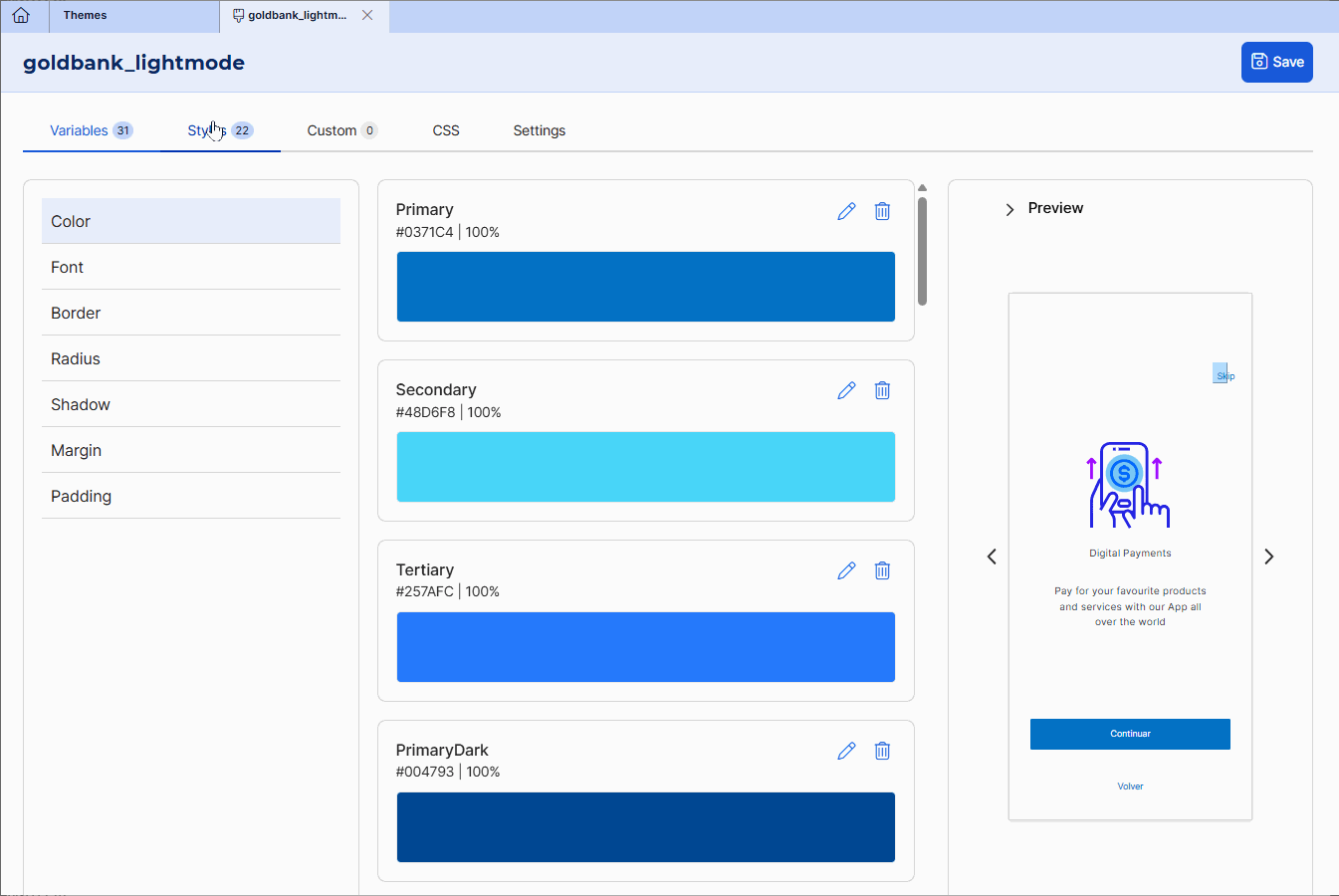
When you concatenate styles, the attribute defined in the Custom style overwrites the configuration of the same attribute in the component style. In this case, if the primary button style has the Border configured with the Primary color variable (hexa code #0371C4 ), you will add a new style for the border color in hexa code #c40306 and then concatenate the styles.
Warning
Once you create the Custom style, you must refresh the browser so that it appears available in the screens editor.
Once you created the style,follow the instructions below.
Go to the app screen you want to edit.
Select the component from the Treeview tab or directly click it in the canvas.
Go to the right panel, that opens in the Design tab. In the Basic section, go to the CSS attribute. First, click the field select and the main style. Then, click the field again and select the Custom style. In this example, the btn_primary style was previously selected, select only the border_error style. The component will adopt the appearance of the main style selected and combine it with the attribute of the Custom style selected.
Save your screen to save changes and continue working.