Text Input
The Text Input component is a text box that allows the app user to enter text under specific conditions. To insert a Text Input component in the screen, go to the Left Panel in the screens editor. Go through the list of components to find the Text Input component or click the search bar and type its name. Then, drag and drop the component into the canvas and configure its attributes in the right panel. Refer to the sections below to learn more.Text Input
Important
The Text Input component can be used in web and mobile apps (both for Android and iOS devices).
Attributes Specifications
Refer to the section below to learn more about all the right panel attributes that appear for configuration when you drag and drop a text input component into the canvas.
Important
This section is for information purposes only. Configure the attributes for the component according to your project's requirements.
Design
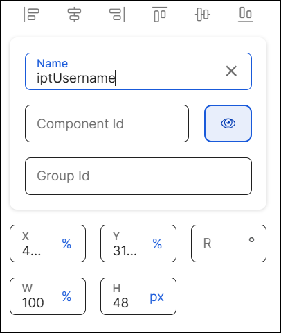
First of all, you must change the name of the text input to represent its position within the screen layout. For example, the name can be iptUsername.
Then, you can configure the position attributes, which affect the position of all the children components within it, as specified in the table below.
X | Position of the component in the canvas with regard to the x axis. Enter a number in the field and then select the % or px unit of measurement. |
Y | Position of the component in the canvas with regard to the x axis. Enter a number in the field and then select the % or px unit of measurement. |
R | Angle with the vertical axis in which the component is positioned. |
W | Width of the component with regard to the screen size. |
H | Height of the component with regard to the screen size. |
Margin properties | Space around a component's border. To configure the margins, click the number field of each margin (left, right, top, bottom) and enter the desired value. Then, click the unit of measurement located to the right and select the px or % option from the list. |
Padding properties | Space between the component's border and the component's content (value). To configure the paddings, click the number field of each margin (left, right, top, bottom) and enter the desired value. Then, click the unit of measurement located to the right and select the px or % option from the list. |
Position Type | Click the arrow and select a type from the drop-down menu. Refer to the table below to learn more about the options available.
|
Important
The Tab Index attribute is deprecated. Instead, you must use the Accessibillity Order attribute.
In this section, you can define the settings of the component's background. Refer to the table below to learn more.
Flat | Click the Flat radio button to set a single color for the component's background. To set the color, click the field and type a hexa code or click the rounded-edges square icon to open the color picker. In the color picker, enter the hexa color code. You can also set the opacity percentage outside the color picker in the Opacity field. If you previously selected a color in the color picker, the opacity is set in 100 by default. If no color was selected, this field is empty. To modify it, click the field and enter the desired percentage. |
Gradient | Click the Gradient radio button to set a color gradient for the component's background. Click each of the rounded-edges square icons to open the color picker. In the color picker, enter the hexa color code in the Hexa field. Click |
Image | Click the Image checkbox to add an image to the component's background. You can use a background image with both the Flat and Gradient background options. Click the Background image field and type the name of the background image, or click the upload icon to open the image picker. Select one of the images from the list or use the search bar to find an image by name. |


Note
If you select the Flat background, you cannot choose the Gradient background and vice versa. The Background Image option is available in both cases.
In this section, you can set the style of one or more borders of your component.
To set all the borders of the component, click the chain link icon in the middle of the square. The chain appears unbroken and all the inner borders of the square turn blue.
To configure the attributes of borders individually, click the desired border of the square icon; the border selected turns blue and the chain link icon appears broken. Remember to configure attributes for each border you want to customize.
Then, you must set the color and width of the border or borders you want to configure. Refer to the table below to learn more.
Color | Border color. To set the color, click the field and type a hexa code or click the rounded-edges square icon to open the color picker. In the color picker, enter the hexa color code. |
Width | Border width. Type a number to set the width. To change the unit of measurement, click the ellipsis (three dots) and select an option from the drop-down menu. |
In this section, you can configure the radius to define the roundness of the component's corners.
By default, all the component's corners appear selected. The chain appears unbroken and the dots representing each corner of the square turn blue. If you use this option, the same attributes will be applied to all corners.
To configure the attributes of corners individually, click the desired corner of the square icon; the dot in the selected corner turns blue. Remember to configure attributes for each corner you want to customize.
To increase or decrease the radius size of the borders or a specific border, type the value in the Radius field. To change the unit of measurement, click the unit of measurement selected (blue-colored text) and choose an option from the drop-down menu.
Important
Changes made in this section will not appear in the published app.
State | Attribute that allows you to simulate the appearance of the component under a specific state. States are defined in the Styles section of the theme applied to the app and define the appearance of the component under specific circumstances - to apply the state style to a component, you must set the logic in the right panel, indicating the app that, under a specific event, the component must change its default state. Select an option from the drop-down menu: Active, Focus, Filled, Success, Error, Disabled. Learn more about each option below.
|
Value | Attribute that simulates the behavior of the Value attribute from the Basic section in the Design tab. Click the field and type a value to see it applied to the component automatically. |
Background Image | Image applied to the component's background. To set the image, click the field and type the name of the image, or click the magnifying glass icon to open the image picker. Then, select one of the images available in the list, or use the search bar to find an image by name. |
In this section, you can configure basic attributes of the component. Refer to the table below to learn more.
CSS Class | CSS or style invoked from Global Design > Themes and applied to the component. Click the field and select a style from the drop-down menu. TipYou can add more than one style. | ||||||
Charset | Set of characters supported by the component. This expression defines the characters that are valid and can be entered by the app user in the component's field. To set the charset, click the field and enter the charset or click the magnifying glass icon to open the charset picker. In the charset picker, go through the list to find the desired charset and click Select. The options available are: Alphabetic, Alphabetic lower case, Alphabetic upper case, Alphanumeric and Numeric. | ||||||
Form Id | Id of the form to which the text input belongs. This attribute must be configured only if the component is part of a form. To set the id, click the field and enter the id value. NoteTo set a form, all the text inputs included in it must be configured with the same Form Id, so they are executed as a group. | ||||||
Submit Button | Component id of the button used to submit the data entered in a form. This attribute must be configured if the text input is part of a form. To set the id, click the field and enter the value. | ||||||
Submit Button Text | Text included in the submit button. This attribute must be configured with the text defined in the Submit Button component. To set the text, click the field and enter the value. | ||||||
Enable Code AutoFill | Attribute that includes the Security Code Autofill feature, through which OTP codes received via SMS appear as automatic autofill suggestions. The OTP code will be detected as a suggestion if the text includes the word CODE (or its translation) followed by a space and the OTP code. To configure this attribute, click the arrow and choose one of the two values in the drop-down menu. Select true to enable the auto-fill suggestions or select false so suggestions are not enabled. ImportantThis attribute is only available for devices with iOS 12 or higher. This attribute won't respond in devices with previous iOS versions or with Android, even if configured. | ||||||
Required | Attribute that defines whether the app user must enter data in the text input field. You can either leave the field empty or click the arrow and select true so that the text input is required. | ||||||
Display Name | Placeholder defined for the component's text displayed on screen. To set the text, click the field and enter a value. | ||||||
Input Msg | Message received by the app user if the data entered in the text input field is invalid. To set a message, click the field and enter the text. | ||||||
Regexp | Regular expression that validates the data entered by the app user into the component's field. To set the expression, click the field and type it or click the the magnifying glass icon to open the RegEx picker. In the picker, go through the list to find the desired expression and click Select. The options available are: Any, Email, Float, X Characters and X to Y Characters. | ||||||
Target Var | Token where the information will be stored the app user submits the data entered in a form. To set a token, click the field and enter the token number. NoteYou can only set one token. | ||||||
Auto dump | Token where the Value attribute of the component will be stored every time such attribute changes. To set a token, click the field and enter the token number. NoteYou can only set one token. | ||||||
Value | Text displayed in the component that informs the app user about the data to be entered. You can add plain text or a reference to a parameter or register. You can also add the value to the translations dictionary or select an existing translation if there are languages selected in the branch settings.Translations TipIf you don't fill in this field, you can also enter the text by double clicking the component and typing the desired text. Once you fill in the Value field, you cannot use this option. | ||||||
Min Length | Minimum number of characters that the app user can enter in the text input field. To set the minimum length, click the field and type a numeric value. | ||||||
Max Length | Maximum number of characters that the app user can enter in the text input field. To set the maximum length, click the field and type a numeric value. | ||||||
Enabled | Attribute that defines whether the component can be edited by the app user, which means that the app user can enter text. Click the arrow and choose one of the two values from the drop-down menu. Select true so that the component can be clicked by the user or false so it cannot be clicked. Disabled buttons will appear grayed out in the app. The default value is true. ImportantThis attribute is available for mobile and web apps. | ||||||
Enabled Selectors | Attribute that allows you to enable or disable date selectors. Click the arrow and choose a value from the drop-down menu. Select true to enable date selectors or false to disable them. The default value is false. | ||||||
Date Mask | Date mask format. To set a date format, click the arrow and select one of the options available: DD-MM-YYYY, DD-MMM-YYYY, DD-MMMM-YYYY, DD/MM/YYYY, DD/MMM/YYYY or DD/MMMM/YYYY. The default value is DD/MM/YYYY. | ||||||
Active preview date | Attribute that activates the preview of the date entered. Click the arrow and choose an option from the drop-down menu. Select true so that the preview is activated or false so that the preview is not activated. | ||||||
Date Language | Click the arrow and select one of the options available: English, French, Portuguese or Spanish. | ||||||
Disable Weekends | Selector used to disable weekends from the calendar. Click the arrow and choose one of the two values from the drop-down menu. Select true so that weekends are disabled or false to keep them enabled. | ||||||
Visible | Attribute that defines whether the component is visible in the app. Click the arrow and choose an option from the drop-down menu. Select true so that the component is visible in the app or false so that it is not visible. The default value is true. | ||||||
Disabled Copy/Paste | Attribute that disables the copy/paste options for web apps so that the app user cannot copy and paste texts when entering text into the text input field. Click the arrow and choose one of the values from the drop-down menu. Select true so that the copy/paste option is disabled or false to keep it enabled. NoteThe copy/paste disabling attribute applies both for the Copy and Paste options available when clicking the mouse's right button or the CTRL+C and CTRL+V keyboard commands. | ||||||
Max File Size (MB) | Attribute that defines the maximum size of a file to be uploaded by the user. To configure it, enter an integer or decimal number. ImportantThis attribute must be configured if the Type attribute is File. It is only applicable for web apps. | ||||||
On Max File Size Exceeded | Action triggered when the user uploads a file that exceeds the maximum file size. To set an action, click the vertical three-dot icon. In the Create New Link modal that opens, select an action from the drop-down menu and configure it accordingly. Then, click Accept. ImportantThis attribute must be configured if the Type attribute is File. It is only applicable for web apps. | ||||||
Encode File | Token where the data of the file's Encode attribute will be stored after the On Change action—set in the Actions tab—is executed. Click the field and enter the token. | ||||||
Call onDateInputComplete when clean | Click the arrow and choose a value from the drop-down menu. Select true or false. | ||||||
Normalize padding | Attribute that normalizes the padding in iOS devices, so that the data entered by the app user is displayed in the same way as it is displayed in Android devices. Click the arrow and choose an option from the drop-down menu. Select true so that padding is normalized or false so that no changes are applied to the component's padding. TipIn iOS devices, the data entered by the app user is directly placed in the left border of the component, while in Android devices, there is a space between the border and the first character of the text entered. | ||||||
Keyboard Options | Attribute that defines the behavior of the virtual keyboard. Click the arrow and choose an option from the drop-down menu. Refer to the table below to learn more about the options available.
| ||||||
Important For Accessibility | Attribute that defines whether the screen reader reads or ignores the value defined in the Accessibility Text attribute of the component. Click the arrow and select an option from the drop-down menu. Choose true so that the screen reader reads the component or false so that the screen reader does not read the component. The default value is false. | ||||||
Accessibility Text | Alternative text. Add a short text to describe the component to users who may not be able to see it. The text will be read by iOS Voice Over or Android Talk Back. You can also add the accessibility text to the translations dictionary or select an existing translation if there are languages selected in your branch settings.Left PanelSettings | ||||||
Accessibility Order | Attribute that tells the screen reader the order in which it must read the components. To configure it, click the field and enter a number to define the order. For example, if this component should be read in third place, enter the value 3. If you don't configure a custom order, components are read from top to bottom and left to right of the screen. |
In this section, you configure the attributes to align the text within the component and set margin and padding properties. Refer to the table below to learn more.
Text Alignment | Click the desired alignment option. From left to right: none (no alignment), justified, left, centered or right, depending on whether you want the text not to be aligned, to be aligned with both left and right edges, the left edge, centered between the two edges of the component or aligned with the right edge. You can also click </> and type the code to set the text alignment manually. |
In this section, you configure the style of the component. Refer to the table below to learn more.
Resource Origin | Method through which the resource referenced by the component is loaded. Fill in this field if the component selected references a resource, like an image or a video. Click the arrow and select one of the options available in the drop-down menu: choose L (Local) to retrieve the coded content from the local resources or choose H (HTTP) to retrieve the resource content from the Comm Server. |
Border Color Focus | Color set to the component's border when the component is on focus. To set the color, click the field and type a hex color code or click the square icon to open the color picker. In the color picker, select a color or click HEXA or RGBA, then click the field to the left and type a HEXA or RGBA color code, respectively. TipFocus is placed on the component whenever the app user clicks, taps or selects it by pressing the TAB key. |
In this section, you can define the order of the components within the screen. Refer to the table below to learn more.
Z-Index | Property that defines the components' position order. If several components overlap, components with a higher Z-index will be placed over those with a lower index. This field is filled in automatically. |
In this section, you can set the different attributes available to configure the component's tooltip. Refer to the table below to learn more.
Tooltip Enabled | Determines whether the tooltip is enabled in the app for the selected component. Click the arrow and choose an option from the drop-down menu. Select true to enable the tooltip or false to disable it. | ||||||||||
Color | To set a color, click the field and type the hexa color code or click the rounded-edges square icon to open the color picker. and type the HEXA color code in the Hexa field. To set the opacity, go to the Opacity field and enter a number up to 100. You can also set the opacity outside the color picker in the Opacity field next to the Background color field. | ||||||||||
Font Size | To set the size, click the field and type the desired value. Refer to the table below to learn more about the types of text sizes and values available.
| ||||||||||
Font Family | To set a font family or typeface, click the arrow and select an option from the drop-down menu. You can also click </> and type the code to set the text font family manually. | ||||||||||
Background Color | To set a color, click the field and type the hexa color code or click the rounded-edges square icon to open the color picker. and type the HEXA color code in the Hexa field. To set the opacity, go to the Opacity field and enter a number up to 100. You can also set the opacity outside the color picker in the Opacity field next to the Background color field. | ||||||||||
Position | Click the arrow and select an option from the drop-down menu to set the position of the tooltip with regard to the component: Bottom, Left, Right or Top. |
In this section, you can set attributes for the app user to enter start and end dates in the component when using the app.
Separator | Text that specifies how start and end dates are separated. For example, in "04/01/2021 to 04/15/2021", the separator is "to". |
Menu date range | Configuration of the left menu displayed in a calendar preview. It must be set in JSON format. |
End Date Autodump | Token where the end date will be stored. Enter the token value. |
End Date Value | End date displayed as DD/MM/YYYY. Click the field and enter the date. |
The only attribute to be configured is Format Time picker (h), which allows you to visualize the time selection in 12 or 24 hours format. To set the attribute, click the arrow and select 12 or 24 from the drop-down menu.
In this section, you can set advanced attributes related to the design of the component as well as actions to be executed under specific circumstances. Refer to the table below to learn more.
Style | This attribute is deprecated. |
On Complete Valid | Action executed if the app user completes the text field with the number of characters configured and the data entered is valid according to the regular expression defined. To learn how to set this to be triggered, refer to Events & Actions. |
On Complete Invalid | Action executed if the app user completes the text field with the number of characters configured and the data entered is invalid according to the regular expression defined. To learn how to set this to be triggered, refer to Events & Actions. |
On Valid | Action occurring after an onChange event—which implies changing the component's text value and is set in the Actions tab of the right panel—is executed by the app user and it complies with the regular expression and the minimum and maximum length values defined. To learn how to set this to be triggered, refer to Events & Actions. |
On Invalid | Action occurring after an onChange event is executed by the app user and it fails to comply with the regular expression and the minimum and maximum length values defined. To learn how to set this to be triggered, refer to Events & Actions. |
On Clear | Action to be executed when the app user enters the last character into the component's field. To learn how to set this to be triggered, refer to Events & Actions. |
Input Mask | Attribute that allows the use of different types of data input (for example, currency or decimals). |
Type | Attribute that specifies how the functionality of the component can be visually implemented. Click the arrow and select an option from the drop-down menu. The options include: Calendar, Date, Daterange, Url, Number, File, Time picker, PIN, rutChile, text, text multiline, email, and mask. ImportantThe Daterange, File, Time picker and rutChile options can only be used in web apps. The PIN and email options can only be used in mobile apps. |
Protect with captcha | Attribute that adds an input to Google reCAPTCHA protection feature. To configure this attribute, click the arrow and choose one of the two values in the drop-down menu. Select true to add an input to the protection feature or select false to refrain from adding it. |
Custom File Loader | Click the arrow and choose a value from the drop-down menu. Select true or false. |
Custom File Button Text | To learn how to configure this attribute, contact your admin. |
Custom File Empty Text | To learn how to configure this attribute, contact your admin. |
Target Var File Name | Click the field and enter the target var file name. |
Min Limit Date | Attribute that indicates the number of days visible in the calendar prior to the current date—date on which the app user is using the app. If no number is set, no minimum limit date will be defined in the calendar. Click the field and enter the desired number of days. |
Max Limit Date | Attribute that indicates the maximum number of days visible ahead of the current date. If no number is set, no maximum limit date will be defined in the calendar. Click the field and enter the desired number of days. |
File Filter Type | Standard code applicable to the file type displayed by the file upload window. Click the field and enter the code. |
Datepicker Button Image | Image on the date picker button. To set the image, click the field and type the name of the image, or click the magnifying glass icon to open the image picker. Then, select one of the images available in the list, or use the search bar to find an image by name and click it. |
Hide Clear Button | Attribute that hides the button that allows the app user to clear the data entered in the component's text field. Select true to hide the button or select false so that the button is displayed in the app. ImportantThis attribute is only available for iOS devices. |
In this section, you can set a hint for the component with its attributes. In text input components, hints help the app user understand the type of data they must enter in the text field when using the app.
Hint | To set the content, click the field and enter the desired word or phrase. | ||||||||||
Hint Color | To set the color, click the field and type a hexa color code or click the square icon to open the color picker. In the color picker, select a color or type a HEXA color code in the Hexa field. | ||||||||||
Hint Font Size | Hint text size. To set the size, click the field and type the desired value. Refer to the table below to learn more about the types of text sizes and values available. Then, click the arrow and select a unit of measurement from the drop-down menu to the right.
| ||||||||||
Hint Font Family | To set a font family or typeface, click the arrow and select an option from the drop-down menu. You can also click </> and type the code to set the font family manually. | ||||||||||
Hint Font Style | To set the font style, click the arrow and select an option from the drop-down menu. The only option available is italic. | ||||||||||
Hint Font Weight | To set the font weight, click the arrow and select an option from the drop-down menu. The only option available is bold. | ||||||||||
Hint Text Decoration | To set the hint appearance, click the arrow and select an option from the drop-down menu. The only option available is underline. |
In this section, you can configure icons to be placed on the left and right sides of the component. The icons will be displayed within the component's space.
Left Icon | To set an icon on the left side of the component, click the field and type the name of the image, or click the magnifying glass icon to open the image picker. Then, select one of the images available in the list, or use the search bar to find an image by name. |
Left Icon Color | To set a color for the icon located to the left, click the field and type a hexa color code or click the square icon to open the color picker. In the color picker, select a color or type a HEXA color code in the Hexa field. To set the opacity, go to the Opacity field and enter a number up to 100. You can also set the opacity outside the color picker in the Opacity field next to the Background color field. |
Right Icon | To set an icon on the right side of the component, click the field and type the name of the image, or click the magnifying glass icon to open the image picker. Then, select one of the images available in the list, or use the search bar to find an image by name. |
Right Icon Color | To set a color for the icon located to the right, click the field and type a hexa color code or click the square icon to open the color picker. In the color picker, select a color or type a HEXA color code in the Hexa field. To set the opacity, go to the Opacity field and enter a number up to 100. You can also set the opacity outside the color picker in the Opacity field next to the Background color field. |
In this section, you can set the attributes applicable to the text content of the component that will be visible in the app. Refer to the table below to learn more.
Font Family | To set a font family or typeface, click the arrow and select an option from the drop-down menu. You can also click </> and type the code to set the text font family manually. | ||||||||||
Color | To set a color, click the field and type the hexa color code or click the rounded-edges square icon to open the color picker. and type the HEXA color code in the Hexa field. To set the opacity, go to the Opacity field and enter a number up to 100. You can also set the opacity outside the color picker in the Opacity field next to the Background color field. | ||||||||||
Font Size | To set the size, click the field and type the desired value. Refer to the table below to learn more about the types of text sizes and values available.
| ||||||||||
Font Style | To set the font style, click the arrow and select an option from the drop-down menu. The only option available is italic. | ||||||||||
Font Weight | To set the font weight, click the arrow and select an option from the drop-down menu. The only option available is bold. | ||||||||||
Text Decoration | To set the decoration, click the arrow and select an option from the drop-down menu. The only option available is underline. |
Actions
In this section, you can set events or actions on the component that will be triggered by other certain actions. For example, if the action configured is "On Click", an event or action will be triggered when the app user clicks the component. Refer to the table below to learn more about each action.
On Hold | Action triggered when the user clicks the component and maintains it clicked for more than one second. |
On Click | Action triggered when the user clicks or taps the component. |
On Focus | Action triggered when the user focuses on the component. For example, tapping on the component's text field to begin typing. |
On Blur | Action triggered when the user loses focus on that same component. |
On Change | Action triggered when the user enters data in the component. |
Debounce onChange | Attribute that indicates the app to wait until the user finishes entering text before executing the action in the OnChange attribute. The system will wait 300 milliseconds before executing the action - if the user continues to write before that period, the time counter starts over. By default, no value is assigned. Click and select an option: choose true so that the app is requested to wait until executing the action, or choose false to allow the app to process any actions while the user enters text. NoteThis attribute avoids the app system performing unnecessary searches or validations and improves the app performance and speed. |
On DateInput Complete | Action triggered when the user completes a date in a date field by typing the date or selecting it from the calendar. NoteThis applies if the input is used to enter or select a date. |
Left Icon On Click | Action triggered when the user clicks on the icon to the left of the text input. If no icon is set, this action won't be available. |
In all cases, to set the event or action, type the action to be triggered in the corresponding field or click the vertical three-dot icon. The Create new link window opens. Click the arrow and select one of the link types available in the drop-down menu: View, SW States, Process, Lambda, Pop Up, Toggle, Event, Link, Mail, Module Screen or Interface Message. A new drop-down menu appears. Click the down arrow and select the action or event within the selected type. Then, fill in the parameters applicable to the option selected. Once you configure the required parameters, click Accept.Instancing a Screen-type Module
In this section, you can set different effects on the component's attributes and the animations through which the effects take place. First, you must select the attributes for which you want to set effects. Refer to the table below to learn more.
Alpha | Effect in the component’s transparency or opacity. Enter the value to set the initial opacity of the component before the animation is executed. The value can range from 0 to 1, considering 1 as the value that grants the highest level of transparency. |
Scale | Effect in the component's dimension. Enter the value to set the initial scale of the component before the animation is executed. By default, the scale value is 1, which equals the component’s original size. The value can be any number starting on 1. |
Then, you configure the animation through which the effects previously defined will be executed. The only animation available is On Load Effect, which occurs immediately after the screen loads. You can set the animation's code or configure it with the Animation Editor. To configure the animation, click </> and then click on the text field to start typing the code or click the vertical three-dot icon to open the Animation Editor. To learn more about the Animation Editor, read Actions.Actions