Themes
A theme is a group of configurations that define colors, sizes, fonts, backgrounds and other elements of the look & feel of the components in app screens. The styles defined in a theme are applied to a component in the screens editor, through a specific attribute called CSS Class.
Why use a theme?
Using a theme allows you to define, in one sitting, all the attributes that configure the style or appearance of the mostly used components in your app. Once you create each style, you apply it to the component. Then, if you need to make changes, you don't have to manually update each component - instead, you modify the style configuration and it will have effect on all the components using it.
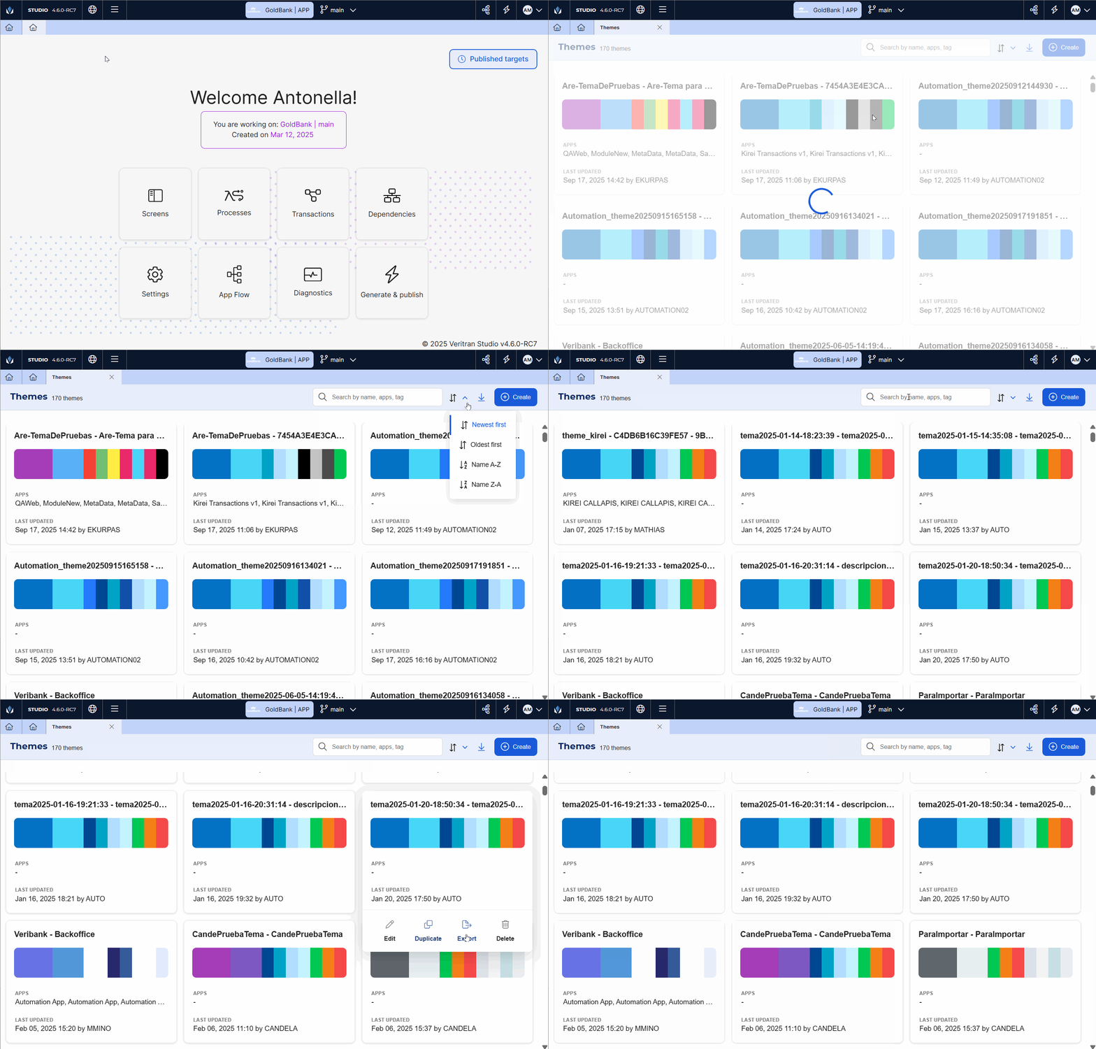
The Themes page (Menu > Design > Themes) shows a list of all the themes created for your environment, including one default theme. From this page, you can see and edit themes created, create new themes, and import and export them.
Best practice
As a best practice, you should create a new theme per new project. In case you have a theme created for your project, and you need to make changes under special circumstances (for example, a new look & feel to be applied to a specific customer segment), you can duplicate the theme and make minor changes.
Navigate the Themes page
Note
When you create an app, you must always apply a theme, even though is not the one created for the project. Then, you can create the theme in the Themes page and apply it to your app. To learn more, read Use the theme.

To access the Themes page from the Menu, go to Design > Themes. You can review if the theme you need has been already created by another user.
Each theme is represented by a card, which includes the theme name, the apps in which it is used, the last time and date on which it was updated, and the user who made the changes.
To find a theme, scroll down the list or narrow it down by typing the theme name or tags, or the name of the app in which it is used in the search bar.
To organize the themes displayed (either before or after a search), click the arrows icons and select one of the options available: Newest first, Oldest first, Name A-Z, Name Z-A.
Once you found the theme you need, hover over the theme card and choose any of the actions available:
Edit | Click to open the theme configuration and review or make any required changes to the theme variables, styles, custom, css and settings. These changes must have been previously defined by the design team of the project. Depending on the modifications, these can affect the apps that have the theme applied. Learn more in the list below:
WarningThe changes in the theme will be applied to all the apps using it. Make sure to double-check the apps and how the changes will affect their appearance. |
Duplicate | Click to create a copy of a theme. The Duplicate a Theme modal opens, where you must enter a name for the theme. The name must refer to the project Then, click Duplicate. ImportantDuplicate a theme if you already created one under best practices and you need to make minor changes. |
Export | Click to export the theme to your device in .xml format. Then, you can import it in a different environment. To learn more, read Import a theme. |
Delete | Click to permanently delete a theme. A confirmation modal opens, where you must click Yes, delete to proceed. |
If you cannot use or don't need the existing themes, you can either import a theme from your device or create a theme from scratch.
Import a theme
To import a theme, click Import (  ).
).
Once your device file browser opens, select the previously exported theme in .xml format. Then, click Open. The theme will be automatically uploaded to the Themes list. Then, you can edit it (if required) and apply it to your app.