Text Label
The Text Label component is a text box that provides specific information to the app user and does not require any data input. To insert a Text Label component in the screen, go to the Left Panel in the Visual Builder. Go through the list of components to find the Text Label component or click the search bar and type its name. Then, drag and drop the component into the canvas and configure its attributes in the right panel. Refer to the sections below to learn more.Left Panel
Important
The Text Label component can be used in web and mobile apps (both for Android and iOS devices).
Attributes Specifications
Refer to the section below to learn more about all the right panel attributes that appear for configuration when you drag and drop a text label component into the canvas.
Important
This section is for information purposes only. Configure the attributes for the component according to your project's requirements.
Design
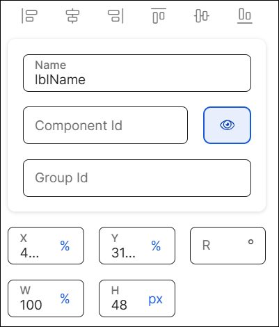
First of all, you must change the name of the text label to represent its position within the screen layout. For example, the name can be lblName.
Then, you can configure the position attributes, which affect the position of all the children components within it, as specified in the table below.
X | Position of the component in the canvas with regard to the x axis. Enter a number in the field and then select the % or px unit of measurement. |
Y | Position of the component in the canvas with regard to the x axis. Enter a number in the field and then select the % or px unit of measurement. |
R | Angle with the vertical axis in which the component is positioned. |
W | Width of the component with regard to the screen size. |
H | Height of the component with regard to the screen size. |
Margin properties | Space around a component's border. To configure the margins, click the number field of each margin (left, right, top, bottom) and enter the desired value. Then, click the unit of measurement located to the right and select the px or % option from the list. |
Padding properties | Space between the component's border and the component's content (value). To configure the paddings, click the number field of each margin (left, right, top, bottom) and enter the desired value. Then, click the unit of measurement located to the right and select the px or % option from the list. |
Position Type | Click the arrow and select a type from the drop-down menu. Refer to the table below to learn more about the options available.
|
Important
The Tab Index attribute is deprecated. Instead, you must use the Accessibility Order attribute.
Initial State | NoteThis attribute is available for web and mobile apps (Android and iOS devices). Defines the initial visual state of the flex container when the screen is rendered. This attribute allows selecting which state is applied when the component is first displayed, which can be different than the default state of the component. The component will keep this state until an event requests the component to change it. ImportantThe appearance of each state is defined in the app theme. Read Create or edit a theme to learn more. To configure the attribute, select an option from the drop-down menu. Learn more below.
TipIf you select a state that has not been configured in the app theme, the default state of the component will be applied. Read State attribute to learn about the default state of the component |
Important
Changes made in this section will not appear in the published app.
State | Attribute that allows you to simulate the appearance of the component under a specific state. States are defined in the Styles section of the theme applied to the app and define the appearance of the component under specific circumstances - to apply the state style to a component, you must set the logic in the right panel, indicating the app that, under a specific event, the component must change its default state. Select an option from the drop-down menu: Active, Success, Error, Disabled. Learn more about each option below.
|
Value | Attribute that simulates the behavior of the Value attribute from the Basic section in the Design tab. Click the field and type a value to see it applied to the component automatically. |
Background Image | Image applied to the component's background. |
CSS Class | CSS or style invoked from Global Design > Themes and applied to the component. Click the field and select a style from the drop-down menu. TipYou can add more than one style. |
Profile Option | Code applied in reference to the app user profile. Click the field and enter the code. |
Value | Text displayed in the component that informs the app user about the data to be entered. You can add plain text or a reference to a parameter or register. NoteTo avoid rendering issues, do not use emoticons in the component Value field. You can also add the value to the translations dictionary or select an existing translation if there are languages selected in the context's settings.TranslationsSettings TipIf you don't complete this field, you can also enter the text by double clicking on the component and typing the desired text. Once you complete the Value field, you cannot use this option. |
Single Line | Attribute that indicates that the text value must be displayed in a single line within the component. Click the field and select true to enable this option or leave the field empty. TipThe only value in the drop-down menu is true. |
Single Line Mode | Attribute that indicates how the text value of the component is reduced to be displayed in a single line. The options available are: Ellipsis End, EllipsisMiddle, EllipsisStart, Stretch, TrimChar, TrimWord. TipTo configure this attribute, the value of the Single Line attribute must be true. |
Visible | Attribute that defines whether the component is visible in the app. Click the arrow and choose an option from the drop-down menu. Select true so that the component is visible in the app or false so that it is not visible. |
Important For Accessibility | Attribute that defines whether the screen reader reads or ignores the value defined in the Accessibility Text attribute of the component. Click the arrow and select an option from the drop-down menu. Choose true so that the screen reader reads the component or false so that the screen reader does not read the component. The default value is false. |
Accessibility Text | Alternative text. Add a short text to describe the component to users who may not be able to see it. The text will be read by iOS Voice Over or Android Talk Back. You can also add the accessibility text to the translations dictionary or select an existing translation if there are languages selected in your branch settings.Left PanelSettings |
Accessibility Order | Attribute that tells the screen reader the order in which it must read the components. To configure it, click the field and enter a number to define the order. For example, if this component should be read in third place, enter the value 3. If you don't configure a custom order, components are read from top to bottom and left to right of the screen. |
Text Alignment | Click the desired alignment option. From left to right: none (no alignment), justified, left, centered or right, depending on whether you want the text not to be aligned, to be aligned with both left and right edges, the left edge, centered between the two edges of the component or aligned with the right edge. You can also click </> and type the code to set the text alignment manually. TipThe justified alignment is now available for mobile and web apps. |
Background Color | Component's background color. To set a color, click the field and type the hexa color code or click the rounded-edges square icon to open the color picker. and type the HEXA color code in the Hexa field. To set the opacity, go to the Opacity field and enter a number up to 100. You can also set the opacity outside the color picker in the Opacity field next to the color field. |
Background Gradient | Color gradient defined for the component's background. To set the gradient, you must enter the gradient's direction (either horizontal or vertical) and the hex codes for the two colors of the gradient, all separated by commas. For example, to set a gradient in horizontal direction, enter the following: h,#673AB7,#949AC8. To set a gradient in vertical direction, enter: v,#673AB7,#949AC8. To set the opacity, go to the Opacity field and enter a number up to 100. You can also set the opacity outside the color picker in the Opacity field next to the Background color field. NoteIf you set a background color, the gradient won't be applied. Remember to complete one of the two options. |
Background Image | Image applied to the component's background. To add an image, click the Background Image field and type the name of the background image, or click the magnifying glass icon to open the image picker. Select one of the images available in the list, or use the search bar to find an image by name. |
Resource Origin | Method through which the resource referenced by the component is loaded. Fill in this field if the component selected references a resource, like an image or a video. Click the arrow and select one of the options available in the drop-down menu: choose L (Local) to retrieve the coded content from the local resources or choose H (HTTP) to retrieve the resource content from the Comm Server. |
Z-Index | Property that defines the components' position order. If several components overlap, components with a higher Z-index will be placed over those with a lower index. This field is filled in automatically. |
Tooltip Enabled | Determines whether the tooltip is enabled in the app for the selected component. Click the arrow and choose an option from the drop-down menu. Select true to enable the tooltip or false to disable it. | ||||||||||
Message | Message displayed by the tooltip. Enter a message to be displayed on screen. | ||||||||||
Color | To set a color, click the field and type the hexa color code or click the rounded-edges square icon to open the color picker. and type the HEXA color code in the Hexa field. To set the opacity, go to the Opacity field and enter a number up to 100. You can also set the opacity outside the color picker in the Opacity field next to the Background color field. | ||||||||||
Font Size | To set the size, click the field and type the desired value. Refer to the table below to learn more about the types of text sizes and values available.
| ||||||||||
Font Family | To set a font family or typeface, click the arrow and select an option from the drop-down menu. You can also click </> and type the code to set the text font family manually. | ||||||||||
Background Color | To set a color, click the field and type the hexa color code or click the rounded-edges square icon to open the color picker. and type the HEXA color code in the Hexa field. To set the opacity, go to the Opacity field and enter a number up to 100. You can also set the opacity outside the color picker in the Opacity field next to the Background color field. | ||||||||||
Position | Click the arrow and select an option from the drop-down menu to set the position of the tooltip with regard to the component: Bottom, Left, Right or Top. |
Line Spacing | Determines the space between lines in the component text. By default, it is configured with the font value for the font size selected. To set the spacing, enter a number (integer or decimal) and the expression px. For example: 12px or 12.5px. If you set the value in 0px, the font lines will overlap. If you write a value in letters only (for example, newtest, the configuration won't have effect and it will apply the default value explained above. NoteThis attribute only accepts sizes in px (unit of measurement used for fonts). Avoid using negative values. | ||||||||||
Character Spacing | Determines the space between characters in the component text. By default, it is configured with the font value for the font size selected. To set the spacing, enter a number (integer or decimal) and the expression px. For example: 12px or 12.5px. NoteThis attribute only accepts sizes in px (unit of measurement used for fonts). If you use negative values, the space between characters will decrease. If you set the value in 0px, the spacing will be the default spacing of the font used. If you write a value in letters only (for example, newtest, the configuration won't have effect and it will apply the default value explained above. | ||||||||||
Font Size | To set the size, click the field and type the desired value. Refer to the table below to learn more about the types of text sizes and values available.
| ||||||||||
Font Family | To set a font family or typeface, click the arrow and select an option from the drop-down menu. You can also click </> and type the code to set the text font family manually. | ||||||||||
Font Style | To set the font style, click the arrow and select an option from the drop-down menu. The only option available is italic. | ||||||||||
Font Weight | To set the font weight, click the arrow and select an option from the drop-down menu. The only option available is bold. | ||||||||||
Text Decoration | To set the decoration, click the arrow and select an option from the drop-down menu. The only option available is underline. | ||||||||||
Color | To set a color, click the field and type the hexa color code or click the rounded-edges square icon to open the color picker. and type the HEXA color code in the Hexa field. To set the opacity, go to the Opacity field and enter a number up to 100. You can also set the opacity outside the color picker in the Opacity field next to the Background color field. |
Actions
In this section, you can set events or actions on the component that will be triggered by other certain actions. For example, if the action configured is "On Click", an event or action will be triggered when the app user clicks the component. Refer to the table below to learn more about each action.
On Double Click | Action triggered when the user clicks or taps the component twice. |
On Click | Action triggered when the user clicks or taps the component. |
Click Delay | Attribute that activates a delay between any clicks made on the same component. ImportantThe delay impacts on the On Click and On Double Click attributes (if configured). For example, if you set the delay in true, and both On Click and On Double Click attributes are configured, such delay will apply on both. Previous configurationBefore setting this attribute, you must first configure the global parameter CLICK_DELAY. This parameter defines the behavior of the attribute: you can globally define if you enable (true value) or disable (false value) the 500 milliseconds delay between multiple clicks. When configuring it, select the string ype and then define the value: select True to disable the multiple click and activate the 500 milliseconds delay between one click and the other or False to enable the multiple click without any delay. To set the delay, select an option from the drop-down menu, that impacts on the Value defined in the CLICK_DELAY parameter: choose None (default value) to apply the value previously defined in the parameter; choose True to override the parameter value and activate the delay; choose False to override the parameter value and disable the delay. |
In all cases, to set the event or action to be triggered, type the action in the corresponding field or click the vertical three-dot icon. The Create new link window opens. Click the down arrow and select one of the link types available in the drop-down menu: View, SW States, Process, Lambda, Pop Up, Toggle, Event, Link, Mail, Module Screen or Interface Message. A new drop-down menu appears. Click the down arrow and select the action or event within the selected type. Then, complete the parameters applicable to the option selected. Once you configure the required parameters, click Accept.Instancing a Screen-type Module
Note
The Click Delay attribute is the only attribute that is not configured through the Create new link modal.
Alpha | Component’s transparency or opacity. Enter the value to set the initial opacity of the component before the animation is executed. The value can range from 0 to 1, considering 1 as the value that grants the highest level of transparency. |
Scale | Component's dimension. Enter the value to set the initial scale of the component before the animation is executed. By default, the scale value is 1, which equals the component’s original size. The value can be any number starting on 1. |
Then, you configure the animation through which the effects previously defined will be executed. Refer to the table below to learn more about the animations available.
On Load Effect | Animation executed immediately after the screen loads. |
On Call Effect | Animation executed upon invoking it through a message. |
In all cases, you can set the animation's code or configure it with the Animation Editor. To configure the animation, click </> and then click on the text field to start typing the code or click the vertical three-dot icon to open the Animation Editor. Refer to Actions to learn how to use the editor.Actions