Button
Platforms | Web and mobile apps |
Operating Systems | Android and iOS |
The Button component indicates an action (for example, showing a screen or submitting a form) and allows the app user to perform such action by clicking or tapping the component. To insert a Button component in the screen, go to the Left Panel in the screens editor. Go through the list of components to find the Button component or click the search bar and type its name. Then, drag and drop the component into the canvas and configure its attributes in the right panel. Refer to the sections below to learn more.
How to use a button component in an app
This section includes a use case that explains how you should use and configure a button component to fulfill a request made by GoldBank, your client.
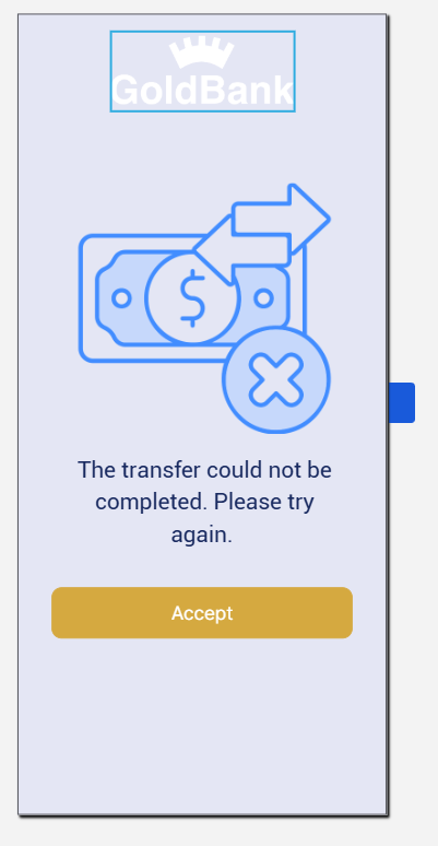
GoldBank asks you to redesign the error modal that appears when an error occurs and a transfer transaction cannot be executed. This error is not specific and cannot be classified, so you need to add a generic message for the user to understand that the transaction was not executed and must go back to the Transfers section and try again.
The screen below shows the components that are included when the error occurs: an image of the GoldBank logo, an image of the error, a text label with a message for the user, and a button that the user clicks to acknowledge the message and be redirected to another screen. For purposes of this example, the use case will only give you instructions on how to build and configure the button to go back to the Transfers screen. Refer to the instructions below to learn more about how to configure the screen according to the client's requirements.
Go to the GoldBank app. In the Overview, click Screens.
Click + New screen to open the screens editor.
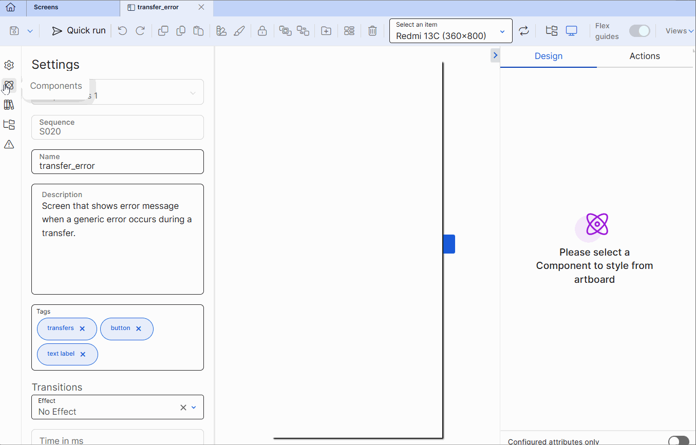
In the screens editor, go to the left panel and then go to the Info tab. Add a name to identify the screen, for example: transfer_error, and a description including information about the purpose of the screen, for example: Screen that shows error message when a generic error occurs during a transfer. . In addition, add the sequence. You can also add tags to easily find the screen in the screens list in the future, for example: button , text label and transfers .
Note
Screen name must comply with Veritran naming conventions.
Click Save (diskette icon) to save the Info changes before editing the screen. The Commit message modal opens, where you have to enter a description informing why the screen was created or edited for the branch previously selected. You can also add the Jira ticket where the request was defined, if applicable. Then, click Save and continue.
As the best practice, you must add the parent flex container to the canvas and configure it. Within this flex container, you will add secondary flex containers that will represent the sections within the screen. In this case, you will add only one secondary flex container, where you will include the button component.
Go to the left panel and go to the Components tab. Type Flex Container in the search bar or find it in the list. Then, drag and drop it into the canvas to use it as a main flex to contain any other flex containers within it.
Go to the right panel. In the Name field enter flxParent.
Go to the Component Id field and enter flxParent.
Go to the position and alignment section. Delete the values in the X and Y attributes. In the W and H attributes, leave 100 and % (percentage) selected as unit of measurement, so that the flex container covers the entire screen (both in length and width).
As required under the project's design, go to the Background section and enter a color for the flex container's background. In this case, enter #E4E6F4, which is the hexadecimal code that represents the shade of blue defined for the app according to the client's requirements.
Tip
As a best practice, enter the hexadecimal code for the color required instead of selecting a color from the color picker.
Go to the Size & Position section. In the Position type field, select Relative.
Tip
As a best practice, the parent flex container, secondary flex containers, and child components must have the Position Type defined in Relative. With the Relative positioning, child components are aligned one after the other according to the parent flex container layout (either in columns or rows). In addition, if the size of a child component is modified, relative positioning will allow all the child components to reorganize automatically, to avoid overlapping between them.
Go to the Layout section.
In the Direction subsection, select Column, so that the components within the flex run from the top to the bottom of the container.
In the Align subsection, select stretch, so that the components inside the flex container are aligned and stretch across the entire space of the container.
In the Justify subsection, select start, so that the components within the flex are placed at the top part of the container.
In the Children section, select Wrap so that, if the components within the flex container exceed its maximum width, they are placed below the rest of the components. Then, from the wrapping options that appear, select Start.
As per the client requirements, the button must contain an Accept message, that indicates that the user understands there was an error, and must redirect the user back to the Transfers page, so they can try executing the transaction again.
Read the instructions below to configure the set the button. To learn more about how to configure the text label and image components, read the Image and Text Label articles.
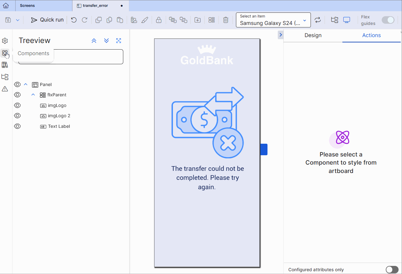
Go to the Components tab in the left panel. Type Button in the search bar or find it in the list. Then, drag and drop it into the canvas. Make sure it appears as the last component listed in the treeview.
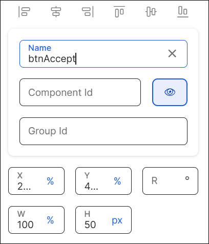
Go to the right panel. In the Name field, enter btnAccept.
In the Component Id field, enter btnAccept.
Go to the position and alignment section. Change the values but leave the unit of measurements that appear by default.
In the X field, enter 9.
In the Y field, enter 58.
In the W field, enter 82.
In the H field, enter 50.
Important
Since the app has a theme applied, the button component has a specific style applied. Do not modify the Background, Border, Radius sections and CSS Class field values.
Go to the Basic section. In the Value field, enter Accept.
Go to the Text section. In the Font Size field, change the size to 16px.
Click Actions to open the Actions tab.
Go to the Events & Actions section and then go to the On Click field. You must enter the id of the Transfers screen, where the user must be redirected when clicking the Accept button. Enter V00|contents1:S901. When you enter it, To see or edit the transfers screen defined, click
 to the right of the field. You will be redirected to the screens editor for that screen.
Save the screen and complete the Commit message.
Attributes
In the right panel, you can configure different attributes to customize the component. Refer to the sections below to learn more.
Design
In the Design tab, you can configure the selected component's basic information and the attributes that determine how the component will look like in the app. Refer to the sections below to learn more.
First of all, you must change the name of the button to represent its position within the screen layout. For example, the name can be btnAccept.
Then, you can configure the position attributes, as specified in the table below.
X | Position of the component in the canvas with regard to the x axis. Enter a number in the field and then select the % or px unit of measurement. |
Y | Position of the component in the canvas with regard to the x axis. Enter a number in the field and then select the % or px unit of measurement. |
R | Angle with the vertical axis in which the component is positioned. |
W | Width of the component with regard to the screen size. |
H | Height of the component with regard to the screen size. |
Actions
In the Actions tab, you can set animations for the components in your app's screen and determine how the user invokes effects and triggers actions while interacting with the app. Refer to the sections below to learn more.