Video
The Video component is a video content player. To insert a Video component in the screen, go to the Left Panel in the screens editor. Go through the list of components to find the Video component or click the search bar and type its name. Then, drag and drop the component into the canvas and configure its attributes in the right panel. Refer to the sections below to learn more.Left Panel
Important
The Video component can only be used in mobile apps (both for Android and iOS devices).
Attributes
In the right panel, you can configure different attributes to customize the component. Refer to the sections below to learn more.Right Panel
Design
In the Design tab, you can configure the selected component's basic information and the attributes that determine how the component will look like in the app. Refer to the sections below to learn more.Design

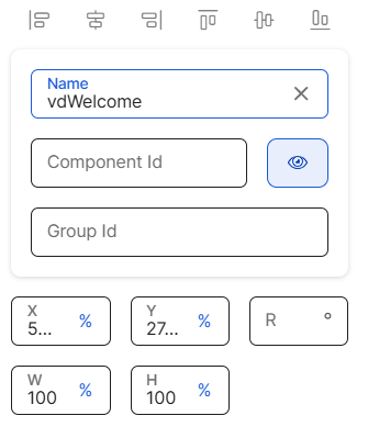
First of all, you must change the name of the component to represent its position within the screen layout. For example, the name can be vdWelcome.
Then, you can configure the position attributes, which affect the position of all the children components within it, as specified in the table below.
X | Position of the component in the canvas with regard to the x axis. Enter a number in the field and then select the % or px unit of measurement. |
Y | Position of the component in the canvas with regard to the x axis. Enter a number in the field and then select the % or px unit of measurement. |
R | Angle with the vertical axis in which the component is positioned. |
W | Width of the component with regard to the screen size. |
H | Height of the component with regard to the screen size. |
Position Type | Click the arrow and select a type from the drop-down menu. Refer to the table below to learn more about the options available.
| ||||||
Abs. Bottom | Distance from the right to the left of the component. ImportantThis attribute only appears for configuration in child flex container components. |
CSS Class | CSS or style invoked from Global Design > Themes and applied to the component. Click the field and select a style from the drop-down menu. TipYou can add more than one style. | ||||||||
Src | Id of the image to be displayed in the component. To set the image, click the field and type the name of the image, or click the magnifying glass icon to open the image picker. Then, select one of the images available in the list, or use the search bar to find an image by name. | ||||||||
Resource Origin | Method through which the resource referenced by the component is loaded. Fill in this field if the component selected references a resource, like an image or a video. Click the arrow and select one of the options available in the drop-down menu: choose L (Local) to retrieve the coded content from the local resources or choose H (HTTP) to retrieve the resource content from the Comm Server. | ||||||||
Loop | Defines whether the animation video is played in loop. Click the arrow and choose an option from the drop-down menu. Select true so that the animation is played in loop or false so it is not played in loop. The default value is true. | ||||||||
Show Controls | Defines whether the component displays a video control panel with Pause, Rewind and Fast Forward options. Select true so that the video component displays the video control panel or false so it does not. The default value is false. | ||||||||
Mute | Defines whether the video is played in mute. Click the arrow and choose an option from the drop-down menu. Select true so that the video is played in mute or false so it is not. The default value is true. | ||||||||
Auto Play | Defines whether the animation video is played automatically when the screen loads. Click the arrow and choose an option from the drop-down menu. Select true so that the video is played automatically or false so it is not. The default value is true. | ||||||||
Keep Aspect | Click the arrow and choose an option from the drop-down menu. Select true so that the video keeps its aspect ratio and adjusts to the screen limits or false so that the video keeps its aspect ratio but occupies the full screen. To work properly, the H and W attributes must be configured with the same unit of measurement, rh or rw: use rw if you want the video to occupy a 100% width, and rh if you want the video to occupy a 100% height. TipTo define the aspect, use the simple three rule. See two examples below:
NoteIf configured, this attribute only impacts on iOS devices. | ||||||||
Format | Defines how the duration of the video is displayed in the app. Click the field and enter one of the options in the table below.
| ||||||||
Visible | Attribute that defines whether the component is visible in the app. Click the arrow and choose an option from the drop-down menu. Select true so that the component is visible in the app or false so that it is not visible. | ||||||||
Visibility | Attribute that defines whether the component is visible in the app. Click the arrow and choose an option from the drop-down menu. Select visible so that the component is visible in the app or none so that it is not visible. This attribute is only applicable for web apps. | ||||||||
Important For Accessibility | Attribute that defines whether the screen reader reads or ignores the value defined in the Accessibility Text attribute of the component. Click the arrow and select an option from the drop-down menu. Choose true so that the screen reader reads the component or false so that the screen reader does not read the component. The default value is false. | ||||||||
Accessibility Text | Alternative text. Add a short text to describe the component to users who may not be able to see it. The text will be read by iOS Voice Over or Android Talk Back. You can also add the accessibility text to the translations dictionary or select an existing translation if there are languages selected in your branch settings.Settings | ||||||||
Accessibility Order | Attribute that tells the screen reader the order in which it must read the components. To configure it, click the field and enter a number to define the order. For example, if this component should be read in third place, enter the value 3. If you don't configure a custom order, components are read from top to bottom and left to right of the screen. |
Z-Index | Property that defines the components' position order. If several components overlap, components with a higher Z-index will be placed over those with a lower index. This field is filled in automatically. |
Actions
In the Actions tab, you can set animations for the components in your app's screen and determine how the user invokes effects and triggers actions while interacting with the app. Refer to the sections below to learn more.Actions
In this section, you can set different effects on the component's attributes and the animations through which the effects take place. First, you must select the attributes for which you want to set effects. Refer to the table below to learn more.
Alpha | Component’s transparency or opacity. Enter the value to set the initial opacity of the component before the animation is executed. The value can range from 0 to 1, considering 1 as the value that grants the highest level of transparency. |
Scale | Component's dimension. Enter the value to set the initial scale of the component before the animation is executed. By default, the scale value is 1, which equals the component’s original size. The value can be any number starting on 1. |
Then, you configure the animation through which the effects previously defined will be executed. Refer to the table below to learn more about the animations available.
On Call Effect | Animation executed upon invoking it through a message. |
In all cases, you can set the animation's code or configure it with the Animation Editor. To configure the animation, click </> and then click on the text field to start typing the code or click the vertical three-dot icon to open the Animation Editor. Refer to Actions to learn how to use the editor.Actions